■ 4월 10일 - 1일차
■ 반응형 웹 기본
○ 반응형 웹 기본
오늘날 다양한 기기와 해상도를 통해 웹 문서를 열람하고 있는데
이로 인해 특정 기기, 브라우저에 국한 되지 않고
다양한 환경에서 동일한 경험을 제공할 수 있는 웹 문서를 만들어야 한다.
이것을 반응형 웹 이라고 함.
○ 반응형 웹이란?
다양한 기기나 브라우저의 크기에 맞게 구성이나 크기를 변경해 가며
반응하는 웹문서 또는 이를 위해 사용하는 기법
스마트 모바일 기기 등장 및 태블릿 등장으로 웹문서 설계에 변화가 필요함
모바일 전용 URL 제공, 데스크톱 전용 URL 따로 제공하는 방식도 있음.
그러나 기기의 유형의 다양해 짐에 따라 한계가 드러날 수 밖에 없음
그로인해 사용하는 기기에 적절하게 맞춰지는 사이트를 개발 하는 것이 바람직해졌고
가변성을 유지 시켜주는 것이 핵심 키워드가 됨.
○ 뷰포트 (Viewport)
현재 화면에 보여지는 영역을 의미
기기 별로 뷰포트가 다르기 때문에 동일한 웹 페이지 라도 기기에 따른 배율조정으로 화면의 크기가 다르게 보임
<meta name="viewport" content="width=device-width, initial-scale=1.0">- 기기의 너비 기준으로 초기 크기를 1배율로 하겠다라는 의미 임.
- 작성하지 않으면 뷰포트 변경에 따라서 크기가 유지 되지 않고 사이즈가 각각 달라짐.
반응형 웹의 일반적 화면 크기는 모바일 768px 미만, 태블릿 1024px 미만, 데스크 탑 1024px 이상

■ 단위(상대 단위, 뷰포트 단위)
○ 절대 단위, 상대 단위
- 절대 단위 : px 은 절대 길이 단위로 화면이 변형되어도 변경되지 않고 고정되어있음
- 상대 단위 : rem, em 은 상대적인 길이 단위로 특정 요소에 고정되어 요소의 변경에 따라 변화됨
○ em, rem
- 박스에서 텍스트 크기를 조정할 때 사용하는 상대 단위
- em : 부모요소의 글꼴 크기를 의미함 부모가 20px 이면 1em = 20px, 2em = 40px
- rem : 루트 요소의 글꼴 크기를 의미함 1rem = 16px, 2rem = 32px
- 루트 요소는 Html요소를 말하고 기본값은 16px
- Hint : em으로 여백(margin, padding) 크기를 지정할 때는 부모가 아닌 가지 자신의 글자크기를 기준으로 함
○ 뷰포트 단위 (vw, vh, vmin, vmax)
- em 과 rem은 주변에 맞게 크기를 변경하지만 기기화면에 따른 변화는 불가능
- 기기 화면 크기에 맞춰 변화는 단위를 뷰포트 단위 라고 함
- 1vw : 뷰포트 너비의 100분의 1
- 1vh : 뷰포트, 높이의 100분의 1
- 1vmin : 뷰포트 높이와 너비중 작은 쪽
- 1vmax : 뷰포트 높이와 너비중 큰 쪽
○ %단위 가변 레이아웃
- % 백분율로 부모요소와의 상대적 크기를 지정시 사용
- 부모요소와의 상대적 크기를 지정할 수 있다.
- font-size : 부모 글자크기의 50% 비율
- height : 부모 높이의 % 비율
- width, margin, padding : 부모 너비의 %비율 / margin,padding은 너비를 기준으로 들어감
○ Calc
- Css 함수는 괄호안에 인수를 전달하면, 인수에 따른 결과값을 속성에 적용
- calc 사용시 주의 사항으로 사칙연산의 앞뒤는 1칸씩 띄어 써야 함.
width: calc(100% - 100px);
■ 미디어 쿼리
○ 미디어 쿼리(media query)
미디어 타입을 인식하고 물리적 속성을 감지할 수 있는 기능
- 두가지 구성요소를 가지고 있음 (미디어 타입, 조건에 대한 물음)
@media 미디어 타입 and (조건) {
    div{	/* 변경 요소 */

    }
}
/* 800px 이하를 뜻함 */
@media screen and (max-width:800px) {
div{
width: 300px;
height: 300px;
}
}
/* 500px 이하를 뜻함 */
@media screen and (max-width:500px) {
div{
width: 200px;
height: 300px;
}
}
- link로 사용하기 screen and (max-width:800px) 800미만 일때 style.css 적용
- 기존 link보다는 밑에 있어야 적용됨 (나중에 읽기 때문에)
<link rel="stylesheet" href="style2.css">
<link rel="stylesheet" href="style.css" media="screen and (max-width:800px)">
@media (min-width:1025px){ /* 1025px 이상때 실행*/
    .a{
        background-color: red;
    }
}
@media (min-width:701px) and (max-width:1024px){ /* 701px~1024px사이때 실행*/
    .a{
        background-color: blue;
    }
}
@media (max-width:700px){/* 700px 이하일때 실행*/
    .a{
        background-color: green;
    }
}
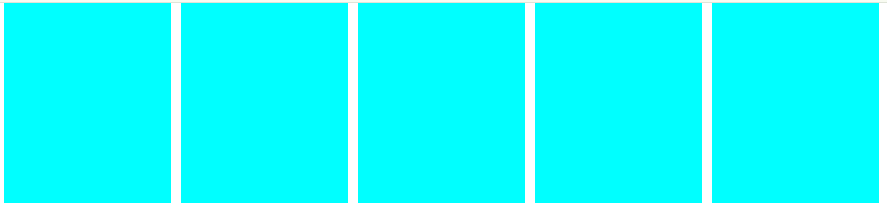
<style>
    body{margin: 0;
        --gap : 10px;
        --num : 5;
    }
    .con{
        width: calc(100% - 300px);
        height: 200px;
        margin: 0 auto;
        display: flex; justify-content: space-between;
    }
    .con .a{
        width: calc((100% - var(--gap)*calc(var(--num) - 1))/var(--num));
        /*100%에서 개수 - 1 한것에 곱하기 사이 px값 나누기 개수 */
        background-color: aqua;
    }
    @media (max-width:1024px){
        body{
            --num : 4;
        }
        .con .a:nth-child(5){
            display: none;
        }
    }
    @media (max-width:700px){
        body{
            --num : 3;
        }
        .con .a:nth-child(4){
            display: none;
        }
    }
    @media (max-width:500px){
        body{
            --num : 1;
        }
        .con .a:nth-child(2),
        .con .a:nth-child(3){
            display: none;
        }
    }
</style>
<body>
    <div class="con">
        <div class="a"></div>
        <div class="a"></div>
        <div class="a"></div>
        <div class="a"></div>
        <div class="a"></div>
    </div>
</body>
</html>
■ 변수 및 반응성

<!DOCTYPE html>
<html lang="en">
<head>
<meta charset="UTF-8">
<meta name="viewport" content="width=device-width, initial-scale=1.0">
<title>Document</title>
</head>
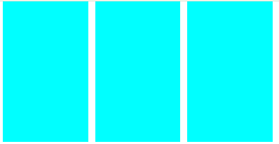
<style>
body{
margin: 0;
--gap : 5px;
--bg1 : red;
--bg2 : blue;
--bg3 : green;
--b5 : 5;
}
.container{
margin: 0 auto;
width: calc(100% - 60px);
background-color: yellow;
display: flex;
flex-wrap: wrap;
gap: var(--gap);
}
.a{
width: calc((100% - var(--gap) * 4) / 5);
aspect-ratio: 1;
background-color: var(--bg3);
}
.a:nth-child(5n){
background-color: var(--bg2);
}
@media (max-width: 1024px){
.a{
width: calc((100% - var(--gap) * 3) / 4);
aspect-ratio: 1 / 0.8;
}
.a:nth-child(4n){
background-color: var(--bg2);
}
.a:not(:nth-child(4n)){
background-color: var(--bg3);
}
}
@media (max-width: 768px){
.a{
width: calc((100% - var(--gap) * 2) / 3);
aspect-ratio: 1 / 0.5;
}
.a:nth-child(3n){
background-color: var(--bg2);
}
.a:not(:nth-child(3n)){
background-color: var(--bg3);
}
}
</style>
<body>
<div class="wrap">
<div class="container">
<div class="a"></div>
<div class="a"></div>
<div class="a"></div>
<div class="a"></div>
<div class="a"></div>
<div class="a"></div>
<div class="a"></div>
<div class="a"></div>
<div class="a"></div>
<div class="a"></div>
<div class="a"></div>
</div>
</div>
</body>
</html>
■ 4월 15일 - 2일차
■ 레이아웃(Layout)
전체적인 디자인 콘셉트와 계획에 따라 서체와 이미지 등 각각의
시각적 요소들을 한정된 공간 안에 적절하게 배치하는 것을 의미
인터페이스 디자인에서 레이아웃이란
화면의 전체적인 구도를 파악하고 심미적 요소들을
화면에 배치하는 것을 의미
시각적 인터페이스의 레이아웃을 결정하는데 있어서의 핵심은
정보의 분류와 위계, 체계 등의 정보 설계, 즉 콘텐츠 구조임
레이아웃을 구성할 때에는 그리드가 명확해야 하며,
페이지 간의 일관성이 뛰어나 사용자가 어떤 페이지에 머물든지 간에
원하는 정보를 빠르게 찾을 수 있어야 한다.
그러나 모든 페이지가 일관적이기만 하면 페이지의 인상이 지루해질 수 있기 때문에
일관성을 유지 하면서도 약간의 변화와 다양성을 줄 수 있어야 한다.
레이아웃은 웹사이트의 심미성 뿐 아니라
사용 편의성 및 효율성, 정보 전달성 등에 밀접한 영향을 미침
○ 그리드 시스템(Grid System)
같은 간격으로 배치된 수직·수평의 가상의 선, 즉 격자로 된 가이드라인을 의미하며,
그리드를 이용하여 디자인 요소들을 조화롭게 구성하고 배치하는 레이아웃 기법
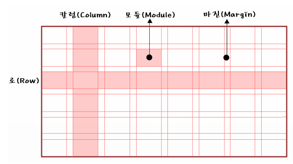
○ 그리드의 종류
그리드를 단으로 나누는 것인데, 단(column)의 수에 따라 이미지가 달라진다.

그리드는 정확한 배치와 통합, 질서, 순서를 부여함으로써
웹사이트 공간을 체계적으로 활용할 수 있게 한다
시각적 조화와 심미성을 높여주며, 정보
를 조직적이고 명료하게 표현하도록 한다
그리드 시스템을 활용하게 되면 시각적 구성 요소들을 배치하는데
기준이 되기 때문에 단순히 감에 의지하여 구성 요소를 배치하는 것보다
레이아웃 작업이 훨씬 쉬워지며, 여러 페이지에 걸쳐 작업해야 하는
웹사이트의 경우에는 웹페이지들의 일관성과 통일성을 유지할 수가 있다
○ 해상도 및 배치
웹사이트를 디자인할 때에는 모니터에 따라 작업 해상도가 달라진다.
가로와 세로 각각 1024×768, 1280×1024, 1920×1080 해상도 등이 있으며,
각 해상도 안에 콘텐츠가 안전하게 보일 수 있도록
디자인 작업 시 좌우 여백을 주는 것이 일반적임
콘텐츠 영역의 폭을 12개의 칼럼으로 나누고
가로 사이즈를 960px로 설정하는 960 그리드 시스템을 적극 활용하는 것이 좋다.
가로 폭을 12개의 칼럼으로 나누는 이유는 12가 1, 2, 3, 4, 6으로 나누어지기 때문인데,
웹사이트 디자인에서 콘텐츠 배치를 위한 가장 일반적 분할이
2단, 3단, 4단임을 고려했을 때 12개의 칼럼은 콘텐츠의 종류와 크기에 따라
다양한 분할과 통합에 매우 효율적이다


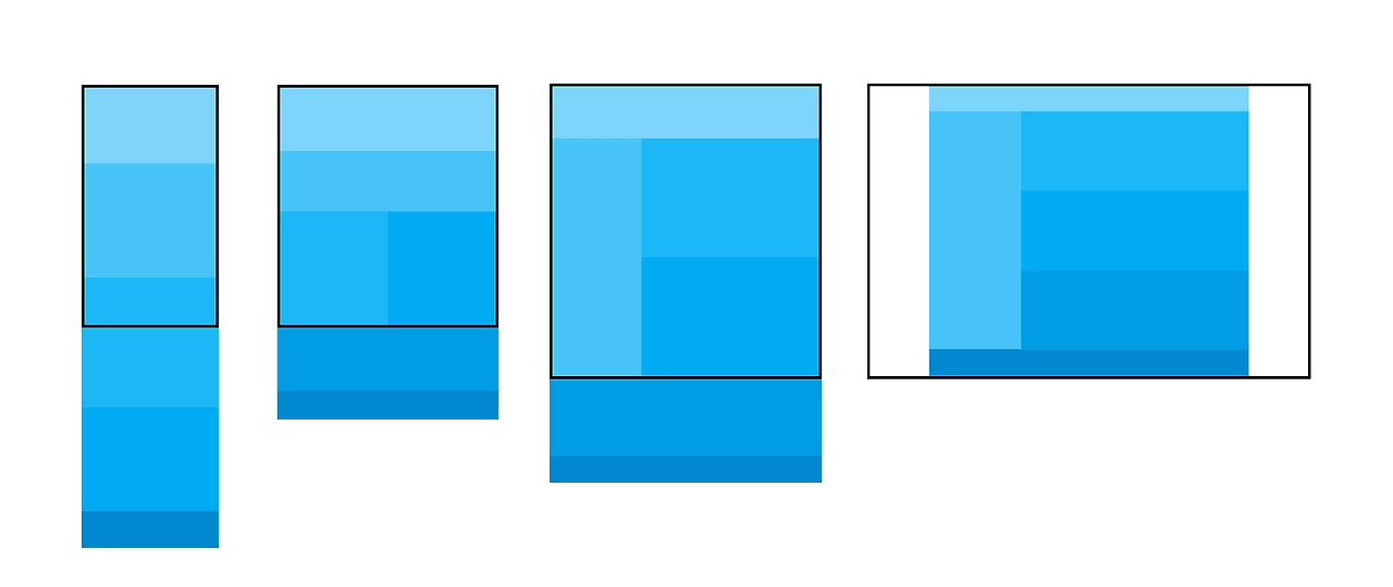
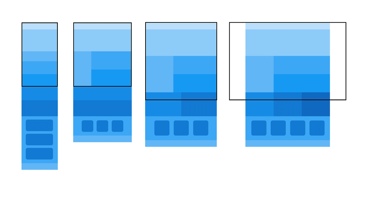
■ 반응형 웹 레이아웃
○ 반응형 웹사이트의 레이아웃
사용자의 화면 크기에 반응을 한다고 하여 반응형 웹이라고 하며
반응형 웹디자인을 기반으로 하는 다양한 디바이스를 대응하는 웹을 말한다.
디스플레이 종류와 크기에 따라 자동으로 조절하며 정보 설계상에서 중요한 항목들을 도출하여
화면에 대한 레이아웃을 정한다
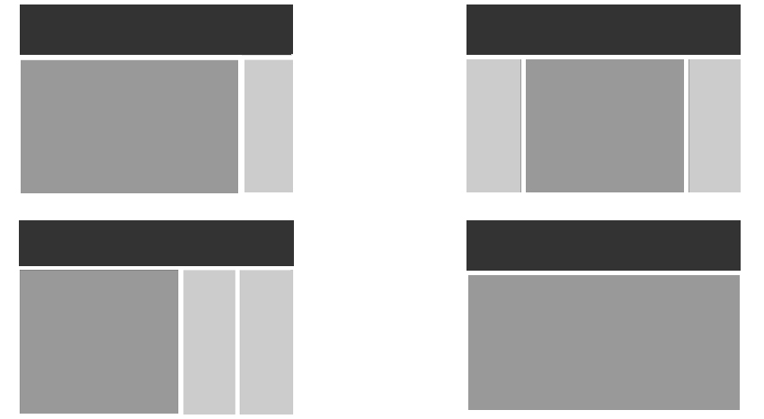
- 유동형 패턴(Mostly Fluid)
중대형 화면에서 중간 크기의 화면까지는 여백 정도만 조정하고,
작은 화면이 되면 그리드가 움직이며 콘텐츠를 수직으로 배치한다.

- 기본형태
<style>
    body{
        padding: 0;
        margin: 0;
    }
    #wrap{
        width: 960px;
        margin: 0 auto;
    }
    #wrap > div {
        height: 400px;
    }
    .box1{
        width: 100%;
        background-color: hotpink;
    }
    .box2{
        width: 50%;
        background-color: aqua;
        float: left;
    }
    .box3{
        width: 50%;
        background-color: blueviolet;
        float: right;
    }


</style>

<body>
    <div id="wrap">
        <div class="box1"></div>
        <div class="box2"></div>
        <div class="box3"></div>
    </div>
</body>
- Media 쿼리 사용
    @media screen and (max-width: 960px){
        #wrap{
            width: 95%;
        }
    }
    @media screen and (max-width: 768px){
        #wrap{
            width: 100%;
        }
    }
    @media screen and (max-width: 480px){
        .box2, .box3{
            float: none;
            width: 100%;
        }
    }
- 칼럼드롭(Column Drop)
화면의 폭이 좁아져 더 이상 콘텐츠의 정상적인 표시가 힘들 경우 컬럼을 하단으로
하여 열을 수직으로 쌓는다.
콘텐츠가 서로 연관 되어 있지 않을때 효과적임
세 개의 콘텐츠가 연관되어 있다면 계층구조 관리가 힘듦

- 기본형태
<style>
    body{
        padding: 0;
        margin: 0;
    }
    #wrap{
        width: 100%;
        display: flex;
    }
    .box1{
        width: 25%;
        height: 600px;
        background-color: hotpink;
    }
    .box2{
        width: 50%;
        background-color: aqua;
    }
    .box3{
        width: 25%;
        background-color: blueviolet;
    }

</style>

<body>
    <div id="wrap">
        <div class="box1"></div>
        <div class="box2"></div>
        <div class="box3"></div>
    </div>
</body>
- Media 쿼리 사용
    @media (max-width: 960px){
        #wrap{
            flex-wrap: wrap;
        }
        .box1{
            width: 30%;
        }
        .box2{
            width: 70%;
        }
        .box3{
            width: 100%;
            height: 300px;
        }

    }
    @media (max-width: 768px){
        .box1{
            width: 100%;
            height: 300px;
        }
        .box2{
            width: 100%;
            height: 600px;
            order: -1;
        }

    }
    @media (max-width: 480px){
        .box2{
            height: 1000px;
        }
        .box1, .box3{
            height: 600px;
        }
    }
- 레이아웃 시프터 패턴(Layout Shifter)
이 패턴은 스크린 크기 마다 다른 형태의 레이아웃을 사용하여 다른 패턴들 보다 복잡하다.
단순히 컬럼을 아래로 떨어뜨리는 배치 방식이 아닌
화면 크기마다 새로운 레이아웃으로 변형한다

- 기본형태
<style>
    body{
        padding: 0;
        margin: 0;
    }
    #wrap{
        width: 960px;
        display: flex;
        margin: 0 auto;
        height: 100vh;
    }
    .box1{
        width: 30%;
        height: 100%;
        background-color: green;
    }
    .boxwrap{
        width: 70%;
        height: 100%;
    }
    .box2{
        height: 50%;
        background-color: brown;
    }
    .box3{
        height: 50%;
        background-color: aqua;
    }

</style>

<body>
    <div id="wrap">
        <div class="box1"></div>
        <div class="boxwrap">
            <div class="box2"></div>
            <div class="box3"></div>
        </div>

    </div>
</body>
- Media 쿼리 사용
    @media (max-width: 960px){
        #wrap{
            width: 95%;
        }
    }
    @media (max-width: 768px){
        #wrap{
            width: 100%;
            display: block;
        }
        .box1{
            width: 100%;
            height: 100px;
        }
        .boxwrap{
            width: 100%;
        }
    }
    @media (max-width: 480px){
        .box1{
            width: 100%;
            height: 50px;
        }
        .boxwrap{
            height: 200%;
        }
    }
- 미세조정 패턴(Tiny Tweaks)
미니멀리즘에 따른 접근 방식으로 다른 패턴들 보다 단순한 패턴이다.
보통 하나의 컬럼을 사용하여 브라우저의 폭이 변하더라도 레이아웃의 변화가 크지 않아서
블로그에서 많이 사용되는 패턴

- 기본형태
<style>
    body{
        margin: 0; padding: 0;
        background-color: bisque;
    }
    #wrap{
        width: 80%; margin: 100px auto;
    }
    .box{
        width: 18%; height: 50px; margin: 1%;
        background-color: #fff;
        border-radius: 10px; float: left;
    }

</style>

<body>
    <div id="wrap">
        <div class="box"></div>
        <div class="box"></div>
        <div class="box"></div>
        <div class="box"></div>
        <div class="box"></div>
        <div class="box"></div>
        <div class="box"></div>
        <div class="box"></div>
        <div class="box"></div>
        <div class="box"></div>
    </div>
</body>
- Media 쿼리 사용
    @media(max-width:1024px){
        .box{width: 23%;}
    }
    @media(max-width:960px){
        .box{width: 31.333%;}
    }
    @media(max-width:768px){
        .box{width: 48%;}
    }
    @media(max-width:480px){
        .box{width: 98%;}
    }
- 오프캔버스 패턴(Off- canvas)
패턴들이 작은 화면에서는 길게 늘어나는 결과가 나타나기 때문에
페이지 컴포넌스를 스크린 밖으로 밀어냈다가 요청을 받으면
슬라이딩 도어처럼 다시 콘텐츠를 화면에 노출하는 방식이다

- 기본형태
<style>
    body{
        padding: 0;
        margin: 0;
    }
    #wrap{
        width: 960px;
        margin: 0 auto;
        height: 100vh;
    }
    #wrap-box{
        width: 100%;
        height: 100%;
        display: flex;
    }
    #wrap-box > div{
        width: calc(100% / 3);
    }
    .box1{
        background-color: aquamarine;
    }
    .box2{
        background-color: burlywood;
    }
    .box3{
        background-color: chartreuse;
    }

</style>

<body>
    <div id="wrap">
        <div id="wrap-box">
            <div class="box1"></div>
            <div class="box2"></div>
            <div class="box3"></div>
        </div>
    </div>
</body>
- Media 쿼리 사용
    @media (max-width: 960px){
        #wrap{
            width: 100%;
        }
    }
    @media (max-width: 768px){
        #wrap{
            overflow: hidden;

            position: relative;
        }
        #wrap-box{
            position: absolute;
            width: 150%;
        }
    }
    @media (max-width: 480px){
        #wrap-box{
            width: 300%;
            margin-left: -100%;
        }

    }
■ 4월 17일 - 3일차
<!DOCTYPE html>
<html lang="en">
<head>
    <meta charset="UTF-8">
    <meta name="viewport" content="width=device-width, initial-scale=1.0">
    <title>Document</title>
    <style>
        body{
            margin: 0;
        }
        .wrap{
            width: 1024px;
            margin: 0 auto;
        }
        header{
            height: 5vh;
            background-color: #ccc;
        }
        main{
            height: 90vh;
            display: flex;
        }
        .section1{
            width: 20%;
            background-color: #eee;
        }
        .section2{
            width: 80%;
        }
        .section2 > article{
            height: calc(100% / 3);
        }
        .section2 > .article1{
            background-color: #aaa;
        }
        .section2 > .article2{
            background-color: #999;
        }
        .section2 > .article3{
            background-color: #777;
        }
        footer{
            height: 5vh;
            background-color: #555;
        }


        @media (max-width:1024px){
            .wrap{
                width: 100%;
            }
            header{
                height: 10vh;
            }
            .section2 > article{
                height: 50%;
            }
            .section2 > .article3{
                display: none;
            }
        }
        @media (max-width:768px){
            header{
                height: 20vh;
            }
            main{
                height: 80vh;
                display: block;
            }
            .section1{
                width: 100%;
                height: 20vh;
            }
            .section2{
                width: 100%;
                height: 60vh;
                display: flex;
            }
            .section2 > article{
                width: 50%;
                height: 100%;
            }
        }

        @media (max-width:500px){
            main{
                height: 120vh;
            }
            .section1{
                height: 40vh;
            }
            .section2{
                display: block;
                height: 80vh;
            }
            .section2 > article{
                width: 100%;
                height: 50%;
            }
        }
    </style>
</head>

<body>
    <div class="wrap">
        <header></header>
        <main>
            <section class="section1"></section>
            <section class="section2">
                <article class="article1"></article>
                <article class="article2"></article>
                <article class="article3"></article>
            </section>
        </main>
        <footer></footer>
    </div>

</body>
</html>
<!DOCTYPE html>
<html lang="en">
<head>
    <meta charset="UTF-8">
    <meta name="viewport" content="width=device-width, initial-scale=1.0">
    <title>Document</title>
    <style>
        body{
            margin: 0;
        }
        .wrap{
            width: 1024px;
            margin: 0 auto;
        }
        header{
            height: 5vh;
            background-color: #fcc;
        }
        .section1{
            height: 40vh;
            background-color: #faa;
        }
        .section2{
            height: 50vh;
            align-content: center;
            background-color: #f99;
        }
        .section2 > .container{
            width: 80%;
            margin: 0 auto;
            display: grid;
            grid-template-columns: repeat(5, 1fr);
            gap: 20px;
        }
        .section2 > .container > .item{
            aspect-ratio: 1;
            border-radius: 5%;
            background-color: #f55;
        }

        footer{
            height: 5vh;
            background-color: #f77;
        }
        @media (max-width:1024px){
            .wrap{
                width: 100%;
            }
            .section2{
                height: auto;
                padding: 50px 0;
                box-sizing: border-box;
            }
            .section2 > .container{
                grid-template-columns: repeat(4, 1fr);
            }
            .section2 > .container > .item:nth-last-child(-n + 2){
                display: none;
            }
        }
        @media (max-width:768px){
            .section2 > .container{
                grid-template-columns: repeat(3, 1fr);
            }
            .section2 > .container > .item:nth-last-child(2){
                display: block;
            }
        }
        @media (max-width:500px){
            .section2 > .container{
                grid-template-columns: repeat(2, 1fr);
            }
            .section2 > .container > .item:nth-last-child(1){
                display: block;
            }
        }
    </style>
</head>
<body>
    <div class="wrap">
        <header></header>
        <section class="section1"></section>
        <section class="section2">
            <div class="container">
                <div class="item"></div>
                <div class="item"></div>
                <div class="item"></div>
                <div class="item"></div>
                <div class="item"></div>
                <div class="item"></div>
                <div class="item"></div>
                <div class="item"></div>
                <div class="item"></div>
                <div class="item"></div>
            </div>
        </section>
        <footer></footer>
    </div>
</body>
</html>
<!DOCTYPE html>
<html lang="en">
<head>
    <meta charset="UTF-8">
    <meta name="viewport" content="width=device-width, initial-scale=1.0">
    <title>Document</title>
    <style>
        body{
            margin: 0;
        }
        .wrap{
            width: 1024px;
            margin: 0 auto;
        }
        header{
            height: 5vh;
            background-color: #eef;
        }
        .section1{
            height: 40vh;
            background-color: #ddf;
        }
        .section2{
            height: 40vh;
            display: flex;
        }
        .section2 > .left{
            width: calc(100% / 3);
            background-color: #ccf;
        }
        .section2 > .right{
            width: calc(100% / 3 * 2);
        }
        .section2 > .right > .content1{
            height: 50%;
            background-color: #bbf;
        }
        .section2 > .right > .content2{
            height: 50%;
            background-color: #aaf;
        }


        .section3{
            height: 30vh;
            display: flex;
        }
        .section3 > div{
            width: calc(100% / 3);
        }
        .section3 > .content1{
            background-color: #99f;
        }
        .section3 > .content2{
            background-color: #88f;
        }
        .section3 > .content3{
            background-color: #77f;
        }
        .section4{
            height: 30vh;
            box-sizing: border-box;
            padding: 50px 100px;
            background-color: #aaf;
        }
        .section4 > .container{
            width: 100%;
            height: 100%;
            display: flex;
            gap: 30px;
        }
        .section4 > .container > div{
            width: 100%;
            background-color: #77f;
            border-radius: 10px;
        }

        footer{
            height: 5vh;
            background-color: #eef;
        }
    </style>
</head>
<body>
    <div class="wrap">
        <header></header>
        <section class="section1"></section>
        <section class="section2">
            <article class="left"></article>
            <article class="right">
                <div class="content1"></div>
                <div class="content2"></div>
            </article>
        </section>
        <section class="section3">
            <div class="content1"></div>
            <div class="content2"></div>
            <div class="content3"></div>
        </section>
        <section class="section4">
            <div class="container">
                <div class="item"></div>
                <div class="item"></div>
                <div class="item"></div>
                <div class="item"></div>
            </div>
        </section>
        <footer></footer>
    </div>
</body>
</html>
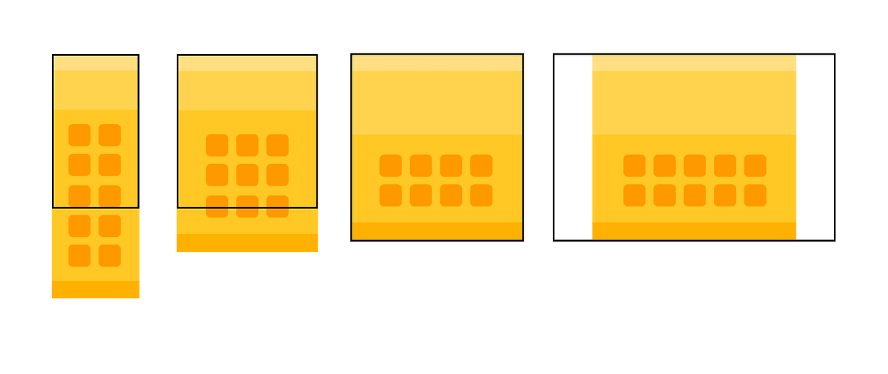
■ grid layout
○ grid layout이란
- 이름 그대로 격자 형태의 레이아웃을 만드는 2차원 레이아웃 방식
- 그리드 아이템의 배치와 정렬은 컨테이너 내부 행과 열의 상호작용을 통해 결정
- flex는 주축과 교차축을 가지고 정리한다고 한다면 gird는 상호작용을 통해 결정
- grid container : 레이아웃을 그리드 방식으로 결정할 요소
- grid item : 컨테이너 내부에서 그리드 방식으로 배치
○ 사용법
grid container에서 display속성의 값에 grid 사용
div{
	diplay: grid;
}
■ grid-template-columns,rows
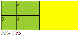
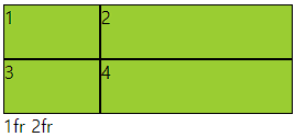
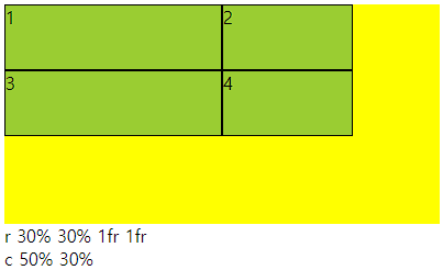
○ grid-template-columns
- grid container 트랙 중 열 내 아이템들의 크기를 지정할 수 있는 속성
- 기본형태는 열과 행 모두 container의 크기에 맞게 나온다.
- 트랙이란 행 또는 열을 뜻함
○ 사용법
- px형태로 3열을 구성하려면 px px px (개수에 따라서 열 구성, 차이는 남)
- %형태로 container의 크기의 %형태로 들어감
- fr형태 남은 사이즈를 가지고 fr의 전체를 가지고 나눔 1fr 2fr (남은것중 1/3 2/3) 크기
- 같이 사용 가능
○ 코드
<div class="container">
    <div class="item">1</div>
    <div class="item">2</div>
    <div class="item">3</div>
    <div class="item">4</div>
</div>

<style>
    .container{
        height: 100px;
        background-color: yellow;
        display: grid;
        grid-template-columns: 10% 100px 2fr;
    }
    .item{
        background-color: yellowgreen;
        border: 1px solid #000;
    }
</style>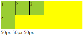
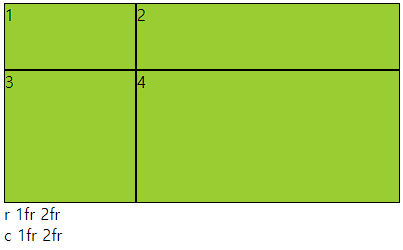
○ grid-template-rows
- grid container 트랙 중 행 내 아이템들의 크기를 지정할 수 있는 속성
- columns와 동일하며 item이 부족해 남으면 빈공간을 남김
- columns과 같이 주어도 됨
○ 코드
<div class="container">
    <div class="item">1</div>
    <div class="item">2</div>
    <div class="item">3</div>
    <div class="item">4</div>
</div>

<style>
    .container{
        height: 200px;
        background-color: yellow;
        display: grid;
        grid-template-rows: 1fr 2fr;
        grid-template-columns: 1fr 2fr;
    }
    .item{
        background-color: yellowgreen;
        border: 1px solid #000;
    }
</style>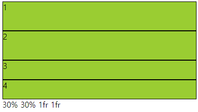
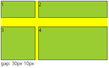
■ gap(grid-gap)
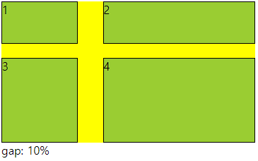
○ gap(grid-gap)
- gap으로만 사용가능
- grid cotainer에서 item들의 사이 간격을 지정하는 속성
- columns 와 rows가 수치로 되어 있으면 container를 넘어감
○ 사용법
- px로 사용해도 되고 %로 사용해도됨 그러나 너비와 높이가 다르면 %는 각각에 %임
○ 코드
<div class="container">
    <div class="item">1</div>
    <div class="item">2</div>
    <div class="item">3</div>
    <div class="item">4</div>
</div>

<style>
    .container{
        height: 200px;
        background-color: yellow;
        display: grid;
        grid-template-rows: 1fr 2fr;
        grid-template-columns: 1fr 2fr;
        gap: 30px 10px;
    }
    .item{
        background-color: yellowgreen;
        border: 1px solid #000;
    }
</style>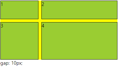
■ 트랙함수
○ 트랙 함수
- grid container의 크기를 지정할때 사용할 수 있는 유용 함수
- repeat(), minmax(), auto-fill, auto-fit 이며 template에서 사용한다.
- grid-template-columns: repeat( , ) 형태로 사용
○ repeat(반복개수, 크기)
- 반복적으로 수치를 설정할때 사용함
- 크기가 container를 넘어가면 넘어간다.
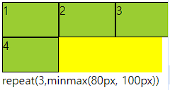
○ minmax(작은, 큰)
- 작은보다 작아질수 없고 큰보다 커질수 없다.
- repeat(개수, minmax(작은, 큰)) 으로 사용함
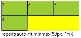
○ auto-fill, auto-fit
- repeat의 개수에 작성
- auto-fill은 공간이 남으면 개수를 늘리고 모든것이 열로 나오면 남은 공간을 남김
- auto-fit은 위와 동일하나 남은 공간을 체워준다.
- 수치값이 어떠냐에 따라 체워주지 않을수도 있다.
○ 코드
<div class="container">
    <div class="item">1</div>
    <div class="item">2</div>
    <div class="item">3</div>
    <div class="item">4</div>
</div>

<style>
    .container{
        height: 100px;
        background-color: yellow;
        display: grid;
        grid-template-columns: repeat(auto-fill,minmax(80px, 1fr));

    }
    .item{
        background-color: yellowgreen;
        border: 1px solid #000;
    }
</style>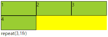
■ grid-row, grid-column
○ grid-row, grid-column
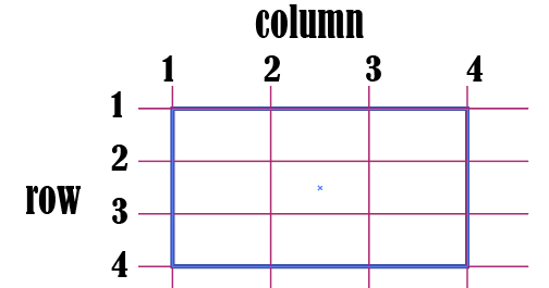
grid-item에서 사용하며 그리드 컨테이너의 줄번호를 이용해 배치할 수 있다.
row는 위아래로 내려오면서 기준선을 따라서 번호 가장 윗선이 1
column은 좌우로 넘어가면서 기준선을 따라서 번호 가장 왼쪽이 1
○ 코드
<div class="main">
    <div class="a">1</div>
    <div class="a">2</div>
    <div class="a">3</div>
    <div class="a">4</div>
    <div class="a">5</div>
    <div class="a">6</div>
</div>div{
border: 1px solid #000;
box-sizing: border-box;
}
.main{
width: 300px; height: 100px;
display: grid;
grid-template-columns: repeat(3,1fr);
grid-template-rows: repeat(3,1fr);
background-color: yellowgreen;
}
.a{
background-color: aquamarine;
}
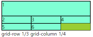
.a:nth-child(2){
grid-column: 2/4;
grid-row: 2/5;
}
○ grid-row-start, end / grid-coumn-start,end
- grid-row : 1 / 3 == grid-row-start: 1; grid-row-end: 3 과 동일
■ grid-templare-areas, grid-area
○ grid-templare-areas, grid-area
- 그리드 영역의 이름을 이용해 레이아웃의 형태를 정의
- grid-templare-areas : grid container에서 형태를 지정
- grid-area : grid item에서 이름을 지정하는 형태
- grid item에서 이름지정방식
.a:nth-child(1){
    grid-area: a;
}
-grid container에서 areas 통제방식
.container{
	grid-template-areas:
    "a a b"
    "d d b"
    "- - c"
    ;
}
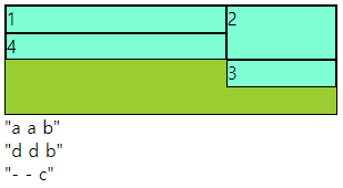
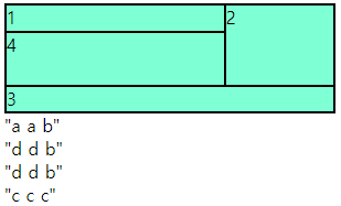
- 빈칸은 다른 이름으로 넣어주면 됨 보통(.)으로 넣는다. 숫자는 사용하지 않을것
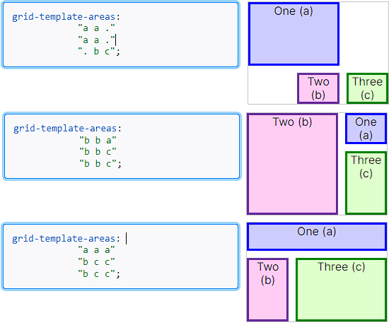
- 요소들이 분리되면 문제 발생
- 비어 있어도, 넘어가도 문제 발생
- 행과 열이 많이 편성되어 있을때 지역을 잡지 않으면 나오는 문제
<div class="main">
    <div class="a">1</div>
    <div class="a">2</div>
    <div class="a">3</div>
    <div class="a">4</div>
</div>div{
border: 1px solid #000;
box-sizing: border-box;
}
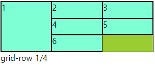
.main{
width: 300px; height: 100px;
display: grid;
grid-template-columns: repeat(3,1fr);
grid-template-rows: repeat(4,1fr);
background-color: yellowgreen;
grid-template-areas:
"a a b"
"d d b"
"- - c"
;
}
.a{
background-color: aquamarine;
}
.a:nth-child(1){
grid-area: a;
}
.a:nth-child(2){
grid-area: b;
}
.a:nth-child(3){
grid-area: c;
}
.a:nth-child(4){
grid-area: d;
}
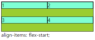
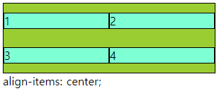
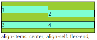
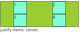
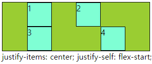
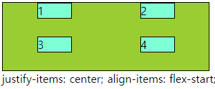
■ align-items,self / justify-items,slef
○ align-items,self / justify-items,slef
- align-items : grid container 에서 행트랙의 높이 기준으로 grid item 배치
- justify-items : grid container 에서 행트랙의 너비 기준으로 그리드 grid item 배치
- align-self : grid item 에서 행트랙의 높이 기준으로 개별 배치
- justify-self : grid item 에서 행트랙의 너비 기준으로 개별 배치
- 속성 값 : flex-end, flex-start, center 등
○ 코드
<div class="main">
    <div class="a">1</div>
    <div class="a">2</div>
    <div class="a">3</div>
    <div class="a">4</div>
</div>div{
border: 1px solid #000;
box-sizing: border-box;
}
.main{
width: 300px; height: 100px;
display: grid;
grid-template-columns: repeat(2,1fr);
grid-template-rows: repeat(2,1fr);
background-color: yellowgreen;
align-items: center;
}
.a{
background-color: aquamarine;
}
.a:nth-child(2){
align-self: flex-end;
}
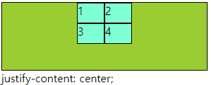
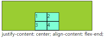
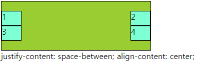
■ align-content, justify-content
○ align-content, justify-content
- align-content : 열방향에 container에 여유공간이 있을때 사용할 수 있다.
- justify-content : 행방향에 container에 여유공간이 있을때 사용할 수 있다.
- 속성으로 : flex-end, flex-start, center, space-around, space-bertween, space-evenly
○ 코드
div{
    border: 1px solid #000;
    box-sizing: border-box;
}
.main{
    width: 300px;   height: 100px;
    display: grid;
    grid-template-columns: repeat(2,40px);
    grid-template-rows: repeat(2,30px);
    background-color: yellowgreen;
    justify-content: space-between;
    align-content: center;

}
.a{
    background-color: aquamarine;
}
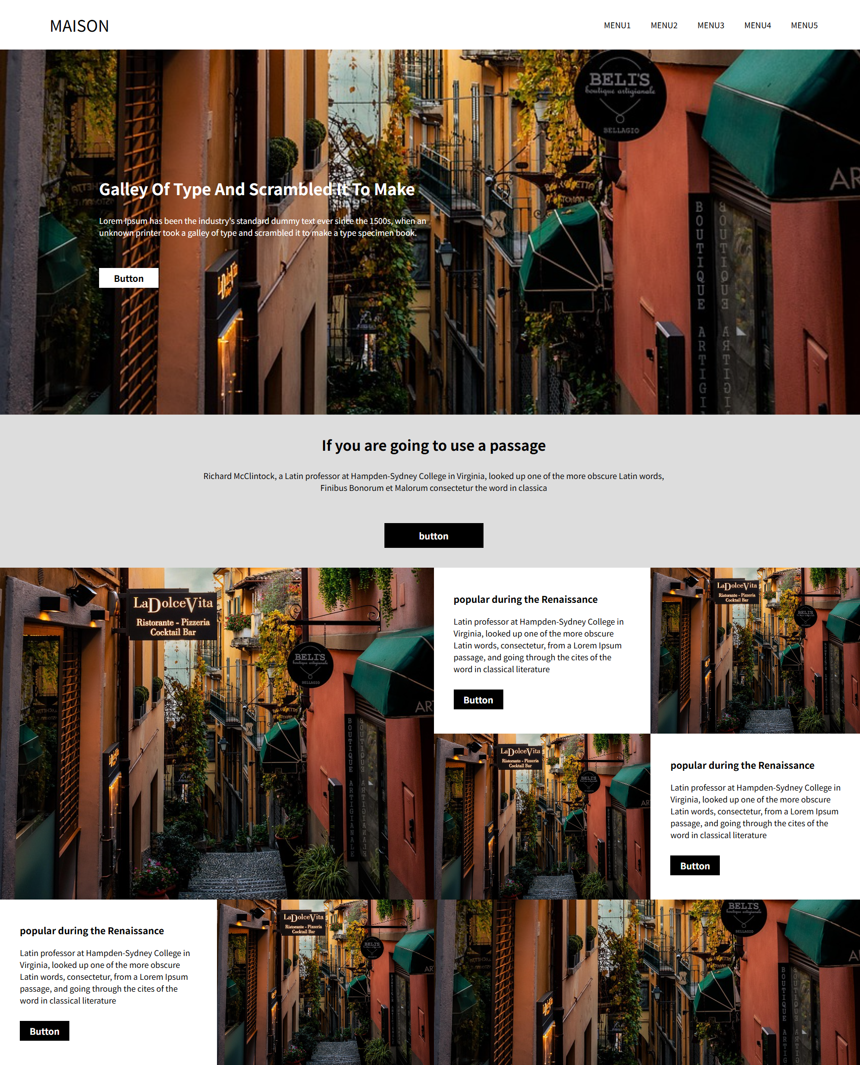
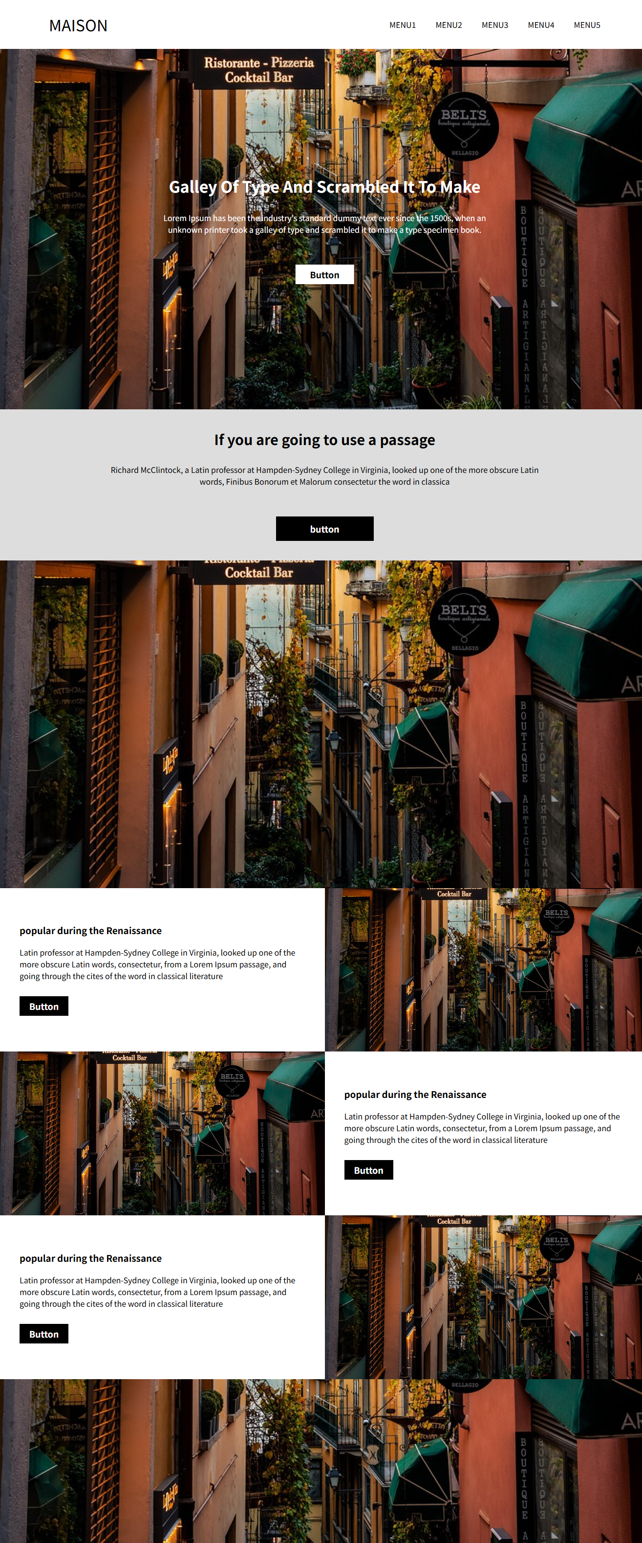
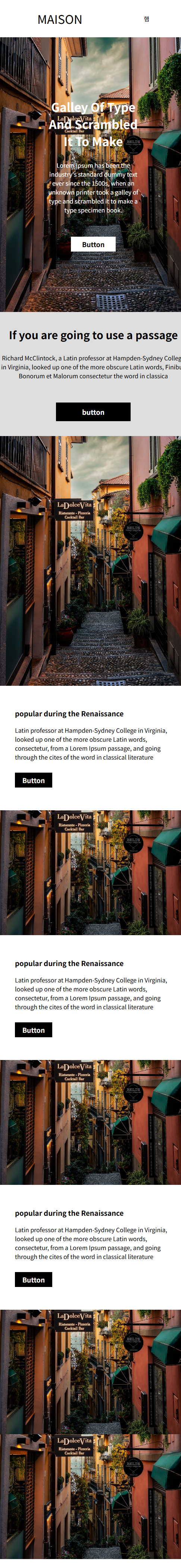
■ 4월 18일 - 4일차
<!DOCTYPE html>
<html lang="en">
<head>
    <meta charset="UTF-8">
    <meta http-equiv="X-UA-Compatible" content="IE=edge">
    <meta name="viewport" content="width=device-width, initial-scale=1.0">
    <title>Document</title>
    <style>
        body,h1,h2,h3,p{
            margin: 0;
        }
        img{
            width: 100%; object-fit: cover; display: block;
        }
        header{
            height: 100vh;
        }
        header nav{
            height: 100px;
            display: flex;
            justify-content: space-between;
            align-items: center;
            padding: 0px 100px; box-sizing: border-box;
        }
        header nav .logo{
            font-size: 2rem;
        }
        header nav .menu{
            display: flex;
            gap: 40px;
        }
        header nav .ham{
            display: none;
        }


        header .img-box{
            height: calc(100% - 100px);
            position: relative;
        }
        header .img-box img{
            height: 100%;
        }
        header .img-box .text-box{
            position: absolute; left: 200px; top: 50%; transform: translateY(-50%);
            color: #fff;
            width: 40%;

        }
        header .img-box .text-box h1{
            margin-bottom: 30px;
            text-transform: capitalize;
        }
        header .img-box .text-box p{
            margin-bottom: 60px;
        }
        header .img-box .text-box .button{
            width: 120px;
            height: 40px;
            background-color: #fff; color: #000;
            text-align: center; align-content: center;
            font-size: 18px; font-weight: 600;
        }
        .s1{
            padding: 40px 400px; box-sizing: border-box;
            text-align: center; background-color: #ddd;
        }
        .s1 h2{
            font-size: 1.8rem;
            margin-bottom: 30px;
        }
        .s1 p{
            margin-bottom: 60px;
        }
        .s1 .button{
            width: 200px;
            height: 50px;
            background-color: #000; color: #fff;
            align-content: center; font-size: 18px; font-weight: 600;
            margin: 0 auto;
        }
        .s2{
            height: 80vh;
            display: flex;
        }
        .s2 img{
            height: 100%;
        }
        .s2 > div{
            width: 50%;
        }
        .s2 .s2-r{
            display: flex;
            flex-wrap: wrap;
        }
        .s2 .s2-r .item{
            width: 50%;
            height: 50%;
        }
        .s2 .s2-r .titem{
            box-sizing: border-box;
            padding: 0 40px;
            align-content: center;
        }
        .s2 .s2-r .titem h3{
            margin-bottom: 20px;
        }
        .s2 .s2-r .titem p{
            margin-bottom: 30px;
        }
        .s2 .s2-r .titem .button{
            width: 100px; height: 40px;
            font-size: 18px; font-weight: 600;
            background-color: #000; color: #fff;
            align-content: center; text-align: center;
        }
        .s2 .s2-r .item:nth-child(3){
            order: 1;
        }
        .s3{
            height: 40vh;
        }
        .s3 .s2-r .item{
            height: 100%;
        }
        @media (max-width: 1400px){
            header .img-box .text-box{
                left: 50%; transform: translate(-50%, -50%);
                width: 50%; text-align: center;
            }
            header .img-box .text-box .button{
                margin: 0 auto;
            }
            .s1{
                padding: 40px 200px;
            }
            .s2{
                height: 160vh;
                display: block;
            }
            .s2 > div{
                width: 100%;
                height: 50%;
            }
            .s3{
                height: 80vh; display: block;
            }
            .s3 .s2-r .item{
                height: 100%;
            }
        }
        @media (max-width: 768px){
            .s1{
                padding: 40px 0;
            }
            header nav .menu{
                display: none;
            }
            header nav .ham{
                display: block;
            }
        }
        @media (max-width: 500px){

            .s2{
                height: 240vh;
            }
            .s2 .s2-l{
                height: 80vh;
            }
            .s2 .s2-r{
                height: 160vh;
            }
            .s2 .s2-r .item{
                width: 100%;
                height: 25%;
            }

            .s2 .s2-r .item:nth-child(3){
                order: 0;
            }
            .s3{
                height: 120vh;
            }
            .s3 > .s2-r{
                height: 80vh;
                display: block;
            }
            .s3 > .s2-r > .item{
                height: 50%;
            }
            .s3 > .s2-l{
                height: 40vh;
            }
        }
    </style>
</head>
<body>
    <div class="wrap">
        <header>
            <nav>
                <div class="logo">MAISON</div>
                <div class="menu">
                    <p>MENU1</p>
                    <p>MENU2</p>
                    <p>MENU3</p>
                    <p>MENU4</p>
                    <p>MENU5</p>
                </div>
                <div class="ham">햄</div>
            </nav>
            <div class="img-box">
                <img src="image.jpg" alt="">
                <div class="text-box">
                    <h1>galley of type and scrambled it to make</h1>
                    <p>Lorem Ipsum has been the industry's standard dummy text ever since the 1500s, when an unknown printer took a galley of type and scrambled it to make a type specimen book.</p>
                    <div class="button">Button</div>
                </div>
            </div>
        </header>
        <main>
            <section class="s1">
                <h2>If you are going to use a passage</h2>
                <p>Richard McClintock, a Latin professor at Hampden-Sydney College in Virginia, looked up one of the more obscure Latin words, Finibus Bonorum et Malorum consectetur the word in classica </p>
                <div class="button">button</div>
            </section>
            <section class="s2">
                <div class="s2-l">
                    <img src="image.jpg" alt="">
                </div>
                <div class="s2-r">
                    <div class="item titem">
                        <h3>popular during the Renaissance</h3>
                        <p>Latin professor at Hampden-Sydney College in Virginia, looked up one of the more obscure Latin words, consectetur, from a Lorem Ipsum passage, and going through the cites of the word in classical literature</p>
                        <div class="button">Button</div>
                    </div>
                    <div class="item iitem">
                        <img src="image.jpg" alt="">
                    </div>

                </div>
            </section>
            <section class="s2 s3">
                <div class="s2-r">
                    <div class="item titem">
                        <h3>popular during the Renaissance</h3>
                        <p>Latin professor at Hampden-Sydney College in Virginia, looked up one of the more obscure Latin words, consectetur, from a Lorem Ipsum passage, and going through the cites of the word in classical literature</p>
                        <div class="button">Button</div>
                    </div>
                    <div class="item iitem">
                        <img src="image.jpg" alt="">
                    </div>
                </div>
                <div class="s2-l">
                    <img src="image.jpg" alt="">
                </div>
            </section>
        </main>
    </div>
</body>
</html>
'Web 수업자료 > Web 정규' 카테고리의 다른 글
| 웹 디자인 1 25-04 (0) | 2025.04.10 |
|---|---|
| Web 2 25-04 (0) | 2025.04.09 |
| UIUX 디자인 24-03 (1) | 2025.03.22 |
| Web 2 25-03 (0) | 2025.03.13 |
| 웹 디자인 2 25-03 (0) | 2025.03.13 |