https://naver.me/5CWuGlXf
■ 4월 10일 - 1일차
<!DOCTYPE html>
<html lang="en">
<head>
<meta charset="UTF-8">
<meta http-equiv="X-UA-Compatible" content="IE=edge">
<meta name="viewport" content="width=device-width, initial-scale=1.0">
<title>Document</title>
<link rel="stylesheet" href="https://cdnjs.cloudflare.com/ajax/libs/font-awesome/6.7.2/css/all.min.css">
<style>
body,h1,h2,h3,p{
margin: 0;
}
ul{ /* UL 기본속성 초기화 */
margin: 0;
padding: 0;
list-style: none;
}
a{
color: inherit; /*부모 색깔 상속*/
text-decoration: none;
}
img{
width: 100%;
object-fit: cover;
display: block;
}
header{
height: 60vh;
position: relative;
}
header img{
height: 100%;
}
header nav{
position: absolute;
left: 0;
top: 0;
color: #fff;
width: 100%;
padding: 0 100px;
box-sizing: border-box;
display: flex;
justify-content: space-between;
}
header nav .logo{
font-size: 24px;
height: 40px;
align-content: center;
}
/* 메뉴 전체 */
header nav .menu{
display: flex;
}
header nav .menu > li{
}
header nav .menu > li > a{
padding: 5px 30px;
display: inline-block;
background-color: #0006;
}
/* 호버링 */
header nav .menu > li:hover > a{
background-color: #fff;
color: #000;
}
header nav .menu > li:hover > .submenu{
display: block;
}
/* 서브메뉴 */
header nav .menu .submenu{
background-color: #fff;
color: #000;
display: none;
}
header nav .menu .submenu a{
padding: 5px 0; display: inline-block;
width: 100%;
text-align: center;
}
/* 헤더 아이콘 */
header nav .icon-box{
display: flex;
gap: 10px;
align-items: center;
height: 40px;
}
header nav .icon-box .num{
width: 22px;
height: 22px;
display: inline-block;
background-color: #fff;
color: #000;
border-radius: 50%;
text-align: center;
align-content: center;
font-size: 14px;
}
/* 해더 텍스트 */
header .text-box{
position: absolute;
left: 100px;
top: 50%;
transform: translateY(-50%);
color: #fff;
}
header .text-box h1{
font-size: 42px;
margin-bottom: 30px;
}
header .text-box p{
font-size: 18px;
font-weight: 600;
}
/* 메인 시작 */
/* 섹션1 베스트 셀러 */
.section1{
padding: 100px 100px;
box-sizing: border-box;
}
.section1 h2{
text-align: center;
margin-bottom: 60px;
}
.section1 .container{
display: flex;
justify-content: space-between;
}
.section1 .container .item{
width: calc((100% - 160px)/3);
}
.section1 .container .item img{
height: 300px;
transition: 1s;
}
.section1 .container .item .img-box{
margin-bottom: 12px;
overflow: hidden;
}
/* 이미지 호버링 */
.section1 .container .item .img-box:hover img{
scale: 1.2;
}
.section1 .container .item .text-box h3{
margin-bottom: 12px;
}
.section1 .container .item .text-box .line{
text-decoration: line-through;
}
.section1 .container .item .text-box .hl{
font-size: 18px;
color: rgb(68, 68, 161);
font-weight: 600;
}
/* 섹션2 프로모션 */
.section2{
padding: 100px 0;
}
.section2 h2{
text-align: center;
margin-bottom: 60px;
}
.section2 .img-box{
height: 500px;
position: relative;
overflow: hidden;
}
.section2 .img-box img{
height: 100%;
}
.section2 .img-box .text-box{
position: absolute;
left: -600px; top: 50%;
transform: translateY(-50%);
color: #fff;
transition: 1s;
}
.section2 .img-box .text-box .title{
font-size: 42px;
margin-bottom: 10px;
}
.section2 .img-box .text-box .source{
font-weight: 600;
margin-bottom: 24px;
}
.section2 .img-box .text-box .sale{
font-size: 38px;
margin-bottom: 50px;
}
.section2 .img-box .text-box .button{
border: 1px solid #fff;
height: 40px; width: 120px;
text-align: center; align-content: center;
font-size: 20px;
}
/* 섹션2 호버링 */
.section2:hover .img-box .text-box{
left: 100px;
}
/* 섹션3 */
.section3{
padding: 100px 200px;
}
.section3 .container{
display: flex;
justify-content: space-between;
}
.section3 .container .item{
width: calc((100% - 20px)/2);
height: 300px;
position: relative;
overflow: hidden;
}
.section3 .container .item img{
height: 100%;
}
.section3 .container .item .text-box{
height: 100px;
background-color: #fff9;
text-align: center;
align-content: center;
transition: 1s;
position: absolute;
width: 100%;
bottom: -100px;
}
.section3 .container .item:hover .text-box{
bottom: 0px;
}
</style>
</head>
<body>
<div class="wrap">
<header>
<img src="plant-6544088_640.jpg" alt="">
<nav>
<div class="logo">Home Page</div>
<ul class="menu">
<li>
<a href="#">BRAND</a>
<ul class="submenu">
<li><a href="#">Sub1-1</a></li>
<li><a href="#">Sub1-2</a></li>
<li><a href="#">Sub1-3</a></li>
<li><a href="#">Sub1-4</a></li>
</ul>
</li>
<li>
<a href="#">SHOPPING</a>
<ul class="submenu">
<li><a href="#">Sub2-1</a></li>
<li><a href="#">Sub2-2</a></li>
<li><a href="#">Sub2-3</a></li>
<li><a href="#">Sub2-4</a></li>
</ul>
</li>
<li>
<a href="#">EVENT</a>
<ul class="submenu">
<li><a href="#">Sub3-1</a></li>
<li><a href="#">Sub3-2</a></li>
<li><a href="#">Sub3-3</a></li>
<li><a href="#">Sub3-4</a></li>
</ul>
</li>
<li>
<a href="#">BEST</a>
<ul class="submenu">
<li><a href="#">Sub4-1</a></li>
<li><a href="#">Sub4-2</a></li>
<li><a href="#">Sub4-3</a></li>
<li><a href="#">Sub4-4</a></li>
</ul>
</li>
<li>
<a href="#">REVIEW</a>
<ul class="submenu">
<li><a href="#">Sub5-1</a></li>
<li><a href="#">Sub5-2</a></li>
<li><a href="#">Sub5-3</a></li>
<li><a href="#">Sub5-4</a></li>
</ul>
</li>
</ul>
<div class="icon-box">
<p>LOGIN</p>
<p>CART <span class="num">0</span></p>
<i class="fa-solid fa-magnifying-glass"></i>
</div>
</nav>
<div class="text-box">
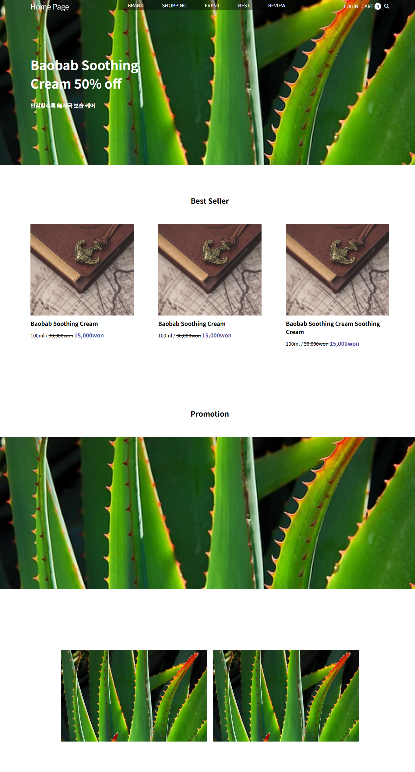
<h1>Baobab Soothing<br>Cream 50% off</h1>
<p>민감할수록 無자극 보습 케어</p>
</div>
</header>
<main>
<section class="section1">
<h2>Best Seller</h2>
<div class="container">
<div class="item">
<div class="img-box">
<img src="close.jpg" alt="">
</div>
<div class="text-box">
<h3>Baobab Soothing Cream</h3>
<p>
<span>100ml /</span>
<span class="line">30,000won</span>
<span class="hl">15,000won</span>
</p>
</div>
</div>
<div class="item">
<div class="img-box">
<img src="close.jpg" alt="">
</div>
<div class="text-box">
<h3>Baobab Soothing Cream</h3>
<p>
<span>100ml /</span>
<span class="line">30,000won</span>
<span class="hl">15,000won</span>
</p>
</div>
</div>
<div class="item">
<div class="img-box">
<img src="close.jpg" alt="">
</div>
<div class="text-box">
<h3>Baobab Soothing Cream Soothing Cream</h3>
<p>
<span>100ml /</span>
<span class="line">30,000won</span>
<span class="hl">15,000won</span>
</p>
</div>
</div>
</div>
</section>
<section class="section2">
<h2>Promotion</h2>
<div class="img-box">
<img src="plant-6544088_640.jpg" alt="">
<div class="text-box">
<p class="title">Baobab Skin Care Launching</p>
<p class="source">민감할수록 無자극 보습 케어</p>
<p class="sale">Up to 51% off<br>21.01.01 - 01.31</p>
<div class="button">Shop now</div>
</div>
</div>
</section>
<section class="section3">
<div class="container">
<div class="item">
<img src="plant-6544088_640.jpg" alt="">
<div class="text-box">
<p class="title">Line Friends Specail Set</p>
<p class="source">귀여운 패키지 알찬 구성 추가혜택</p>
</div>
</div>
<div class="item">
<img src="plant-6544088_640.jpg" alt="">
<div class="text-box">
<p class="title">Line Friends Specail Set</p>
<p class="source">귀여운 패키지 알찬 구성 추가혜택</p>
</div>
</div>
</div>
</section>
</main>
</div>
</body>
</html>
■ 4월 11일 - 2일차
■ flex box란?
○ flex box란?
- 행 또는 열을 주축으로 설정하여 웹 요소를 배치 정렬 하는 1차원 레이아웃 방식
- flex 방식에서, 요소의 배치와 정렬은 flex container와 flex item 간의 상호작용
- flex 방식을 사용하기 위해서는 display: flex 사용
○ flex container
- flex box 방식으로 레이아웃을 결정할 요소
○ flex item
- flex container 내부에서 flex box 방식으로 배치되는 요소
- flex item은 기본적으로 container의 높이에 맞춰 나온다.
○ flex 축방식
- 주축이 가로방향의 행으로 좌우라면 교차축은 세로방향의 열로 위아래

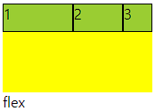
■ flex-direction
○ 주축의 방향성을 결정하는 속성
○ 행은 가로축, 열은 세로축
○ 속성값 의미
| 속성값 | 의미 |
| row | 기본값, 주축은 행으로 가로 콘텐츠 방향과 동일 |
| row-reverse | 주축은 행으로 가로 콘텐츠 방향과 반대 |
| column | 주축은 열으로 세로 콘텐츠 방향과 동일 |
| column-reverse | 주축은 열으로 세로 콘텐츠 방향과 반대 |
○ 코드 연습
<div class="container">
  <div class="item">1</div>
  <div class="item">2</div>
  <div class="item">3</div>
</div>
.container{
width: 200px; height: 200px;
background-color: yellow;
display: flex;
flex-direction: row; /* direction 위치값 */
}
.item{
width: 50px; height: 50px;
background-color: yellowgreen;
border: 1px solid #000;
}


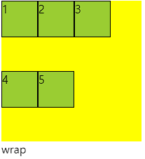
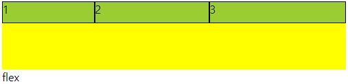
■ flex-wrap
○ flex-wrap
flex item 들이 강제로 한줄에 배치 되게 할 것인지
또는 가능한 영역 내에서 벗어나지 않고 여러행으로 나누어 표현 할 것인지 결정하는 속성
○ wrap
- 너비를 벗어나면 container를 둘로 나누고 나눈 부분에서 위로 정렬
- 한줄에 더큰 요소가 있을때는 벗어나서 표시해줌
- 크기를 벗어나게 많은 요소가 있을때는 보여지는 부분이 넘어가서 활성화됨
- 그러나 행은 기본형태인 1가지 행으로 구성되어 있다고 인지하면됨
○ 속성값 의미
| 속성값 | 의미 |
| nowrap | 기본값. 공간이 부족해도 한줄배치 |
| wrap | 공간 크기에 따라 요소가 여러 행에 걸쳐 배치 |
| wrap-reverse | wrap에서 나열되는 시작점과 끝점이 반대 |
○ 코드
<div class="container">
  <div class="item">1</div>
  <div class="item">2</div>
  <div class="item">3</div>
  <div class="item">4</div>
  <div class="item">5</div>
</div>

<style>
  .container{
    width: 200px; height: 200px;
    background-color: yellow;
    display: flex;
    flex-wrap: wrap-reverse; /* reverse */
  }
  .item{
    width: 50px; height: 50px;
    background-color: yellowgreen;
    border: 1px solid #000;
  }
</style>

■ flex-flow
○ flex-flow
direction과 wrap을 한번에 사용하는 속성
○ 코드
<div class="container">
    <div class="item">1</div>
    <div class="item">2</div>
    <div class="item">3</div>
    <div class="item">4</div>
    <div class="item">5</div>
</div>

<style>
    .container{
        width: 200px; height: 200px;
        background-color: yellow;
        display: flex;
        flex-flow: column wrap;
    }
    .item{
        width: 50px; height: 50px;
        background-color: yellowgreen;
        border: 1px solid #000;
    }
</style>
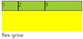
■ justify-content
○ justify-content
flex item 들이 박스의 주축을 따라 배치될때 요소 사이의 공간 분배
| 속성값 | 의미 |
| flex-start | 주축의 시작점으로부터 끝점을 향해 배치 |
| flex-end | 주축의 끝점으로 부터 시작점을 향해 배치 |
| center | 주축의 중심부에 배치 |
| space-between | 주축에서 양끝에 배치 사이 간격 동일 |
| space-around | 각각의 요소에 동일한 여백 |
| space-evenly | 모든 여백이 같음 |
○ 코드
<div class="container">
    <div class="item">1</div>
    <div class="item">2</div>
    <div class="item">3</div>
</div>

<style>
    .container{
        width: 200px; height: 100px;
        background-color: yellow;
        display: flex;
        justify-content: flex-start; /* 주축 정렬 */
    }
    .item{
        width: 30px; height: 30px;
        background-color: yellowgreen;
        border: 1px solid #000;
    }
</style>


■ align-items
○ flex - container
교차축 위에 플렉스 아이템들이 어떤식으로 정렬될 것인지 결정
| 속성값 | 의미 |
| stretch | 교차축 길이에 맞춰 늘어남 width, height가 우선 |
| flex-start | 교차축 시작점 부터 시작 |
| flex-end | 교차축 끝점 부터 시작 |
| center | 교차축 중심부에 배치 |
○ 코드
<div class="container">
    <div class="item">1</div>
    <div class="item">2</div>
    <div class="item">3</div>
</div>

<style>
    .container{
        width: 200px; height: 100px;
        background-color: yellow;
        display: flex;
        align-items: flex-start; /* 보조축 정렬 */
    }
    .item{
        width: 30px; height: 30px;
        background-color: yellowgreen;
        border: 1px solid #000;
    }
</style>


■ align-self
○ align-self
- 각각의 flex item이 교차축에서 정렬될지 스스로 결정
- flex item에 직접입력함
<div class="container">
    <div class="item">1</div>
    <div class="item">2</div>
    <div class="item item3">3</div> /* 개별 클래스 이름 설정 */
</div>

<style>
    .container{
        width: 200px; height: 100px;
        background-color: yellow;
        display: flex;
    }
    .item{
        width: 30px; height: 30px;
        background-color: yellowgreen;
        border: 1px solid #000;
    }
    .item3{
        align-self: flex-end; /* 개별 요소 보조축 정렬 */
    }
</style>


■ align-content
○ align-content
- 교차축 정렬인데 flex-wrap: wrap; 상태일때 사용가능
- space에 대해서도 사용가능 align-item에서는 안됨
- align-item에 center와 align-content의 space-around가 같음
<div class="container">
    <div class="item">1</div>
    <div class="item">2</div>
    <div class="item">3</div>
</div>

<style>
    .container{
        width: 200px; height: 100px;
        background-color: yellow;
        display: flex;
        flex-wrap: wrap; /* wrap일때 사용가능 */
        align-content: space-around;  /* align-item : center 와 동일 */
      	/* 다른값은 align-item에서 구할수 없음 */
    }
    .item{
        width: 80px; height: 30px;
        background-color: yellowgreen;
        border: 1px solid #000;
    }
</style>


■ flex-grow
○ flex-grow
- flex item이 기본 크기에 대해서 더 커질수 있다.
- container에서 할당 받을 수 있는 공간을 상대적으로 정의
- 남은게 300px 이고 1과 2로구성 되었다면 1은 100px 커지고 2는 200px 커짐
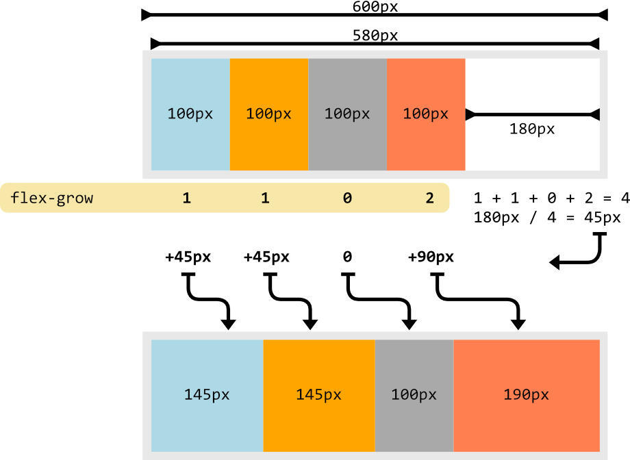
○ 코드
<div class="container">
    <div class="item">1</div>
    <div class="item">2</div>
    <div class="item">3</div>
</div>

<style>
    .container{
        height: 100px; /* 너비값 없게 놓고 해보는 것이 좋음 계속 변경해야함*/
        background-color: yellow;
        display: flex;
    }
    .item{
        width: 50px; height: 30px;
        background-color: yellowgreen;
        border: 1px solid #000;
    }
    .item:nth-child(2){
        flex-grow: 1; /* 남은 공간을 3으로보고 1커지기 */
    }
    .item:nth-child(3){
        flex-grow: 2; /* 남은 공간을 3으로보고 2커지기 */
    }

</style>

■ flex-shrink
○ flex-shrink
- flex item이 기본 크기에 대해서 더 작아질 수 있다.
- container에서 할당 받을 수 있는 공간을 상대적으로 정의
- 수치를 입력하지 않은것과 입력한 1을 입력한것은 동일
- 0을 입력하면 안작아짐

○ 코드
<div class="container">
    <div class="item">1</div>
    <div class="item">2</div>
    <div class="item">3</div>
</div>

<style>
    .container{
        height: 100px; /* 너비값 없게 놓고 해보는 것이 좋음 계속 변경해야함*/
        background-color: yellow;
        display: flex;
    }
    .item{
        width: 50px; height: 30px;
        background-color: yellowgreen;
        border: 1px solid #000;
    }
    .item:nth-child(1){
        flex-shrink: 0; /* 줄어들지 않음 */
    }
    .item:nth-child(2){
        flex-shrink: 1; /* 줄어든 공간을 3으로보고 1배율작아지기 */
    }
    .item:nth-child(3){
        flex-shrink: 2; /* 줄어든 공간을 3으로보고 1배율작아지기 */
    }

</style>


■ flex-basis
○ flex-basis
플렉스 아이템의 초기 크기를 지정, 콘텐츠 박스의 크기를 결정
기본값은 auto로 width 속성을 정의 할 때와 동일한 방식
■ flex
○ flex
flex-grow, flex-shrink, flex-basis 세가지 속성의 정의
순서는 grow, shrink, basis임
○ 코드
<div class="container">
    <div class="item">1</div>
    <div class="item">2</div>
    <div class="item">3</div>
</div>

<style>
    .container{
        height: 100px;
        background-color: yellow;
        display: flex;
    }
    .item{
        height: 30px;
        background-color: yellowgreen;
        border: 1px solid #000;
    }
    .item:nth-child(1){
        flex: 1 1 100px;  /* 증가, 감소, 본크기 */
    }
    .item:nth-child(2){
        flex: 2 2 100px;
    }
    .item:nth-child(3){
        flex: 3 3 100px;
    }

</style>
■ order
○ order
플렉스 아이템의 배치 순서를 개발자가 마음대로 설정
지정한 숫자에 맞춰 오름차순 배치
코드에는 영향을 끼치지 않고 보여지는 순서에만 영향
-값에서 + 형태로 입력해 준다. 미입력 0
○ 코드
<div class="container">
    <div class="item">1</div>
    <div class="item">2</div>
    <div class="item">3</div>
</div>

<style>
    .container{
        height: 100px;
        background-color: yellow;
        display: flex;
    }
    .item{
        width: 50px; height: 30px;
        background-color: yellowgreen;
        border: 1px solid #000;
    }
    .item:nth-child(1){
        order: 1;
    }
    .item:nth-child(2){

    }
    .item:nth-child(3){
        order: -1;
    }


</style>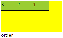
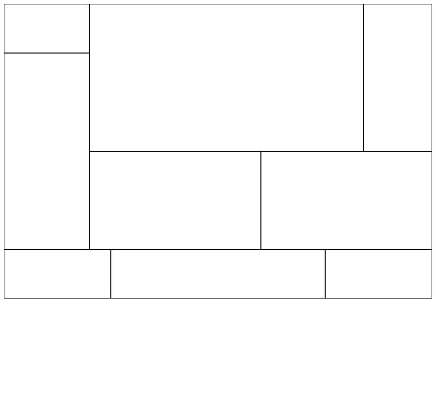
<!DOCTYPE html>
<html lang="en">
<head>
    <meta charset="UTF-8">
    <meta http-equiv="X-UA-Compatible" content="IE=edge">
    <meta name="viewport" content="width=device-width, initial-scale=1.0">
    <title>Document</title>
    <style>
        div{
            box-sizing: border-box;
        }
        main{
            display: flex;
        }
        main .m-l{
            width: 20%;
        }
        main .m-r{
            width: 80%;
        }
        main .m-l .top{
            height: 20%;
            border: 1px solid #000;
        }
        main .m-l .bottom{
            height: 80%;
            border: 1px solid #000;
        }
        main .mt{
            height: 300px;
            display: flex;
        }
        main .mt .box:nth-child(1){
            width: 80%;
            border: 1px solid #000;
        }
        main .mt .box:nth-child(2){
            width: 20%;
            border: 1px solid #000;
        }
        main .mb{
            display: flex;
            height: 200px;
        }
        main .mb .box{
            width: 50%;
            border: 1px solid #000;
        }
        footer{
            height: 100px;
            display: flex;
        }
        footer .f-s{
            width: 25%;
            border: 1px solid #000;
        }
        footer .f-b{
            width: 50%;
            border: 1px solid #000;
        }
    </style>
</head>
<body>
    <main>
        <div class="m-l">
            <div class="top"></div>
            <div class="bottom"></div>
        </div>
        <div class="m-r">
            <div class="mt">
                <div class="box"></div>
                <div class="box"></div>
            </div>
            <div class="mb">
                <div class="box"></div>
                <div class="box"></div>
            </div>
        </div>
    </main>
    <footer>
        <div class="f-s"></div>
        <div class="f-b"></div>
        <div class="f-s"></div>
    </footer>
</body>
</html>
'Web 수업자료 > Web 정규' 카테고리의 다른 글
| Web 3 24-04 (0) | 2025.04.10 |
|---|---|
| 웹 디자인 1 25-04 (0) | 2025.04.10 |
| UIUX 디자인 24-03 (1) | 2025.03.22 |
| Web 2 25-03 (0) | 2025.03.13 |
| 웹 디자인 2 25-03 (0) | 2025.03.13 |