■ 12월 10일 - 1일차
■ 반응형 웹 기본
○ 반응형 웹 기본
오늘날 다양한 기기와 해상도를 통해 웹 문서를 열람하고 있는데
이로 인해 특정 기기, 브라우저에 국한 되지 않고
다양한 환경에서 동일한 경험을 제공할 수 있는 웹 문서를 만들어야 한다.
이것을 반응형 웹 이라고 함.
○ 반응형 웹이란?
다양한 기기나 브라우저의 크기에 맞게 구성이나 크기를 변경해 가며
반응하는 웹문서 또는 이를 위해 사용하는 기법
스마트 모바일 기기 등장 및 태블릿 등장으로 웹문서 설계에 변화가 필요함
모바일 전용 URL 제공, 데스크톱 전용 URL 따로 제공하는 방식도 있음.
그러나 기기의 유형의 다양해 짐에 따라 한계가 드러날 수 밖에 없음
그로인해 사용하는 기기에 적절하게 맞춰지는 사이트를 개발 하는 것이 바람직해졌고
가변성을 유지 시켜주는 것이 핵심 키워드가 됨.
○ 뷰포트 (Viewport)
현재 화면에 보여지는 영역을 의미
기기 별로 뷰포트가 다르기 때문에 동일한 웹 페이지 라도 기기에 따른 배율조정으로 화면의 크기가 다르게 보임
<meta name="viewport" content="width=device-width, initial-scale=1.0">- 기기의 너비 기준으로 초기 크기를 1배율로 하겠다라는 의미 임.
- 작성하지 않으면 뷰포트 변경에 따라서 크기가 유지 되지 않고 사이즈가 각각 달라짐.
반응형 웹의 일반적 화면 크기는 모바일 768px 미만, 태블릿 1024px 미만, 데스크 탑 1024px 이상

■ 단위(상대 단위, 뷰포트 단위)
○ 절대 단위, 상대 단위
- 절대 단위 : px 은 절대 길이 단위로 화면이 변형되어도 변경되지 않고 고정되어있음
- 상대 단위 : rem, em 은 상대적인 길이 단위로 특정 요소에 고정되어 요소의 변경에 따라 변화됨
○ em, rem
- 박스에서 텍스트 크기를 조정할 때 사용하는 상대 단위
- em : 부모요소의 글꼴 크기를 의미함 부모가 20px 이면 1em = 20px, 2em = 40px
- rem : 루트 요소의 글꼴 크기를 의미함 1rem = 16px, 2rem = 32px
- 루트 요소는 Html요소를 말하고 기본값은 16px
- Hint : em으로 여백(margin, padding) 크기를 지정할 때는 부모가 아닌 가지 자신의 글자크기를 기준으로 함
○ 뷰포트 단위 (vw, vh, vmin, vmax)
- em 과 rem은 주변에 맞게 크기를 변경하지만 기기화면에 따른 변화는 불가능
- 기기 화면 크기에 맞춰 변화는 단위를 뷰포트 단위 라고 함
- 1vw : 뷰포트 너비의 100분의 1
- 1vh : 뷰포트, 높이의 100분의 1
- 1vmin : 뷰포트 높이와 너비중 작은 쪽
- 1vmax : 뷰포트 높이와 너비중 큰 쪽
○ %단위 가변 레이아웃
- % 백분율로 부모요소와의 상대적 크기를 지정시 사용
- 부모요소와의 상대적 크기를 지정할 수 있다.
- font-size : 부모 글자크기의 50% 비율
- height : 부모 높이의 % 비율
- width, margin, padding : 부모 너비의 %비율 / margin,padding은 너비를 기준으로 들어감
○ Calc
- Css 함수는 괄호안에 인수를 전달하면, 인수에 따른 결과값을 속성에 적용
- calc 사용시 주의 사항으로 사칙연산의 앞뒤는 1칸씩 띄어 써야 함.
width: calc(100% - 100px);
■ 미디어 쿼리
○ 미디어 쿼리(media query)
미디어 타입을 인식하고 물리적 속성을 감지할 수 있는 기능
- 두가지 구성요소를 가지고 있음 (미디어 타입, 조건에 대한 물음)
@media 미디어 타입 and (조건) {
    div{	/* 변경 요소 */

    }
}
/* 800px 이하를 뜻함 */
@media screen and (max-width:800px) {
div{
width: 300px;
height: 300px;
}
}
/* 500px 이하를 뜻함 */
@media screen and (max-width:500px) {
div{
width: 200px;
height: 300px;
}
}
- link로 사용하기 screen and (max-width:800px) 800미만 일때 style.css 적용
- 기존 link보다는 밑에 있어야 적용됨 (나중에 읽기 때문에)
<link rel="stylesheet" href="style2.css">
<link rel="stylesheet" href="style.css" media="screen and (max-width:800px)">
■ 변수 및 반응성

<!DOCTYPE html>
<html lang="en">
<head>
    <meta charset="UTF-8">
    <meta name="viewport" content="width=device-width, initial-scale=1.0">
    <title>Document</title>

</head>
<style>

    body{
        margin: 0;
        --gap : 5px;
        --bg1 : red;
        --bg2 : blue;
        --bg3 : green;
        --b5 : 5;
    }
    .container{
        margin: 0 auto;
        width: calc(100% - 60px);
        background-color: yellow;
        display: flex;
        flex-wrap: wrap;
        gap: var(--gap);
    }
    .a{
        width: calc((100% - var(--gap) * 4) / 5);
        aspect-ratio: 1;
        background-color: var(--bg3);
    }
    .a:nth-child(5n){
        background-color: var(--bg2);
    }
    @media (max-width: 1024px){
        .a{
            width: calc((100% - var(--gap) * 3) / 4);
            aspect-ratio: 1 / 0.8;
        }
        .a:nth-child(4n){
            background-color: var(--bg2);
        }
        .a:not(:nth-child(4n)){
            background-color: var(--bg3);
        }
    }
    @media (max-width: 768px){
        .a{
            width: calc((100% - var(--gap) * 2) / 3);
            aspect-ratio: 1 / 0.5;
        }
        .a:nth-child(3n){
            background-color: var(--bg2);
        }
        .a:not(:nth-child(3n)){
            background-color: var(--bg3);
        }
    }
</style>
<body>
    <div class="wrap">
        <div class="container">
            <div class="a"></div>
            <div class="a"></div>
            <div class="a"></div>
            <div class="a"></div>
            <div class="a"></div>
            <div class="a"></div>
            <div class="a"></div>
            <div class="a"></div>
            <div class="a"></div>
            <div class="a"></div>
            <div class="a"></div>
        </div>
    </div>
</body>
</html>
■ 12월 12일 - 2일차
■ 레이아웃(Layout)
전체적인 디자인 콘셉트와 계획에 따라 서체와 이미지 등 각각의
시각적 요소들을 한정된 공간 안에 적절하게 배치하는 것을 의미
인터페이스 디자인에서 레이아웃이란
화면의 전체적인 구도를 파악하고 심미적 요소들을
화면에 배치하는 것을 의미
시각적 인터페이스의 레이아웃을 결정하는데 있어서의 핵심은
정보의 분류와 위계, 체계 등의 정보 설계, 즉 콘텐츠 구조임
레이아웃을 구성할 때에는 그리드가 명확해야 하며,
페이지 간의 일관성이 뛰어나 사용자가 어떤 페이지에 머물든지 간에
원하는 정보를 빠르게 찾을 수 있어야 한다.
그러나 모든 페이지가 일관적이기만 하면 페이지의 인상이 지루해질 수 있기 때문에
일관성을 유지 하면서도 약간의 변화와 다양성을 줄 수 있어야 한다.
레이아웃은 웹사이트의 심미성 뿐 아니라
사용 편의성 및 효율성, 정보 전달성 등에 밀접한 영향을 미침
○ 그리드 시스템(Grid System)
같은 간격으로 배치된 수직·수평의 가상의 선, 즉 격자로 된 가이드라인을 의미하며,
그리드를 이용하여 디자인 요소들을 조화롭게 구성하고 배치하는 레이아웃 기법
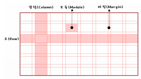
○ 그리드의 종류
그리드를 단으로 나누는 것인데, 단(column)의 수에 따라 이미지가 달라진다.

그리드는 정확한 배치와 통합, 질서, 순서를 부여함으로써
웹사이트 공간을 체계적으로 활용할 수 있게 한다
시각적 조화와 심미성을 높여주며, 정보
를 조직적이고 명료하게 표현하도록 한다
그리드 시스템을 활용하게 되면 시각적 구성 요소들을 배치하는데
기준이 되기 때문에 단순히 감에 의지하여 구성 요소를 배치하는 것보다
레이아웃 작업이 훨씬 쉬워지며, 여러 페이지에 걸쳐 작업해야 하는
웹사이트의 경우에는 웹페이지들의 일관성과 통일성을 유지할 수가 있다
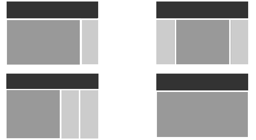
○ 해상도 및 배치
웹사이트를 디자인할 때에는 모니터에 따라 작업 해상도가 달라진다.
가로와 세로 각각 1024×768, 1280×1024, 1920×1080 해상도 등이 있으며,
각 해상도 안에 콘텐츠가 안전하게 보일 수 있도록
디자인 작업 시 좌우 여백을 주는 것이 일반적임
콘텐츠 영역의 폭을 12개의 칼럼으로 나누고
가로 사이즈를 960px로 설정하는 960 그리드 시스템을 적극 활용하는 것이 좋다.
가로 폭을 12개의 칼럼으로 나누는 이유는 12가 1, 2, 3, 4, 6으로 나누어지기 때문인데,
웹사이트 디자인에서 콘텐츠 배치를 위한 가장 일반적 분할이
2단, 3단, 4단임을 고려했을 때 12개의 칼럼은 콘텐츠의 종류와 크기에 따라
다양한 분할과 통합에 매우 효율적이다


■ 반응형 웹 레이아웃
○ 반응형 웹사이트의 레이아웃
사용자의 화면 크기에 반응을 한다고 하여 반응형 웹이라고 하며
반응형 웹디자인을 기반으로 하는 다양한 디바이스를 대응하는 웹을 말한다.
디스플레이 종류와 크기에 따라 자동으로 조절하며 정보 설계상에서 중요한 항목들을 도출하여
화면에 대한 레이아웃을 정한다
- 유동형 패턴(Mostly Fluid)
중대형 화면에서 중간 크기의 화면까지는 여백 정도만 조정하고,
작은 화면이 되면 그리드가 움직이며 콘텐츠를 수직으로 배치한다.

- 기본형태
<style>
    body{
        padding: 0;
        margin: 0;
    }
    #wrap{
        width: 960px;
        margin: 0 auto;
    }
    #wrap > div {
        height: 400px;
    }
    .box1{
        width: 100%;
        background-color: hotpink;
    }
    .box2{
        width: 50%;
        background-color: aqua;
        float: left;
    }
    .box3{
        width: 50%;
        background-color: blueviolet;
        float: right;
    }


</style>

<body>
    <div id="wrap">
        <div class="box1"></div>
        <div class="box2"></div>
        <div class="box3"></div>
    </div>
</body>
- Media 쿼리 사용
    @media screen and (max-width: 960px){
        #wrap{
            width: 95%;
        }
    }
    @media screen and (max-width: 768px){
        #wrap{
            width: 100%;
        }
    }
    @media screen and (max-width: 480px){
        .box2, .box3{
            float: none;
            width: 100%;
        }
    }
- 칼럼드롭(Column Drop)
화면의 폭이 좁아져 더 이상 콘텐츠의 정상적인 표시가 힘들 경우 컬럼을 하단으로
하여 열을 수직으로 쌓는다.
콘텐츠가 서로 연관 되어 있지 않을때 효과적임
세 개의 콘텐츠가 연관되어 있다면 계층구조 관리가 힘듦

- 기본형태
<style>
    body{
        padding: 0;
        margin: 0;
    }
    #wrap{
        width: 100%;
        display: flex;
    }
    .box1{
        width: 25%;
        height: 600px;
        background-color: hotpink;
    }
    .box2{
        width: 50%;
        background-color: aqua;
    }
    .box3{
        width: 25%;
        background-color: blueviolet;
    }

</style>

<body>
    <div id="wrap">
        <div class="box1"></div>
        <div class="box2"></div>
        <div class="box3"></div>
    </div>
</body>
- Media 쿼리 사용
    @media (max-width: 960px){
        #wrap{
            flex-wrap: wrap;
        }
        .box1{
            width: 30%;
        }
        .box2{
            width: 70%;
        }
        .box3{
            width: 100%;
            height: 300px;
        }

    }
    @media (max-width: 768px){
        .box1{
            width: 100%;
            height: 300px;
        }
        .box2{
            width: 100%;
            height: 600px;
            order: -1;
        }

    }
    @media (max-width: 480px){
        .box2{
            height: 1000px;
        }
        .box1, .box3{
            height: 600px;
        }
    }
- 레이아웃 시프터 패턴(Layout Shifter)
이 패턴은 스크린 크기 마다 다른 형태의 레이아웃을 사용하여 다른 패턴들 보다 복잡하다.
단순히 컬럼을 아래로 떨어뜨리는 배치 방식이 아닌
화면 크기마다 새로운 레이아웃으로 변형한다

- 기본형태
<style>
    body{
        padding: 0;
        margin: 0;
    }
    #wrap{
        width: 960px;
        display: flex;
        margin: 0 auto;
        height: 100vh;
    }
    .box1{
        width: 30%;
        height: 100%;
        background-color: green;
    }
    .boxwrap{
        width: 70%;
        height: 100%;
    }
    .box2{
        height: 50%;
        background-color: brown;
    }
    .box3{
        height: 50%;
        background-color: aqua;
    }

</style>

<body>
    <div id="wrap">
        <div class="box1"></div>
        <div class="boxwrap">
            <div class="box2"></div>
            <div class="box3"></div>
        </div>

    </div>
</body>
- Media 쿼리 사용
    @media (max-width: 960px){
        #wrap{
            width: 95%;
        }
    }
    @media (max-width: 768px){
        #wrap{
            width: 100%;
            display: block;
        }
        .box1{
            width: 100%;
            height: 100px;
        }
        .boxwrap{
            width: 100%;
        }
    }
    @media (max-width: 480px){
        .box1{
            width: 100%;
            height: 50px;
        }
        .boxwrap{
            height: 200%;
        }
    }
- 미세조정 패턴(Tiny Tweaks)
미니멀리즘에 따른 접근 방식으로 다른 패턴들 보다 단순한 패턴이다.
보통 하나의 컬럼을 사용하여 브라우저의 폭이 변하더라도 레이아웃의 변화가 크지 않아서
블로그에서 많이 사용되는 패턴

- 기본형태
<style>
    body{
        margin: 0; padding: 0;
        background-color: bisque;
    }
    #wrap{
        width: 80%; margin: 100px auto;
    }
    .box{
        width: 18%; height: 50px; margin: 1%;
        background-color: #fff;
        border-radius: 10px; float: left;
    }

</style>

<body>
    <div id="wrap">
        <div class="box"></div>
        <div class="box"></div>
        <div class="box"></div>
        <div class="box"></div>
        <div class="box"></div>
        <div class="box"></div>
        <div class="box"></div>
        <div class="box"></div>
        <div class="box"></div>
        <div class="box"></div>
    </div>
</body>
- Media 쿼리 사용
    @media(max-width:1024px){
        .box{width: 23%;}
    }
    @media(max-width:960px){
        .box{width: 31.333%;}
    }
    @media(max-width:768px){
        .box{width: 48%;}
    }
    @media(max-width:480px){
        .box{width: 98%;}
    }
- 오프캔버스 패턴(Off- canvas)
패턴들이 작은 화면에서는 길게 늘어나는 결과가 나타나기 때문에
페이지 컴포넌스를 스크린 밖으로 밀어냈다가 요청을 받으면
슬라이딩 도어처럼 다시 콘텐츠를 화면에 노출하는 방식이다

- 기본형태
<style>
    body{
        padding: 0;
        margin: 0;
    }
    #wrap{
        width: 960px;
        margin: 0 auto;
        height: 100vh;
    }
    #wrap-box{
        width: 100%;
        height: 100%;
        display: flex;
    }
    #wrap-box > div{
        width: calc(100% / 3);
    }
    .box1{
        background-color: aquamarine;
    }
    .box2{
        background-color: burlywood;
    }
    .box3{
        background-color: chartreuse;
    }

</style>

<body>
    <div id="wrap">
        <div id="wrap-box">
            <div class="box1"></div>
            <div class="box2"></div>
            <div class="box3"></div>
        </div>
    </div>
</body>
- Media 쿼리 사용
    @media (max-width: 960px){
        #wrap{
            width: 100%;
        }
    }
    @media (max-width: 768px){
        #wrap{
            overflow: hidden;

            position: relative;
        }
        #wrap-box{
            position: absolute;
            width: 150%;
        }
    }
    @media (max-width: 480px){
        #wrap-box{
            width: 300%;
            margin-left: -100%;
        }

    }
■ 12월 17일 - 3일차
■ 그리드로 반응형 변화시키면서 나가기
<style>
    .con{
        width: 60%;
        margin: 0 auto;
        display: grid;
        grid-template-columns: repeat(4, 1fr);
        background-color: antiquewhite;
        gap: 10px 10px;
    }
    .box{

        height: 30px;
        box-sizing: border-box;
        border: 1px solid #000;
    }
    .box:nth-child(6n+1){
        grid-column: 1 / 3;
    }
    .box:nth-child(6n){
        grid-column: 3 / 5;
    }

    @media (max-width:1200px){
        .con{
            grid-template-columns:repeat(3, 1fr);
        }
        .box:nth-child(6n+1){
            grid-column: auto;
        }
        .box:nth-child(6n){
            grid-column: auto;
        }
        .box:nth-child(4n+1){
            grid-column: 1/3;
        }
        .box:nth-child(4n){
            grid-column: 2/4;
        }
    }
    @media (max-width:800px){
        .con{
            grid-template-columns:repeat(1, 1fr);
        }
        .box:nth-child(4n+1){
            grid-column: auto;
        }
        .box:nth-child(4n){
            grid-column: auto;
        }
    }
</style>
<body>
    <div class="con">
        <div class="box"></div>
        <div class="box"></div>
        <div class="box"></div>
        <div class="box"></div>
        <div class="box"></div>
        <div class="box"></div>
        <div class="box"></div>
        <div class="box"></div>
        <div class="box"></div>
    </div>
</body>


<!DOCTYPE html>
<html lang="en">
<head>
    <meta charset="UTF-8">
    <meta name="viewport" content="width=device-width, initial-scale=1.0">
    <title>Document</title>
    <style>
        body{
            margin: 0;
        }
        .wrap{
            width: 1024px;
            margin: 0 auto;
        }
        header{
            height: 5vh;
            background-color: #ccc;
        }
        main{
            height: 90vh;
            display: flex;
        }
        .section1{
            width: 20%;
            background-color: #eee;
        }
        .section2{
            width: 80%;
        }
        .section2 > article{
            height: calc(100% / 3);
        }
        .section2 > .article1{
            background-color: #aaa;
        }
        .section2 > .article2{
            background-color: #999;
        }
        .section2 > .article3{
            background-color: #777;
        }
        footer{
            height: 5vh;
            background-color: #555;
        }


        @media (max-width:1024px){
            .wrap{
                width: 100%;
            }
            header{
                height: 10vh;
            }
            .section2 > article{
                height: 50%;
            }
            .section2 > .article3{
                display: none;
            }
        }
        @media (max-width:768px){
            header{
                height: 20vh;
            }
            main{
                height: 80vh;
                display: block;
            }
            .section1{
                width: 100%;
                height: 20vh;
            }
            .section2{
                width: 100%;
                height: 60vh;
                display: flex;
            }
            .section2 > article{
                width: 50%;
                height: 100%;
            }
        }

        @media (max-width:500px){
            main{
                height: 120vh;
            }
            .section1{
                height: 40vh;
            }
            .section2{
                display: block;
                height: 80vh;
            }
            .section2 > article{
                width: 100%;
                height: 50%;
            }
        }
    </style>
</head>

<body>
    <div class="wrap">
        <header></header>
        <main>
            <section class="section1"></section>
            <section class="section2">
                <article class="article1"></article>
                <article class="article2"></article>
                <article class="article3"></article>
            </section>
        </main>
        <footer></footer>
    </div>

</body>
</html>

<!DOCTYPE html>
<html lang="en">
<head>
    <meta charset="UTF-8">
    <meta name="viewport" content="width=device-width, initial-scale=1.0">
    <title>Document</title>
    <style>
        body{
            margin: 0;
        }
        .wrap{
            width: 1024px;
            margin: 0 auto;
        }
        header{
            height: 5vh;
            background-color: #fcc;
        }
        .section1{
            height: 40vh;
            background-color: #faa;
        }
        .section2{
            height: 50vh;
            align-content: center;
            background-color: #f99;
        }
        .section2 > .container{
            width: 80%;
            margin: 0 auto;
            display: grid;
            grid-template-columns: repeat(5, 1fr);
            gap: 20px;
        }
        .section2 > .container > .item{
            aspect-ratio: 1;
            border-radius: 5%;
            background-color: #f55;
        }

        footer{
            height: 5vh;
            background-color: #f77;
        }
        @media (max-width:1024px){
            .wrap{
                width: 100%;
            }
            .section2{
                height: auto;
                padding: 50px 0;
                box-sizing: border-box;
            }
            .section2 > .container{
                grid-template-columns: repeat(4, 1fr);
            }
            .section2 > .container > .item:nth-last-child(-n + 2){
                display: none;
            }
        }
        @media (max-width:768px){
            .section2 > .container{
                grid-template-columns: repeat(3, 1fr);
            }
            .section2 > .container > .item:nth-last-child(2){
                display: block;
            }
        }
        @media (max-width:500px){
            .section2 > .container{
                grid-template-columns: repeat(2, 1fr);
            }
            .section2 > .container > .item:nth-last-child(1){
                display: block;
            }
        }
    </style>
</head>
<body>
    <div class="wrap">
        <header></header>
        <section class="section1"></section>
        <section class="section2">
            <div class="container">
                <div class="item"></div>
                <div class="item"></div>
                <div class="item"></div>
                <div class="item"></div>
                <div class="item"></div>
                <div class="item"></div>
                <div class="item"></div>
                <div class="item"></div>
                <div class="item"></div>
                <div class="item"></div>
            </div>
        </section>
        <footer></footer>
    </div>
</body>
</html>

<!DOCTYPE html>
<html lang="en">
<head>
    <meta charset="UTF-8">
    <meta name="viewport" content="width=device-width, initial-scale=1.0">
    <title>Document</title>
    <style>
        body{
            margin: 0;
        }
        .wrap{
            width: 1024px;
            margin: 0 auto;
        }
        header{
            height: 5vh;
            background-color: #aaf;
        }
        .section1{
            height: 40vh;
            background-color: #ccf;
        }
        .section2{
            height: 50vh;
            display: flex;
        }
        .section2 > .left{
            width: calc(100% / 3);
            background-color: #ddf;
        }
        .section2 > .right{
            width: calc(100% / 3 * 2);
        }
        .section2 > .right > .content1{
            height: 50%;
            background-color: #99f;
        }
        .section2 > .right > .content2{
            height: 50%;
            background-color: #77f;
        }
        .section3{
            height: 40vh;
            display: flex;
        }
        .section3 > article{
            width: calc(100% / 3);
        }
        .section3 > .content1{
            background-color: #55f;
        }
        .section3 > .content2{
            background-color: #99f;
        }
        .section3 > .content3{
            background-color: #aaf;
        }
        .section4{
            background-color: #ddf;
            padding: 40px 60px;
            box-sizing: border-box;
        }
        .section4 > .container{
            display: flex;
            justify-content: space-between;
        }
        .section4 > .container > .item{
            width: 22%;
            aspect-ratio: 1;
            background-color: #99f;
            border-radius: 20px;
        }
        footer{
            height: 10vh;
            background-color: #33f;
        }

        @media (max-width:1042px){
            .wrap{
                width: 100%;
            }
            .section3 > .content3{
                display: none;
            }
            .section3 > article{
                width: calc(100% / 2);
            }
            .section4 > .container > .item:last-child{
                display: none;
            }
            .section4 > .container > .item{
                width: 30%;
            }
        }
        @media (max-width:768px){
            .section3{
                display: block;
            }
            .section3 > article{
                height: 50%;
                width: 100%;
            }
        }
        @media (max-width:500px){
            .section2{
                display: block;
            }
            .section2 > .left{
                width: 100%;
                height: 30%;
            }
            .section2 > .right{
                width: 100%;
                height: 70%;
            }
            .section4{
                padding: 40px 30px;
            }
            .section4 > .container{
                flex-direction: column;
                gap: 20px;
            }
            .section4 > .container > .item{
                width: 100%;
                height: 150px;
            }
        }

    </style>
</head>
<body>
    <div class="wrap">
        <header></header>
        <main>
            <section class="section1"></section>
            <section class="section2">
                <article class="left"></article>
                <article class="right">
                    <div class="content1"></div>
                    <div class="content2"></div>
                </article>
            </section>
            <section class="section3">
                <article class="content1"></article>
                <article class="content2"></article>
                <article class="content3"></article>
            </section>
            <section class="section4">
                <div class="container">
                    <div class="item"></div>
                    <div class="item"></div>
                    <div class="item"></div>
                    <div class="item"></div>
                </div>
            </section>
        </main>
        <footer></footer>
    </div>
</body>
</html>
■ 12월 19일 - 4일차
<!DOCTYPE html>
<html lang="en">
<head>
    <meta charset="UTF-8">
    <meta name="viewport" content="width=device-width, initial-scale=1.0">
    <title>Document</title>
    <link rel="stylesheet" href="https://cdnjs.cloudflare.com/ajax/libs/font-awesome/6.7.2/css/all.min.css">
    <style>
        @import url('https://fonts.googleapis.com/css2?family=Lora:ital,wght@0,400..700;1,400..700&family=Noto+Sans:ital,wdth,wght@0,62.5..100,100..900;1,62.5..100,100..900&display=swap');
        .noto, h3, p{
            font-family: "Noto Sans", serif;
        }
        h3{
            font-weight: 600;
        }
        h2{
            font-size: 2.4em;
            font-weight: 500;
        }
        .lora, h1, h2{
            font-family: "Lora", serif;
        }
        body, h1, h2, h3, p{
            margin: 0;
        }
        header{
            height: 50px;
            background-color: rgb(239, 251, 255);
            align-content: center;
        }
        header > .container{
            width: 90%;
            margin: 0 auto;
            display: flex;
            justify-content: space-between;

        }
        header > .container > .center{
            font-size: 2em;
        }
        header > .container > .left,
        header > .container > .right{
            display: flex;
            align-items: center;
        }
        header > .container > div > p:first-child{
            margin-right: 32px;
        }
        .section1{
            height: 80vh;
            position: relative;
        }
        .section1 > img{
            width: 100%;
            height: 100%;
            object-fit: cover;
        }
        .section1 > .main-text{
            position: absolute;
            width: 100%;
            left: 50%;
            top: 50%;
            transform: translate(-50%, -50%);
            text-align: center;
            color: #fff;
            text-shadow: 2px 2px 4px #434343;
        }
        .section1 > .main-text > h1{
            font-size: 3.8em;
            margin-bottom: 0.2em;
        }
        .section1 > .main-text > h3{
            font-size: 1.6em;
            margin-bottom: 2em;
        }
        .section1 > .main-text > .button{
            border: 2px solid #ffffffcc;
            display: inline-block;
            padding: 8px 16px;
            font-size: 1.2em;
        }

        .section1 > i{
            position: absolute;
            right: 20px;
            bottom: 20px;
            font-size: 6em;
            color: #fff;
        }


        .section2{
            padding: 5% 10%;
            box-sizing: border-box;
            background-color: #1a1a1a;
        }
        .section2 > .container{
            color: #fff;
            text-align: center;
            display: flex;
            gap: 10%;
            align-items: center;
        }
        .section2 > .container h3{
            margin-bottom: 0.8em;
        }

        .section3{
            padding: 3% 3%;
        }
        .section3 > .container1{
            display: flex;
            gap: 1em;
            margin-bottom: 2em;
        }
        .section3 > .container1 > .item{
            width: calc((100% - 1em)/2);
            height: 300px;
        }
        .section3 > .container1 > .item:nth-child(2){
            padding: 0 42px;
            box-sizing: border-box;
            align-content: center;
        }
        .section3 > .container1 > .item > img{
            width: 100%;
            height: 100%;
            object-fit: cover;
        }
        .section3 > .container1 > .item > h2{
            margin-bottom: 0.6em;
        }
        .section3 > .container1 > .item > p{
            margin-bottom: 3em;
        }
        .section3 > .container1 > .item > .button{
            width: 120px;
            height: 42px;
            background-color: #1a1a1a;
            text-align: center;
            align-content: center;
            color: #fff;
        }
        .section3 > .container2{
            display: flex;
            gap: 1em;
            margin-bottom: 2em;
        }
        .section3 > .container2 > .item{
            width: calc((100% - 3em) / 4);
        }
        .section3 > .container2 > .item > .img-box{
            aspect-ratio: 1;
            margin-bottom: 1em;
        }
        .section3 > .container2 > .item > .img-box > img{
            width: 100%;
            height: 100%;
        }
        .section3 > .container2 > .item > .text-box > h3{
            margin-bottom: 0.3em;
        }
        .section3 > .container2 > .item > .text-box > p{
            margin-bottom: 0.5em;
        }
        .section3 > .container2 > .item > .text-box > .line{
            border: 1px solid #b0b0b0;
            margin-bottom: 0.5em;
        }

        .section3 > .button{
            width: 210px;
            height: 42px;
            background-color: rgb(225, 246, 253);
            align-content: center;
            text-align: center;
            margin: 0 auto;
        }


        img{
            width: 100px;
            height: 100px;
        }
    </style>
</head>
<body>
    <div class="wrap">
        <header>
            <div class="container">
                <div class="left">
                    <p class="noto">PRODUCTS</p>
                    <p class="noto">BLOG</p>
                </div>
                <div class="center">
                    <i class="fa-brands fa-pied-piper"></i>
                </div>
                <div class="right">
                    <p class="noto">ABOUT</p>
                    <p class="noto">BAG</p>
                </div>
            </div>
        </header>
        <div class="section1">
            <img src="st1.jpg" alt="">
            <div class="main-text">
                <h1 class="lora">Maecenas et scelerisque</h1>
                <h3 class="noto">Suspendisse tincidunt orci sit amet dolor</h3>
                <div class="button noto">Explore</div>
            </div>
            <i class="fa-brands fa-pied-piper"></i>
        </div>
        <div class="section2">
            <div class="container">
                <div class="item">
                    <h3 class="noto">fermentum</h3>
                    <p class="noto">Quisque erat eros, finibus in odio scelerisque, vehicula mattis nisi. Suspendisse imperdiet semper consectetur. Vivamus arcu metus, volutpat id bibendum vitae</p>
                </div>
                <div class="item">
                    <h3 class="noto">Nulla ornare</h3>
                    <p class="noto">Duis dictum dolor et orci tincidunt mattis non iaculis ligula. Fusce vel venenatis libero, id luctus arcu. Duis molestie at dui eu posuere.</p>
                </div>
                <div class="item">
                    <h3 class="noto">Morbi sem sem</h3>
                    <p class="noto">Etiam mollis libero orci, a vestibulum mauris imperdiet a. Curabitur vel consectetur enim. Sed vel ornare tortor. Etiam rutrum fermentum ex tempor sollicitudin.</p>
                </div>
            </div>
        </div>
        <div class="section3">
            <div class="container1">
                <div class="item">
                    <img src="st3-1.jpg" alt="">
                </div>
                <div class="item">
                    <h2>Fusce a quam commodo</h2>
                    <p>Proin posuere odio sed sem bibendum, sit amet molestie erat congue. Duis dictum dolor et orci tincidunt mattis non iaculis ligula. Fusce vel venenatis libero, id luctus arcu</p>
                    <div class="button">Buy now</div>
                </div>
            </div>
            <div class="container2">
                <div class="item">
                    <div class="img-box">
                        <img src="st3-2.jpg" alt="">
                    </div>
                    <div class="text-box">
                        <h3>Aliquam laoreet</h3>
                        <p>Morbi Nam vel erat enim</p>
                        <div class="line"></div>
                        <p>$33</p>
                    </div>
                </div>
                <div class="item">
                    <div class="img-box">
                        <img src="st3-3.jpg" alt="">
                    </div>
                    <div class="text-box">
                        <h3>Vivamus nec</h3>
                        <p>pharetra nunc pellentesque</p>
                        <div class="line"></div>
                        <p>$41</p>
                    </div>
                </div>
                <div class="item">
                    <div class="img-box">
                        <img src="st3-4.jpg" alt="">
                    </div>
                    <div class="text-box">
                        <h3>Tellus iaculis</h3>
                        <p> Quisque elementum, eros</p>
                        <div class="line"></div>
                        <p>$51</p>
                    </div>
                </div>
                <div class="item">
                    <div class="img-box">
                        <img src="st3-5.jpg" alt="">
                    </div>
                    <div class="text-box">
                        <h3>Vestibulum at neque</h3>
                        <p>convallis vehicula dolor bibendum</p>
                        <div class="line"></div>
                        <p>$29</p>
                    </div>
                </div>
            </div>
            <div class="button">Show all Products</div>
        </div>
    </div>
</body>
</html>
■ 12월 20일 - 5일차

<!DOCTYPE html>
<html lang="en">
<head>
<meta charset="UTF-8">
<meta name="viewport" content="width=device-width, initial-scale=1.0">
<title>Document</title>
<link rel="stylesheet" href="https://cdnjs.cloudflare.com/ajax/libs/font-awesome/6.7.2/css/all.min.css">
<style>
@import url('https://fonts.googleapis.com/css2?family=Lora:ital,wght@0,400..700;1,400..700&family=Noto+Sans:ital,wdth,wght@0,62.5..100,100..900;1,62.5..100,100..900&display=swap');
.noto, h3, p{
font-family: "Noto Sans", serif;
}
h3{
font-weight: 600;
}
h2{
font-size: 2.4em;
font-weight: 500;
}
.lora, h1, h2{
font-family: "Lora", serif;
}
body, h1, h2, h3, p{
margin: 0;
}
header{
height: 50px;
background-color: rgb(239, 251, 255);
align-content: center;
}
header > .container{
width: 90%;
margin: 0 auto;
display: flex;
justify-content: space-between;
}
header > .container > .center{
font-size: 2em;
}
header > .container > .left,
header > .container > .right{
display: flex;
align-items: center;
}
header > .container > div > p:first-child{
margin-right: 32px;
}
.section1{
height: 80vh;
position: relative;
}
.section1 > img{
width: 100%;
height: 100%;
object-fit: cover;
}
.section1 > .main-text{
position: absolute;
width: 100%;
left: 50%;
top: 50%;
transform: translate(-50%, -50%);
text-align: center;
color: #fff;
text-shadow: 2px 2px 4px #434343;
}
.section1 > .main-text > h1{
font-size: 3.8em;
margin-bottom: 0.2em;
}
.section1 > .main-text > h3{
font-size: 1.6em;
margin-bottom: 2em;
}
.section1 > .main-text > .button{
border: 2px solid #ffffffcc;
display: inline-block;
padding: 8px 16px;
font-size: 1.2em;
}
.section1 > i{
position: absolute;
right: 20px;
bottom: 20px;
font-size: 6em;
color: #fff;
}
.section2{
padding: 5% 10%;
box-sizing: border-box;
background-color: #1a1a1a;
}
.section2 > .container{
color: #fff;
text-align: center;
display: flex;
gap: 10%;
align-items: center;
}
.section2 > .container h3{
margin-bottom: 0.8em;
}
.section3{
padding: 3% 3%;
}
.section3 > .container1{
display: flex;
gap: 1em;
margin-bottom: 2em;
}
.section3 > .container1 > .item{
width: calc((100% - 1em)/2);
height: 300px;
}
.section3 > .container1 > .item:nth-child(2){
padding: 0 42px;
box-sizing: border-box;
align-content: center;
}
.section3 > .container1 > .item > img{
width: 100%;
height: 100%;
object-fit: cover;
}
.section3 > .container1 > .item > h2{
margin-bottom: 0.6em;
}
.section3 > .container1 > .item > p{
margin-bottom: 3em;
}
.section3 > .container1 > .item > .button{
width: 120px;
height: 42px;
background-color: #1a1a1a;
text-align: center;
align-content: center;
color: #fff;
}
.section3 > .container2{
display: flex;
gap: 1em;
margin-bottom: 2em;
}
.section3 > .container2 > .item{
width: calc((100% - 3em) / 4);
}
.section3 > .container2 > .item > .img-box{
aspect-ratio: 1;
margin-bottom: 1em;
}
.section3 > .container2 > .item > .img-box > img{
width: 100%;
height: 100%;
}
.section3 > .container2 > .item > .text-box > h3{
margin-bottom: 0.3em;
}
.section3 > .container2 > .item > .text-box > p{
margin-bottom: 0.5em;
}
.section3 > .container2 > .item > .text-box > .line{
border: 1px solid #b0b0b0;
margin-bottom: 0.5em;
}
.section3 > .button{
width: 210px;
height: 42px;
background-color: rgb(225, 246, 253);
align-content: center;
text-align: center;
margin: 0 auto;
}
.section4{
height: 60vh;
position: relative;
}
.section4 > img{
width: 100%;
height: 100%;
object-fit: cover;
}
.section4 > p{
position: absolute;
width: 100%;
box-sizing: border-box;
padding-left: 3%;
top: 0;
background: #000;
color: #fff;
height: 50px;
font-size: 1.6em;
align-content: center;
}
.section4 > .button{
position: absolute;
left: 3%;
bottom: 3%;
height: 42px;
width: 180px;
font-size: 1.2em;
text-align: center;
align-content: center;
border-radius: 12px;
background-color: #fff;
}
.section6{
height: 100vh;
}
.section4 > p{
white-space: nowrap;
overflow: hidden;
text-overflow: ellipsis;
}
.section6 .button{
width: 210px;
background-color: transparent;
border: 2px solid #000;
border-radius: 0px;
}
.section7{
box-sizing: border-box;
padding: 5% 3%;
}
.section7 > h2{
margin-bottom: 1em;
}
.section7 > .container{
display: flex;
align-items: end;
gap: 8%;
}
.section7 > .container > .item{
width: calc(84% / 3);
}
.section7 > .container > .item > p{
text-align: justify;
margin-bottom: 1em;
}
.section7 > .container > .item > hr{
border: 2px solid #7e7e7e;
margin-bottom: 2em;
}
.section8{
height: 50vh;
position: relative;
align-content: center;
color: #fff;
text-align: center;
}
.section8 > img{
position: absolute;
top: 0;
left: 0;
width: 100%;
height: 100%;
object-fit: cover;
z-index: -1;
}
.section8 > h2{
margin-bottom: 1em;
}
.section8 > p{
margin-bottom: 1em;
}
.section8 > .box > input{
height: 36px;
width: 400px;
border-width: 0px;
background-color: #ffffffcc;
font-size: 24px;
margin-right: 6px;
margin-bottom: 1em;
}
.section8 > .box > input:focus{
outline: none;
}
.section8 > .box > .button{
display: inline-block;
height: 36px;
width: 130px;
background-color: #fff;
color: #000;
align-content: center;
}
@media (max-width:1024px){
.wrap > div > h2{
font-size: 2em;
}
}
@media (max-width:768px){
.section3 > .container1{
display: block;
}
.section3 > .container1 > .item{
width: 100%;
}
.section3 > .container2{
flex-wrap: wrap;
}
.section3 > .container2 > .item{
width: calc((100% - 1em) / 2);
}
}
@media (max-width:500px){
body{
font-size: 14px;
}
.section2 > .container{
flex-direction: column;
}
.section2 > .container > .item:not(:last-child){
margin-bottom: 5%;
}
.section3 > .container2 > .item{
width: 100%;
}
.section7 > h2{
text-align: center;
}
.section7 > .container{
flex-wrap: wrap;
}
.section7 > .container > .item{
width: 100%;
}
.section7 > .container > .item:not(:last-child){
margin-bottom: 8%;
}
}
</style>
</head>
<body>
<div class="wrap">
<header>
<div class="container">
<div class="left">
<p class="noto">PRODUCTS</p>
<p class="noto">BLOG</p>
</div>
<div class="center">
<i class="fa-brands fa-pied-piper"></i>
</div>
<div class="right">
<p class="noto">ABOUT</p>
<p class="noto">BAG</p>
</div>
</div>
</header>
<div class="section1">
<img src="st1.jpg" alt="">
<div class="main-text">
<h1 class="lora">Maecenas et scelerisque</h1>
<h3 class="noto">Suspendisse tincidunt orci sit amet dolor</h3>
<div class="button noto">Explore</div>
</div>
<i class="fa-brands fa-pied-piper"></i>
</div>
<div class="section2">
<div class="container">
<div class="item">
<h3 class="noto">fermentum</h3>
<p class="noto">Quisque erat eros, finibus in odio scelerisque, vehicula mattis nisi. Suspendisse imperdiet semper consectetur. Vivamus arcu metus, volutpat id bibendum vitae</p>
</div>
<div class="item">
<h3 class="noto">Nulla ornare</h3>
<p class="noto">Duis dictum dolor et orci tincidunt mattis non iaculis ligula. Fusce vel venenatis libero, id luctus arcu. Duis molestie at dui eu posuere.</p>
</div>
<div class="item">
<h3 class="noto">Morbi sem sem</h3>
<p class="noto">Etiam mollis libero orci, a vestibulum mauris imperdiet a. Curabitur vel consectetur enim. Sed vel ornare tortor. Etiam rutrum fermentum ex tempor sollicitudin.</p>
</div>
</div>
</div>
<div class="section3">
<div class="container1">
<div class="item">
<img src="st3-1.jpg" alt="">
</div>
<div class="item">
<h2>Fusce a quam commodo</h2>
<p>Proin posuere odio sed sem bibendum, sit amet molestie erat congue. Duis dictum dolor et orci tincidunt mattis non iaculis ligula. Fusce vel venenatis libero, id luctus arcu</p>
<div class="button">Buy now</div>
</div>
</div>
<div class="container2">
<div class="item">
<div class="img-box">
<img src="st3-2.jpg" alt="">
</div>
<div class="text-box">
<h3>Aliquam laoreet</h3>
<p>Morbi Nam vel erat enim</p>
<div class="line"></div>
<p>$33</p>
</div>
</div>
<div class="item">
<div class="img-box">
<img src="st3-3.jpg" alt="">
</div>
<div class="text-box">
<h3>Vivamus nec</h3>
<p>pharetra nunc pellentesque</p>
<div class="line"></div>
<p>$41</p>
</div>
</div>
<div class="item">
<div class="img-box">
<img src="st3-4.jpg" alt="">
</div>
<div class="text-box">
<h3>Tellus iaculis</h3>
<p> Quisque elementum, eros</p>
<div class="line"></div>
<p>$51</p>
</div>
</div>
<div class="item">
<div class="img-box">
<img src="st3-5.jpg" alt="">
</div>
<div class="text-box">
<h3>Vestibulum at neque</h3>
<p>convallis vehicula dolor bibendum</p>
<div class="line"></div>
<p>$29</p>
</div>
</div>
</div>
<div class="button">Show all Products</div>
</div>
<div class="section4">
<img src="st4.jpg" alt="">
<p>Aenean ultrices, sem sed commodo iaculis, ipsum turpis</p>
<div class="button">Nullam lacinia</div>
</div>
<div class="section3 section5">
<div class="container1">
<div class="item">
<img src="st5.jpg" alt="">
</div>
<div class="item">
<h2>Aenean aliquam, nisi eu vestibulum mattis</h2>
<p>Ut porttitor commodo mi sit amet interdum. Fusce varius a purus nec laoreet. Sed tortor elit, gravida vel efficitur eget, ornare viverra nunc.</p>
<div class="button">Buy now</div>
</div>
</div>
</div>
<div class="section4 section6">
<img src="st6.jpg" alt="">
<p>Aliquam erat volutpat. Praesent bibendum bibendum auctor. Donec eu dictum lectus. Aenean ultrices</p>
<div class="button">Integer consequat</div>
</div>
<div class="section7">
<h2>Orci varius natoque penatibus et magnis</h2>
<div class="container">
<div class="item">
<p>Aliquam erat volutpat. Praesent bibendum bibendum auctor. Donec eu dictum lectus. Aenean ultrices, sem sed commodo iaculis, ipsum turpis ullamcorper sapien</p>
<hr>
<h3>Integer consequat aliquet</h3>
</div>
<div class="item">
<p>Orci varius natoque penatibus et magnis dis parturient montes, nascetur ridiculus mus. Integer luctus odio libero</p>
<hr>
<h3>Morbi vitae pretium</h3>
</div>
<div class="item">
<p>Nunc dignissim, sapien ut porta luctus, erat ligula tempor ipsum, vel vehicula ipsum arcu nec nibh. Donec dapibus volutpat metus porttitor condimentum. </p>
<hr>
<h3>Orci varius natoque</h3>
</div>
</div>
</div>
<div class="section8">
<img src="st8.jpg" alt="">
<h2>Phasellus mollis lacus egestas</h2>
<p>Sed nec tortor viverra augue feugiat ullamcorper. <br> Pellentesque pellentesque lacinia ante vitae mollis.</p>
<div class="box">
<input type="text">
<div class="button">Sign up</div>
</div>
</div>
</div>
</body>
</html>
■ 12월 24일 - 6일차
<!DOCTYPE html>
<html lang="en">
<head>
    <meta charset="UTF-8">
    <meta name="viewport" content="width=device-width, initial-scale=1.0">
    <title>Document</title>
    <style>
        body{
            margin: 0;
        }
        a{
            text-decoration: none;
            color: inherit;
        }
        ul{
            list-style: none;
            padding: 0;
            margin: 0;
        }
        header{
            height: 200px;
            position: relative;
            background-color: #ccc;
        }
        header > .menu{
            width: 60%;
            height: 50px;
            position: absolute;
            right: 0;
            bottom: 0;
            background-color: #fff;
            display: flex;
        }
        header > .menu > li{
            width: 25%;
        }
        header > .menu > li > a{
            width: 100%;
            height: 100%;
            display: block;
            box-sizing: border-box;
            align-content: center;
            text-align: center;
        }
        header > .menu > li > a:hover{
            background-color: #000;
            color: #fff;
        }
        header > .menu:hover > li > .submenu{
            display: block;
        }
        header .submenu{
            background-color: #fff;
            display: none;
        }
        header .submenu > li > a{
            display: block;
            height: 40px;
            text-align: center;
            align-content: center;
        }
        main{
            height: 600px;
            background-color: #eee;
        }
        footer{
            height: 100px;
            background-color: #999;
        }
        @media (max-width:1024px){
            header > .menu{
                width: 100%;
            }
        }
        @media (max-width:500px){
            header > .menu{
                width: 25%;
                left: 0;
                right: auto;
                display: block;
            }
            header > .menu > li{
                width: 100%;
                height: 50px;
                background-color: #fff;
            }
            header > .menu > li > .submenu{
                position: absolute;
                top: 0;
                left: 100%;
            }
            header > .menu:hover > li > .submenu{
                display: none;
            }
            header > .menu > li:hover > .submenu{
                display: block;
                width: 100%;
            }
            header .submenu > li > a{
                height: 50px;
            }
        }
    </style>
</head>
<body>
    <div class="wrap">
        <header>
            <ul class="menu">
                <li><a href="#">Menu1</a>
                    <ul class="submenu">
                        <li><a href="#">Submenu1-1</a></li>
                        <li><a href="#">Submenu1-2</a></li>
                        <li><a href="#">Submenu1-3</a></li>
                        <li><a href="#">Submenu1-4</a></li>
                    </ul>
                </li>
                <li><a href="#">Menu2</a>
                    <ul class="submenu">
                        <li><a href="#">Submenu2-1</a></li>
                        <li><a href="#">Submenu2-2</a></li>
                        <li><a href="#">Submenu2-3</a></li>
                        <li><a href="#">Submenu2-4</a></li>
                    </ul>
                </li>
                <li><a href="#">Menu3</a>
                    <ul class="submenu">
                        <li><a href="#">Submenu3-1</a></li>
                        <li><a href="#">Submenu3-2</a></li>
                        <li><a href="#">Submenu3-3</a></li>
                        <li><a href="#">Submenu3-4</a></li>
                    </ul>
                </li>
                <li><a href="#">Menu4</a>
                    <ul class="submenu">
                        <li><a href="#">Submenu4-1</a></li>
                        <li><a href="#">Submenu4-2</a></li>
                        <li><a href="#">Submenu4-3</a></li>
                        <li><a href="#">Submenu4-4</a></li>
                    </ul>
                </li>
            </ul>
        </header>
        <main></main>
        <footer></footer>
    </div>
</body>
</html>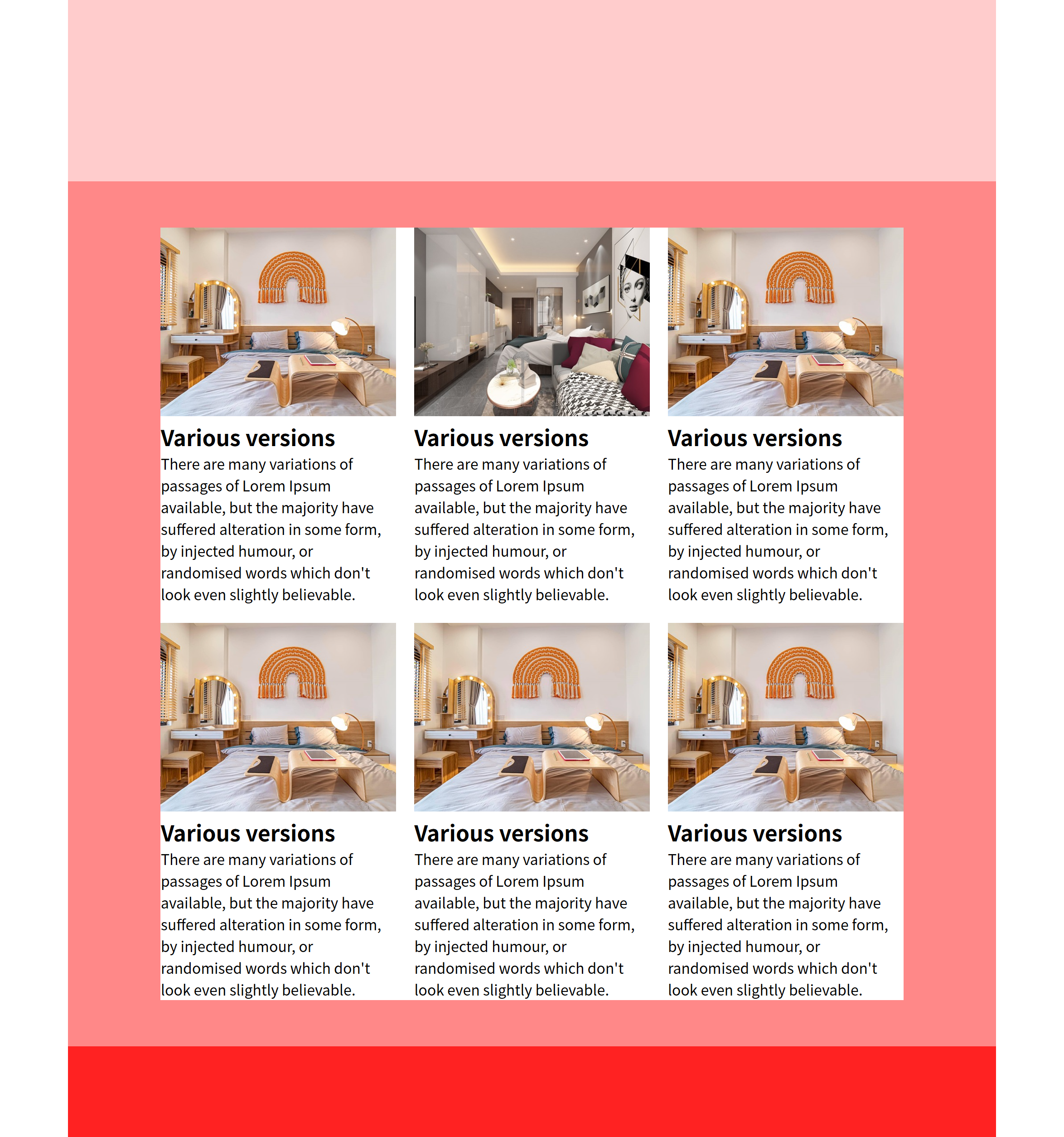
<!DOCTYPE html>
<html lang="en">
<head>
<meta charset="UTF-8">
<meta name="viewport" content="width=device-width, initial-scale=1.0">
<title>Document</title>
<style>
body, h2, p{
margin: 0;
}
.wrap{
width: 1024px;
margin: 0 auto;
background-color: #ccc;
}
header{
height: 200px;
background-color: #fcc;
}
main{
background-color: #f88;
padding: 5% 10%;
}
.container{
background-color: #fff;
display: flex;
flex-wrap: wrap;
gap: 20px;
}
.container > .item{
width: calc((100% - 40px)/3);
}
.container > .item > .img-box > img{
width: 100%;
aspect-ratio: 1 / 0.8;
object-fit: cover;
}
footer{
height: 100px;
background-color: #f22;
}
@media (max-width:1024px){
.wrap{
width: 100%;
}
}
@media (max-width:768px){
.container > .item{
width: calc((100% - 20px)/2);
font-size: 14px;
}
}
@media (max-width:500px){
.container > .item{
width: 100%;
}
}
</style>
</head>
<body>
<div class="wrap">
<header></header>
<main>
<div class="container">
<div class="item">
<div class="img-box">
<img src="st3-2.jpg" alt="">
</div>
<div class="text-box">
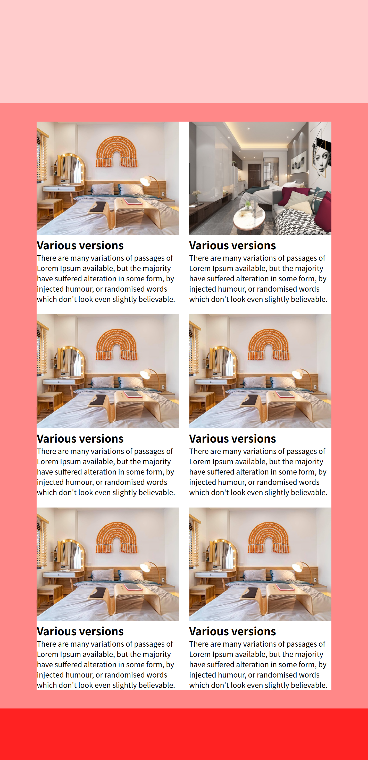
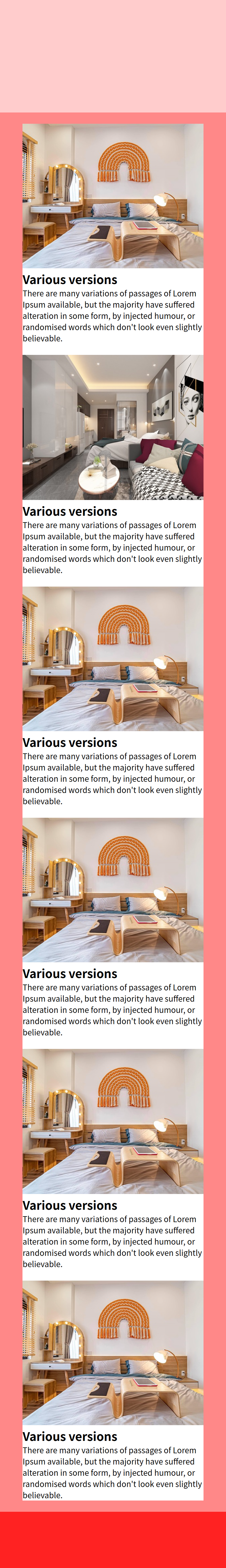
<h2>Various versions</h2>
<p>There are many variations of passages of Lorem Ipsum available, but the majority have suffered alteration in some form, by injected humour, or randomised words which don't look even slightly believable.</p>
</div>
</div>
<div class="item">
<div class="img-box">
<img src="st3-1.jpg" alt="">
</div>
<div class="text-box">
<h2>Various versions</h2>
<p>There are many variations of passages of Lorem Ipsum available, but the majority have suffered alteration in some form, by injected humour, or randomised words which don't look even slightly believable.</p>
</div>
</div>
<div class="item">
<div class="img-box">
<img src="st3-2.jpg" alt="">
</div>
<div class="text-box">
<h2>Various versions</h2>
<p>There are many variations of passages of Lorem Ipsum available, but the majority have suffered alteration in some form, by injected humour, or randomised words which don't look even slightly believable.</p>
</div>
</div>
</div>
</main>
<footer></footer>
</div>
</body>
</html>

<!DOCTYPE html>
<html lang="en">
<head>
<meta charset="UTF-8">
<meta name="viewport" content="width=device-width, initial-scale=1.0">
<title>Document</title>
<style>
body, h2, h3, h4, p{
margin: 0;
}
header{
height: 60vh;
}
header > img{
width: 100%;
height: 100%;
object-fit: cover;
}
.section{
display: flex;
}
.section:nth-child(2n+1) > .item:nth-child(2){
order: -1;
}
.section > .item{
width: 50%;
height: 80vh;
}
.section > .item > img{
width: 100%;
height: 100%;
object-fit: cover;
display: block;
}
.section > .item:nth-child(2){
padding: 10px 16px;
box-sizing: border-box;
text-align: center;
}
.section > .item > h3{
margin-bottom: 0.4em;
color: #777;
}
.section > .item > h2{
margin-bottom: 0.4em;
font-size: 2.6em;
}
.section > .item > p{
width: 80%;
margin: 0 auto;
color: #777;
margin-bottom: 1em;
}
.section > .item > .container{
display: flex;
height: 30%;
gap: 16px;
}
.section > .item > .container > .box{
width: calc((100% - 16px) / 2);
}
.section > .item > .container > .box > img{
width: 100%;
aspect-ratio: 1 / 0.8;
object-fit: cover;
}
@media (max-width:768px){
.section{
display: block;
}
.section > .item{
width: 100%;
}
.section > .item:nth-child(2){
height: auto;
}
}
@media (max-width:500px){
.section > .item > .container{
display: block;
}
.section > .item > .container > .box{
width: 100%;
}
.section > .item:nth-child(2){
padding: 10px 0px;
}
.section > .item > .container > .box:first-child{
margin-bottom: 10px;
}
}
</style>
</head>
<body>
<div class="wrap">
<header>
<img src="st1.jpg" alt="">
</header>
<div class="section">
<div class="item">
<img src="st3-1.jpg" alt="">
</div>
<div class="item">
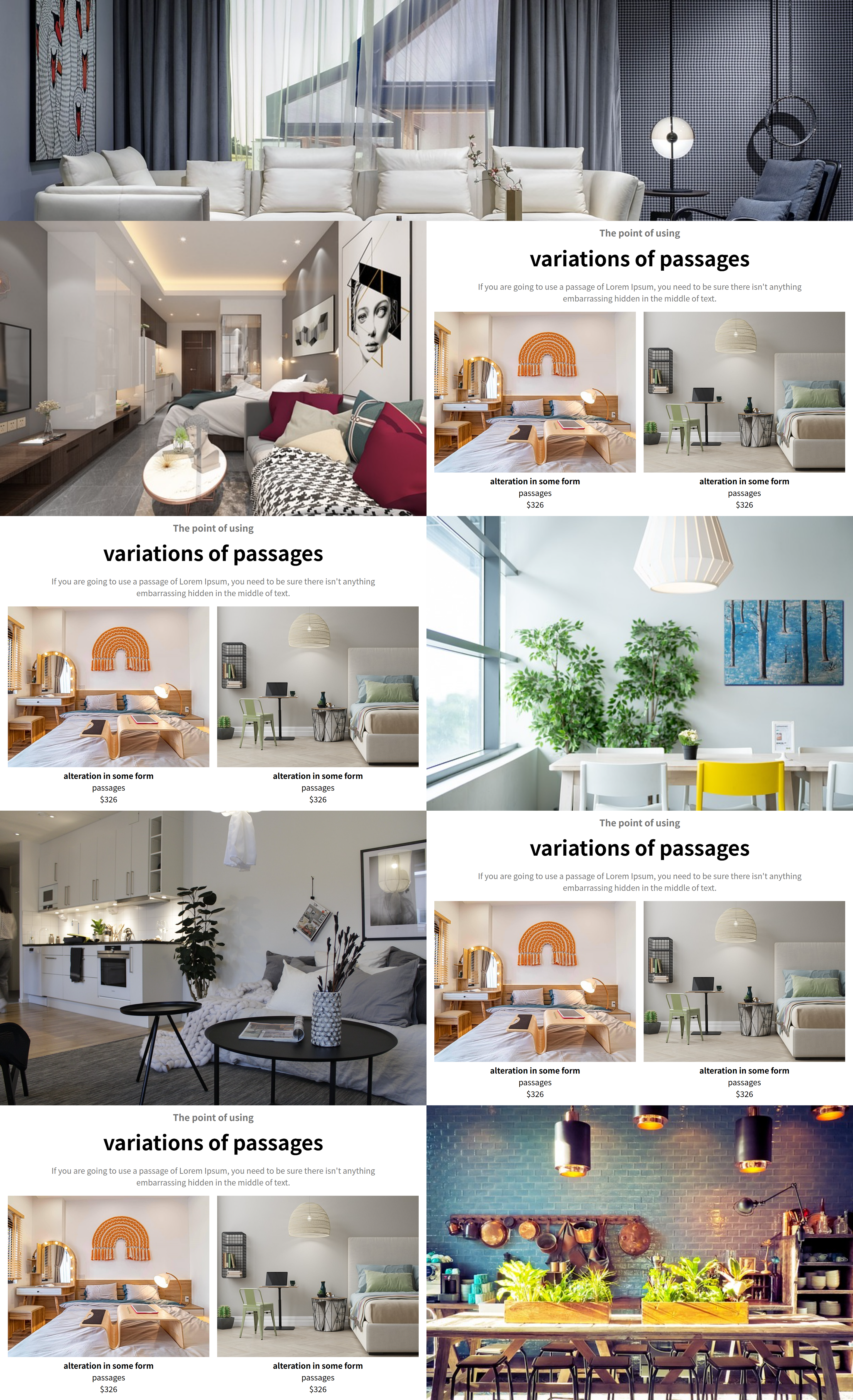
<h3>The point of using</h3>
<h2>variations of passages</h2>
<p> If you are going to use a passage of Lorem Ipsum, you need to be sure there isn't anything embarrassing hidden in the middle of text.</p>
<div class="container">
<div class="box">
<img src="st3-2.jpg" alt="">
<h4>alteration in some form</h4>
<p>passages</p>
<p class="cost">$326</p>
</div>
<div class="box">
<img src="st3-3.jpg" alt="">
<h4>alteration in some form</h4>
<p>passages</p>
<p class="cost">$326</p>
</div>
</div>
</div>
</div>
<div class="section">
<div class="item">
<img src="st3-4.jpg" alt="">
</div>
<div class="item">
<h3>The point of using</h3>
<h2>variations of passages</h2>
<p> If you are going to use a passage of Lorem Ipsum, you need to be sure there isn't anything embarrassing hidden in the middle of text.</p>
<div class="container">
<div class="box">
<img src="st3-2.jpg" alt="">
<h4>alteration in some form</h4>
<p>passages</p>
<p class="cost">$326</p>
</div>
<div class="box">
<img src="st3-3.jpg" alt="">
<h4>alteration in some form</h4>
<p>passages</p>
<p class="cost">$326</p>
</div>
</div>
</div>
</div>
<div class="section">
<div class="item">
<img src="st4.jpg" alt="">
</div>
<div class="item">
<h3>The point of using</h3>
<h2>variations of passages</h2>
<p> If you are going to use a passage of Lorem Ipsum, you need to be sure there isn't anything embarrassing hidden in the middle of text.</p>
<div class="container">
<div class="box">
<img src="st3-2.jpg" alt="">
<h4>alteration in some form</h4>
<p>passages</p>
<p class="cost">$326</p>
</div>
<div class="box">
<img src="st3-3.jpg" alt="">
<h4>alteration in some form</h4>
<p>passages</p>
<p class="cost">$326</p>
</div>
</div>
</div>
</div>
<div class="section">
<div class="item">
<img src="st3-5.jpg" alt="">
</div>
<div class="item">
<h3>The point of using</h3>
<h2>variations of passages</h2>
<p> If you are going to use a passage of Lorem Ipsum, you need to be sure there isn't anything embarrassing hidden in the middle of text.</p>
<div class="container">
<div class="box">
<img src="st3-2.jpg" alt="">
<h4>alteration in some form</h4>
<p>passages</p>
<p class="cost">$326</p>
</div>
<div class="box">
<img src="st3-3.jpg" alt="">
<h4>alteration in some form</h4>
<p>passages</p>
<p class="cost">$326</p>
</div>
</div>
</div>
</div>
</div>
</body>
</html>
■ 12월 26일 - 7일차
■ 피그마 설치
○ 피그마 로그인(구글과 연계)

○ 피그마 다운로드

■ 피그마 실행 / 주요 툴
○ 새 파일 만들기
- 단축키 Ctrl + N
- 위 메뉴에서 Design file 누르기

○ 이름변경
- 위의 이름을 클릭하면 이름을 변경할 수 있다.

○ 확대 축소
- Ctrl + 마우스 휠
- +, - 키
- Ctrl + 0 : 100% 크기
- 크기 수치조정

○ 이동과 크기
- Move : 단축키 V : 이동을할 수 있는 툴
- Scale : 단축키 K : 오브젝트의 크기를 변경하는 툴

○ Frame, Section, Slice
- Section : 아트보드를 전체 관리하는 부분 단축키 Shift + S
- Frame : 아트보드 영역, 하나의 화면을 의미 단축키 A
- Slice : 원하는 영역을 내보낼 수 있는 영역 단축키 S

○ Shape
- 기본 도형툴 사각형 R, 원형 O, 선 L

○ Pen, Pencil
- Pen : 단축키 P 곡선과 직선을 벡터로 그릴 수 있다.
- Pencil : 단축키 Shift + P
- 도형을 더블클릭하여 벡터 편집을 시작할수 있다.

○ Text 툴
- 단축키 : T
- 클릭 드래그 하면 텍스트 박스가 생김
- Ctrl + Enter, Esc 종료
○ Hand 툴
- 단축키 : space
- 화면을 이동
○ Comment
- 댓글기능 단축키 C
○ Layers, Disign, proto type panel 등
○ Preference 설정

- 숫자키를 투명도로 설정하기 위해서는 umber key for opacity를 체크 해야함
- 체크 해제시 0 : 화면 100%, 1: 화면구성 100%, 2: 선택 100%
- 체크 불투명도 넣어줌 숫자를 두개를 눌러주면 5와8 58%로 변경됨
숫자 1개는 3 == 30%
○ Ctrl, Alt
- Ctrl : 오브젝트 선택
- Alt : 간격 확인
○ 오브젝트 내에서
- Ctrl : radius 1개씩 변경, 다중변경 변화
- Alt : 중앙점 고정 크기 변경
- Shift : 배율 고정
○ pen에서
- Ctrl : 선택, 선위에서는 곡선으로 변경, 포인터 위에서는 각도 변경
- Alt : 한쪽 각 변경, 포인트 빼기
○ Shift + space
- prototype 화면으로 보기
■ 피그마기초
○ 특징
- 클라우드 기반으로 컴퓨터에 저장할 필요 없음
- 윈도우 맥 OS 제약을 받지 않는다.
- 팀원과 실시간 협업이 가능
- 커뮤니티에서 다양한 에셋 과 플러그인을 제공
- 기획 프로토타이핑 개발까지 최적의 툴임
○ 인터페이스
- 툴바
- 레이어 패널
- 캔버스
- 계정, 공유, 프로토 타입
- 속성 패널
○ 주요 단축키
- Ctrl + G : 그룹
- Ctrl + Alt + G : 프레임으로 그룹
- Ctrl + Shift + G : 그룹해제
- Alt 드래그 : 복제
- Ctrl + [, ] : 순서
- Ctrl + Shift + [, ] : 한번에 순서 이동
- Ctrl + D : 반복작업
○ 많이 사용하는 plugin

- Unsplash : 이미지 사용 사이트
- Pixabay : 이미지 사용
○ 레이어, 프레임, 섹션
- Section : 화면을 담는 단위로 프레임과 화면 요소들을 담을수 있다.
- Frame : 화면요소와 화면을 담는 컨테이너 그룹 (속성변경시 콘텐츠에 영향없음)
- Group : 화면을 묶는 단위로 컨테이너 역할을 하지 않는다.
○ 도형크기 조절

○ 모양(불투명도, 코너)

○ 색

■ Text
○ 글자 작성
- 클릭시 글자의 너비와 높이를 받아서 만들어짐
- 드래그시 글자박스를 기준으로 만들어져 정렬됨

○ 글자 Layout 크기
- Auto Width : 너비 자동맞춤 Enter가 없으면 1줄 높이
- Auto Hright : 높이 자동맞춤 Layout의 너비가 크면 1줄 나오고 Enter있으면 그에 맞는줄
너비가 작으면 글자가 넘어가며 높이를 맞춰준다.
- Fixed Size : 크기에 맞춰 글자가 나오고 너비가 줄어들면
밑으로 내려온다. 높이가 작으면 넘어감

○ 글자 Layer Align

○ 말줄임표 Truncate text
■ Image
○ 이미지 속성
- Fill : 체우기 크기변경에 따라 중앙을 기준으로 채운다
- Fit : 높이 너비중 작은쪽에 맞춰서 나온다.
- Crop : 자르기 하고 크기변경시 깨진다.
이미지 크기조절시 Ctrl 누르면 자르기로 자동변환
- Tile : 빈공간에 반복적으로 나온다.

■ Position

○ X : Y 축
부모의 frame에 위치를 지정한다. 고정은 기본 Constraints에서 설정하고
고정시켜주면 frame의 크기 변화에 따라 맞춰서 크기 조절됨
■ Auto Layout
○ Auto Layout
오토 레이아웃을 사용하면 반응형 작업 시 레이아웃을 편하게 조정할 수 있으며,
반복되는 콘텐츠 작업 시에도 손쉽게 수정할 수 있다.
○ Gap
내부의 간격으로 Auto 입력시
외부 박스의 크기변경에 따라서 Gap 값이 변화된다.
○ Width, height
너비 높이를 수치값으로 줄수 있다.
Fixed는 크기를 직접 줄수 있고
Hug는 내부 컨텐츠의 크기에 맞춰서 크기 조절을 해준다.
Padding값을 수치로 줄수 있고
Clip content는 부모요소를 빠져나오면 투명하게 해준다.

■ 12월 31일 - 8일차
○ Align

○ Layout 배치

○ Gap, Padding, Align, Hug

○ Gap과 크기조절
Gap이 Auto 일때는 크기 조절시 Gap이 변경
아닐때는 왼쪽 기준일때는 왼쪽 기준으로 변경

○ 내부 Contents 에서의 Fixed, Fill
내부 컨텐츠에서 Fixed는 부모 크기 조절시 내부 크기가 고정되어 있음
Fill로 넣으면 부모크기에 맞춰서 크기 조절
Fill로 넣어도 Min - Max를 지정시 Fixed 효과도 같이 같고 있음

○ Fill에서의 Min Max
Min 속성과 Max 속성을 모두 줄수 있다.

■ 피그마 Local file로 변경
- xxx.fig 파일로 로컬형태로 저장 가능

■ 피그마 협업 및 Icon
○ 많이 사용하는 Plug in

○ 피그마 협업
- Team project : 1개의 팀 프로젝트에 4개의 Design 파일을 제작 가능
그 이상은 유료

- Share를 눌러서 공유할 수 있으며
이메일을 통해 Invite 초대할 수 있다.
Can view, Can edit으로 사용가능함

○ 아이콘 및 플러그인 추가
Community profile을 활용 검색하여 Icon 및 기타 플러그인 추가 가능
Preview 를 활용하여 문제 없이 제공하는지 확인 필요

■ 피그마 컴포넌트
디자인에서 반복적으로 사용되는 요소를 한 번만 정의해두고,
다양한 곳에서 재사용할 수 있는 기능
컴포넌트를 사용하면 디자인의 일관성을 유지하고, 변경 사항을 쉽게 적용
○ Component (Master, Instance)
- Master : 컴포넌트의 원본이 되는 요소
- Instance : 원본 컴포넌트로 복제한 요소
- Master 컴포넌트를 변경하면 Instance를 같이 변경가능
- 변경된 Instance는 Master가 변경되도 변경안됨.
- 변경된 Instance의 속성을 제외하고는 변동됨

- 등록한 Component는 Asset에서
Local assets에서 Instance로 가져올수 있음

- Instance의 속성을 Master와 맞추려면
마우스 오른쪽 눌러서 Reset All Changes 클릭

- Instance 의 Component 해제로 일반 요소로 사용하던지
새로운 Master Component로 제작시
오른쪽 마우스 메뉴에서 Detach instance 사용

- Master component 이동 및
Instance로 변경한 요소로 Master component 변경

- Component는 제작후 해제 할 수 없지만
Instance를 만들어서 Instance를 Master와 연결을 끊어
일반 프레임으로 만드는 방법은 있음
○ Component 활용 버튼 만들기
- 1개의 Master를 수정하면 모든 Instence를 변경할 수 있다.
- Button 형태를 만들때는 버튼을 Auto Layout 으로 작성하는 것이 좋다.

○ 여러개의 Component를 한번에 등록하기
- 여러개를 선택한 상태에서 Multiple Components

○ Instance Swap
- 인스턴스 컴포넌트에서 다른 컴포넌트를 변경하기 위해서는
이름을 눌러주면 Swap Instance나와서 컴포넌트를
눌러주면 변경되며
다른쪽 컴포넌트를 사용하기 위해서는
Local Components를 눌러 주면됨

○ Component와 한글더미 사용하기
- 한글더미를 사용하면 일일이 텍스트를 입력할 필요없이
글자들을 만들어 준다. 디자인을 위해 글자 배치시 많이 사용됨
plugin에서 추가해서 사용하면 됨

■ 피그마 컴포넌트의 프로퍼티
컴포넌트를 여러개를 작성하여 쉽게 변경시킬 수 있는
여러가지 속성

○ Varient
- 여러 상태에 대한 변화되는 요소를 만들어
빠르게 어떠한 상태로 인스턴스 요소를 변경한다.
- 컴포넌트를 누르고 프로퍼티를 누르면 메뉴가 뜨고
Variant를 누르면 배리언트를 추가시키는 매뉴가 뜬다.

- 추가를 하고 요소의 속성을 변경한 후
우측에서 이름을 지정 해 줄 수 있다.

- 새로운 인스턴스를 만든 후 인스턴스에서 프로퍼티를
선택해 주면 적용할 수 있다.

- 여러가지 유형을 만들어서 한번에 만드는 방법
먼저 여러가지 유형의 프레임을 만들고
둘다 선택후 Create component set 이용

- 크기 변경 및 여러가지 형태 만들기
○ Boolean
- 참과 거짓으로 두가지 형태만 가지고 있음
맞고 아님만을 뜻함 (있고 없음)
컴포넌트를 선택한 후 블린을 넣으면 이름과 현재를 어떤 값으로 지정할지 선택

- 메인 컴포넌트에서 사라지게 할 요소를 선택한 후 모양에서 블린의 이름을 클릭
- 인스턴스 요소에서 끄고 킬것들을 선택하고 이름이 지정된 블린을 체크 및 체크 해제

○ Instance swap
- 여러 컴포넌트들을 등록해 놓고
새로운 화면을 작성할때 이전에 등록한 하나의 컴포넌트에 대해서
인스턴스화 하여 같이 작성하여 손쉽게 여러 컴포넌트들을 사용
- 여러 컴포넌트 제작

- 새로운 화면 구성 구성시 인스턴스 컴포넌트 작성

- 화면에서 인스턴스 스웹 클릭 이름 입력
- Value값 입력시 기본 컴포넌트 선택

- +눌러서 변경이 쉽게 인스턴스들을 등록

- 메인이 되는 컴포넌트 화면에서
내부 인스턴스 컴포넌트를 선택하고
Apply instance swap property 선택

- 화면구성한 컴포넌트의 인스턴스를 클릭하여
Instance메뉴에서 어떠한 컨포넌트를 사용할지 지정

■ 변수 Variables
일관된 디자인을 위해 사용하는 값을 저장 및 변경할 수 있는 기능
변수 : 변할 수 있는 수 (값)으로
특정 값에 이름을 붙여놓고 이름으로서 값을 불러올 수 있다.
장점 : 디자인 요소들을 쉽게 변경하고 일관성을 넣어 줄 수 있다.

○ 변수의 사용가능 타입

- Color : Fill, Stroke, Effects
- Number : Width & Height, Padding, Margin, Gap, Corner Radius, Stroke
- String : Text
- Boolean : True or False
○ Color
색을 저장할수 있고 Hex 값, 변수 이름등을 넣어 줄 수 있다.
- collection 만들기
여러 변수의 묶음으로 관리 할 수 있다.
이름도 지정 가능

- 변수 만들고 값 넣어주기
Name은 변수의 이름을 지정하고 Value에 값을 지정함


- 요소에 색 넣어 주기
색에서 Libraries에 넣어준 색이 있음

- 변수의 값 변경
변수의 값을 변경하면 동일한 변수명으로 지정된 요소의 색을 변경한다.

- 변수의 값을 변수로 지정 가능

- 옵션

- New Group
변수를 그루핑 해준다.
그룹 이동은 클릭 드래그

- Edit Variables
변수 편집 , Scope 기능을 사용하여 특정한 곳에서면 사용 가능하도록 체크 해 줄수 있다.

- Duplicate Variables
동일한 색을 복제 해준다
- Delete Variables
변수를 삭제한다.
○ Number
많이 사용하는 수치값을 하나의 변수로 지정하고
변수값을 변경하면 연동되서 모두 변경됨

○ String
문자를 변수로 저장해 두고 변수 내용을 수정 하면 한번에 수정이 가능

○ Boolean
Boolean이 False면 안보이고 True면 보이게함
Apperance 눈에서 Shift 클릭

■ 1월 2일 - 9일차
■ 프로토타입 Prototype
디자인 요소와 화면 간의 상호작용을 시뮬레이션하고
시각화 하는 기능을 제공 디자인의 동작을 검토하는 형태
○ Prototype 기본
- page별로 Prototype을 지정하고 사용할 수 있다.
기본 Settings을 해주면 그대로 화면 조절 가능

- No device는 기본 Frame 크기로 보여 준다.

○ Interaction (상호작용)

○ Triger
상호작용을 하기 위한 사용자의 행동을 정의함

- On click
마우스로 클릭하거나 손가락으로 터치 했을때 실행
- On Drag
오브젝트를 드래그할 때 실행
- While hovering
마우스 커서가 있을때 실행 (빠지면 액션 취소)
- While pressing
길게 누르거나 터치 하는 동안 실행
- Mouse enter
마우스 커서가 들어가는 순간 실행(마우스가 없어도 액션이 취소 안됨)
- Mouse leave
마우스 커서가 사라지면 실행
나머지는 유사
- After delay
일정시간이 지나면 자동 실행
○ Action
상호작용 하는 방식을 지정
- Navigate to
대상으로 지정한 프레임으로 이동
- Back
이전 프레임으로 이동
- Scroll to
지정된 오브젝트로 스크롤로 이동
- Open link
외부 Url연결
- Open overlay
프레임 위로 띄우기
- Swap overlay
열려 있는 오버레이를 다른 오버레이와 교체
- Close overlay
오버레이를 닫음
○ Destination
상호작용이 끝나는 지점
○ Animation
상호작용이 실행되는 움직임을 설정

- instance
상호작용이 즉시 실행
- Dissolve
서로 교차되며 서서히 전환
- Smart animate
같은 이름을 가지고 있는 오브젝트 속성 변경내용인식
움직임을 선형으로 표현
- Move
기존 프레임 위로 밀어 넣거나 밀어냄 (기존 프레임은 고정)
- Push
새로운 프레임이 기존 프레임을 밀어내며 전환
- Slide
기존 프레임 위로 밀어 넣거나 밀어냄 (기존 프레임을 서서히 이동)
○ Scroll
- 보여지는 화면을 구성하는 것으로
화면을 넘어서는 프레임을 만들고
프레임을 감싸는 프레임에 보여질 화면 만큼 크기조절
Clip contents를 체크하여 내부가 보이지 않게 조절
Prototype에서 Scroll 조절


■ 1월 7일 - 10일차
'Web 수업자료 > Web 정규' 카테고리의 다른 글
| 웹 디자인 1 25-02 (1) | 2025.02.13 |
|---|---|
| Web 4 25-01 (0) | 2025.01.14 |
| Web 3 24-12 (1) | 2024.12.10 |
| UX/UI 디자인 24-11 (8) | 2024.11.16 |
| Web 1,2 24-10 (11) | 2024.11.11 |