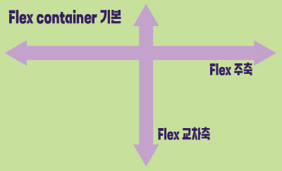
■ flex box란?
○ flex box란?
- 행 또는 열을 주축으로 설정하여 웹 요소를 배치 정렬 하는 1차원 레이아웃 방식
- flex 방식에서, 요소의 배치와 정렬은 flex container와 flex item 간의 상호작용
- flex 방식을 사용하기 위해서는 display: flex 사용
○ flex container
- flex box 방식으로 레이아웃을 결정할 요소
○ flex item
- flex container 내부에서 flex box 방식으로 배치되는 요소
- flex item은 기본적으로 container의 높이에 맞춰 나온다.
○ flex 축방식
- 주축이 가로방향의 행으로 좌우라면 교차축은 세로방향의 열로 위아래
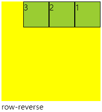
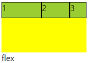
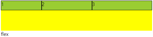
■ flex-direction
○ 주축의 방향성을 결정하는 속성
○ 행은 가로축, 열은 세로축
○ 속성값 의미
| 속성값 | 의미 |
| row | 기본값, 주축은 행으로 가로 콘텐츠 방향과 동일 |
| row-reverse | 주축은 행으로 가로 콘텐츠 방향과 반대 |
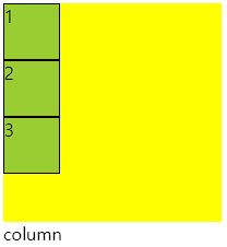
| column | 주축은 열으로 세로 콘텐츠 방향과 동일 |
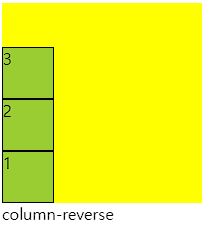
| column-reverse | 주축은 열으로 세로 콘텐츠 방향과 반대 |
○ 코드 연습
<div class="container">
  <div class="item">1</div>
  <div class="item">2</div>
  <div class="item">3</div>
</div>
.container{
width: 200px; height: 200px;
background-color: yellow;
display: flex;
flex-direction: row; /* direction 위치값 */
}
.item{
width: 50px; height: 50px;
background-color: yellowgreen;
border: 1px solid #000;
}
■ flex-wrap
○ flex-wrap
flex item 들이 강제로 한줄에 배치 되게 할 것인지
또는 가능한 영역 내에서 벗어나지 않고 여러행으로 나누어 표현 할 것인지 결정하는 속성
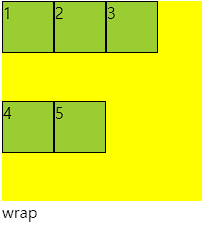
○ wrap
- 너비를 벗어나면 container를 둘로 나누고 나눈 부분에서 위로 정렬
- 한줄에 더큰 요소가 있을때는 벗어나서 표시해줌
- 크기를 벗어나게 많은 요소가 있을때는 보여지는 부분이 넘어가서 활성화됨
- 그러나 행은 기본형태인 1가지 행으로 구성되어 있다고 인지하면됨
○ 속성값 의미
| 속성값 | 의미 |
| nowrap | 기본값. 공간이 부족해도 한줄배치 |
| wrap | 공간 크기에 따라 요소가 여러 행에 걸쳐 배치 |
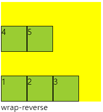
| wrap-reverse | wrap에서 나열되는 시작점과 끝점이 반대 |
○ 코드
<div class="container">
  <div class="item">1</div>
  <div class="item">2</div>
  <div class="item">3</div>
  <div class="item">4</div>
  <div class="item">5</div>
</div>

<style>
  .container{
    width: 200px; height: 200px;
    background-color: yellow;
    display: flex;
    flex-wrap: wrap-reverse; /* reverse */
  }
  .item{
    width: 50px; height: 50px;
    background-color: yellowgreen;
    border: 1px solid #000;
  }
</style>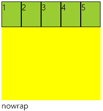
■ flex-flow
○ flex-flow
direction과 wrap을 한번에 사용하는 속성
○ 코드
<div class="container">
    <div class="item">1</div>
    <div class="item">2</div>
    <div class="item">3</div>
    <div class="item">4</div>
    <div class="item">5</div>
</div>

<style>
    .container{
        width: 200px; height: 200px;
        background-color: yellow;
        display: flex;
        flex-flow: column wrap;
    }
    .item{
        width: 50px; height: 50px;
        background-color: yellowgreen;
        border: 1px solid #000;
    }
</style>
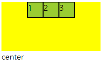
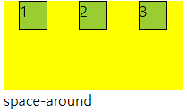
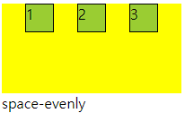
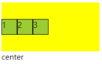
■ justify-content
○ justify-content
flex item 들이 박스의 주축을 따라 배치될때 요소 사이의 공간 분배
| 속성값 | 의미 |
| flex-start | 주축의 시작점으로부터 끝점을 향해 배치 |
| flex-end | 주축의 끝점으로 부터 시작점을 향해 배치 |
| center | 주축의 중심부에 배치 |
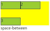
| space-between | 주축에서 양끝에 배치 사이 간격 동일 |
| space-around | 각각의 요소에 동일한 여백 |
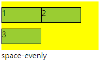
| space-evenly | 모든 여백이 같음 |
○ 코드
<div class="container">
    <div class="item">1</div>
    <div class="item">2</div>
    <div class="item">3</div>
</div>

<style>
    .container{
        width: 200px; height: 100px;
        background-color: yellow;
        display: flex;
        justify-content: flex-start; /* 주축 정렬 */
    }
    .item{
        width: 30px; height: 30px;
        background-color: yellowgreen;
        border: 1px solid #000;
    }
</style>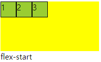


■ align-items
○ flex - container
교차축 위에 플렉스 아이템들이 어떤식으로 정렬될 것인지 결정
| 속성값 | 의미 |
| stretch | 교차축 길이에 맞춰 늘어남 width, height가 우선 |
| flex-start | 교차축 시작점 부터 시작 |
| flex-end | 교차축 끝점 부터 시작 |
| center | 교차축 중심부에 배치 |
○ 코드
<div class="container">
    <div class="item">1</div>
    <div class="item">2</div>
    <div class="item">3</div>
</div>

<style>
    .container{
        width: 200px; height: 100px;
        background-color: yellow;
        display: flex;
        align-items: flex-start; /* 보조축 정렬 */
    }
    .item{
        width: 30px; height: 30px;
        background-color: yellowgreen;
        border: 1px solid #000;
    }
</style>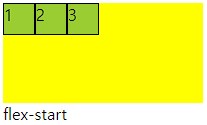

■ align-self
○ align-self
- 각각의 flex item이 교차축에서 정렬될지 스스로 결정
- flex item에 직접입력함
<div class="container">
    <div class="item">1</div>
    <div class="item">2</div>
    <div class="item item3">3</div> /* 개별 클래스 이름 설정 */
</div>

<style>
    .container{
        width: 200px; height: 100px;
        background-color: yellow;
        display: flex;
    }
    .item{
        width: 30px; height: 30px;
        background-color: yellowgreen;
        border: 1px solid #000;
    }
    .item3{
        align-self: flex-end; /* 개별 요소 보조축 정렬 */
    }
</style>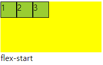
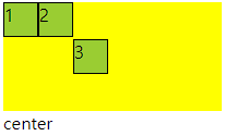
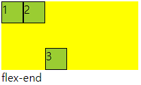
■ align-content
○ align-content
- 교차축 정렬인데 flex-wrap: wrap; 상태일때 사용가능
- space에 대해서도 사용가능 align-item에서는 안됨
- align-item에 center와 align-content의 space-around가 같음
<div class="container">
    <div class="item">1</div>
    <div class="item">2</div>
    <div class="item">3</div>
</div>

<style>
    .container{
        width: 200px; height: 100px;
        background-color: yellow;
        display: flex;
        flex-wrap: wrap; /* wrap일때 사용가능 */
        align-content: space-around;  /* align-item : center 와 동일 */
      	/* 다른값은 align-item에서 구할수 없음 */
    }
    .item{
        width: 80px; height: 30px;
        background-color: yellowgreen;
        border: 1px solid #000;
    }
</style>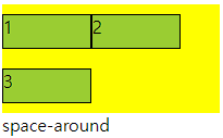
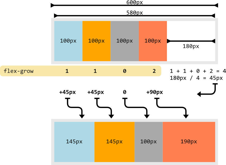
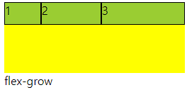
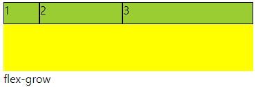
■ flex-grow
○ flex-grow
- flex item이 기본 크기에 대해서 더 커질수 있다.
- container에서 할당 받을 수 있는 공간을 상대적으로 정의
- 남은게 300px 이고 1과 2로구성 되었다면 1은 100px 커지고 2는 200px 커짐
○ 코드
<div class="container">
    <div class="item">1</div>
    <div class="item">2</div>
    <div class="item">3</div>
</div>

<style>
    .container{
        height: 100px; /* 너비값 없게 놓고 해보는 것이 좋음 계속 변경해야함*/
        background-color: yellow;
        display: flex;
    }
    .item{
        width: 50px; height: 30px;
        background-color: yellowgreen;
        border: 1px solid #000;
    }
    .item:nth-child(2){
        flex-grow: 1; /* 남은 공간을 3으로보고 1커지기 */
    }
    .item:nth-child(3){
        flex-grow: 2; /* 남은 공간을 3으로보고 2커지기 */
    }

</style>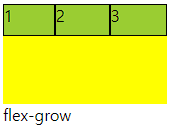
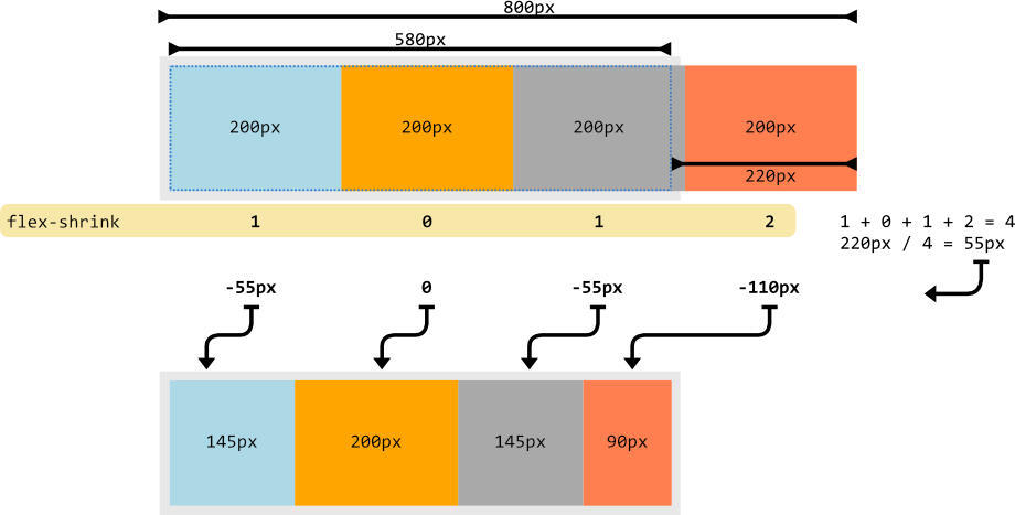
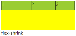
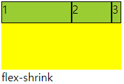
■ flex-shrink
○ flex-shrink
- flex item이 기본 크기에 대해서 더 작아질 수 있다.
- container에서 할당 받을 수 있는 공간을 상대적으로 정의
- 수치를 입력하지 않은것과 입력한 1을 입력한것은 동일
- 0을 입력하면 안작아짐
○ 코드
<div class="container">
    <div class="item">1</div>
    <div class="item">2</div>
    <div class="item">3</div>
</div>

<style>
    .container{
        height: 100px; /* 너비값 없게 놓고 해보는 것이 좋음 계속 변경해야함*/
        background-color: yellow;
        display: flex;
    }
    .item{
        width: 50px; height: 30px;
        background-color: yellowgreen;
        border: 1px solid #000;
    }
    .item:nth-child(1){
        flex-shrink: 0; /* 줄어들지 않음 */
    }
    .item:nth-child(2){
        flex-shrink: 1; /* 줄어든 공간을 3으로보고 1배율작아지기 */
    }
    .item:nth-child(3){
        flex-shrink: 2; /* 줄어든 공간을 3으로보고 1배율작아지기 */
    }

</style>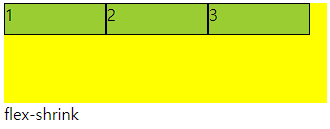
■ flex-basis
○ flex-basis
플렉스 아이템의 초기 크기를 지정, 콘텐츠 박스의 크기를 결정
기본값은 auto로 width 속성을 정의 할 때와 동일한 방식
■ flex
○ flex
flex-grow, flex-shrink, flex-basis 세가지 속성의 정의
순서는 grow, shrink, basis임
○ 코드
<div class="container">
    <div class="item">1</div>
    <div class="item">2</div>
    <div class="item">3</div>
</div>

<style>
    .container{
        height: 100px;
        background-color: yellow;
        display: flex;
    }
    .item{
        height: 30px;
        background-color: yellowgreen;
        border: 1px solid #000;
    }
    .item:nth-child(1){
        flex: 1 1 100px;  /* 증가, 감소, 본크기 */
    }
    .item:nth-child(2){
        flex: 2 2 100px;
    }
    .item:nth-child(3){
        flex: 3 3 100px;
    }

</style>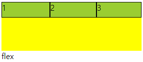
■ order
○ order
플렉스 아이템의 배치 순서를 개발자가 마음대로 설정
지정한 숫자에 맞춰 오름차순 배치
코드에는 영향을 끼치지 않고 보여지는 순서에만 영향
-값에서 + 형태로 입력해 준다. 미입력 0
○ 코드
<div class="container">
    <div class="item">1</div>
    <div class="item">2</div>
    <div class="item">3</div>
</div>

<style>
    .container{
        height: 100px;
        background-color: yellow;
        display: flex;
    }
    .item{
        width: 50px; height: 30px;
        background-color: yellowgreen;
        border: 1px solid #000;
    }
    .item:nth-child(1){
        order: 1;
    }
    .item:nth-child(2){

    }
    .item:nth-child(3){
        order: -1;
    }


</style>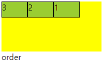
'UIUX > 내용' 카테고리의 다른 글
| img 태그 (0) | 2024.04.15 |
|---|---|
| 레이아웃(Layout) (0) | 2024.04.09 |
| grid (1) | 2024.04.08 |
| CSS 기본 사용형태 (0) | 2024.04.08 |
| 텍스트 스타일 (0) | 2024.04.08 |