■ 이전 내용
■ flex box란?
○ flex box란?
- 행 또는 열을 주축으로 설정하여 웹 요소를 배치 정렬 하는 1차원 레이아웃 방식
- flex 방식에서, 요소의 배치와 정렬은 flex container와 flex item 간의 상호작용
- flex 방식을 사용하기 위해서는 display: flex 사용
○ flex container
- flex box 방식으로 레이아웃을 결정할 요소
○ flex item
- flex container 내부에서 flex box 방식으로 배치되는 요소
- flex item은 기본적으로 container의 높이에 맞춰 나온다.
○ flex 축방식
- 주축이 가로방향의 행으로 좌우라면 교차축은 세로방향의 열로 위아래

■ flex-direction
○ 주축의 방향성을 결정하는 속성
○ 행은 가로축, 열은 세로축
○ 속성값 의미
| 속성값 | 의미 |
| row | 기본값, 주축은 행으로 가로 콘텐츠 방향과 동일 |
| row-reverse | 주축은 행으로 가로 콘텐츠 방향과 반대 |
| column | 주축은 열으로 세로 콘텐츠 방향과 동일 |
| column-reverse | 주축은 열으로 세로 콘텐츠 방향과 반대 |
○ 코드 연습
<div class="container">
  <div class="item">1</div>
  <div class="item">2</div>
  <div class="item">3</div>
</div>
.container{
width: 200px; height: 200px;
background-color: yellow;
display: flex;
flex-direction: row; /* direction 위치값 */
}
.item{
width: 50px; height: 50px;
background-color: yellowgreen;
border: 1px solid #000;
}


■ flex-wrap
○ flex-wrap
flex item 들이 강제로 한줄에 배치 되게 할 것인지
또는 가능한 영역 내에서 벗어나지 않고 여러행으로 나누어 표현 할 것인지 결정하는 속성
○ wrap
- 너비를 벗어나면 container를 둘로 나누고 나눈 부분에서 위로 정렬
- 한줄에 더큰 요소가 있을때는 벗어나서 표시해줌
- 크기를 벗어나게 많은 요소가 있을때는 보여지는 부분이 넘어가서 활성화됨
- 그러나 행은 기본형태인 1가지 행으로 구성되어 있다고 인지하면됨
○ 속성값 의미
| 속성값 | 의미 |
| nowrap | 기본값. 공간이 부족해도 한줄배치 |
| wrap | 공간 크기에 따라 요소가 여러 행에 걸쳐 배치 |
| wrap-reverse | wrap에서 나열되는 시작점과 끝점이 반대 |
○ 코드
<div class="container">
  <div class="item">1</div>
  <div class="item">2</div>
  <div class="item">3</div>
  <div class="item">4</div>
  <div class="item">5</div>
</div>

<style>
  .container{
    width: 200px; height: 200px;
    background-color: yellow;
    display: flex;
    flex-wrap: wrap-reverse; /* reverse */
  }
  .item{
    width: 50px; height: 50px;
    background-color: yellowgreen;
    border: 1px solid #000;
  }
</style>


■ flex-flow
○ flex-flow
direction과 wrap을 한번에 사용하는 속성
○ 코드
<div class="container">
    <div class="item">1</div>
    <div class="item">2</div>
    <div class="item">3</div>
    <div class="item">4</div>
    <div class="item">5</div>
</div>

<style>
    .container{
        width: 200px; height: 200px;
        background-color: yellow;
        display: flex;
        flex-flow: column wrap;
    }
    .item{
        width: 50px; height: 50px;
        background-color: yellowgreen;
        border: 1px solid #000;
    }
</style>
■ justify-content
○ justify-content
flex item 들이 박스의 주축을 따라 배치될때 요소 사이의 공간 분배
| 속성값 | 의미 |
| flex-start | 주축의 시작점으로부터 끝점을 향해 배치 |
| flex-end | 주축의 끝점으로 부터 시작점을 향해 배치 |
| center | 주축의 중심부에 배치 |
| space-between | 주축에서 양끝에 배치 사이 간격 동일 |
| space-around | 각각의 요소에 동일한 여백 |
| space-evenly | 모든 여백이 같음 |
○ 코드
<div class="container">
    <div class="item">1</div>
    <div class="item">2</div>
    <div class="item">3</div>
</div>

<style>
    .container{
        width: 200px; height: 100px;
        background-color: yellow;
        display: flex;
        justify-content: flex-start; /* 주축 정렬 */
    }
    .item{
        width: 30px; height: 30px;
        background-color: yellowgreen;
        border: 1px solid #000;
    }
</style>


■ align-items
○ flex - container
교차축 위에 플렉스 아이템들이 어떤식으로 정렬될 것인지 결정
| 속성값 | 의미 |
| stretch | 교차축 길이에 맞춰 늘어남 width, height가 우선 |
| flex-start | 교차축 시작점 부터 시작 |
| flex-end | 교차축 끝점 부터 시작 |
| center | 교차축 중심부에 배치 |
○ 코드
<div class="container">
    <div class="item">1</div>
    <div class="item">2</div>
    <div class="item">3</div>
</div>

<style>
    .container{
        width: 200px; height: 100px;
        background-color: yellow;
        display: flex;
        align-items: flex-start; /* 보조축 정렬 */
    }
    .item{
        width: 30px; height: 30px;
        background-color: yellowgreen;
        border: 1px solid #000;
    }
</style>


■ align-self
○ align-self
- 각각의 flex item이 교차축에서 정렬될지 스스로 결정
- flex item에 직접입력함
<div class="container">
    <div class="item">1</div>
    <div class="item">2</div>
    <div class="item item3">3</div> /* 개별 클래스 이름 설정 */
</div>

<style>
    .container{
        width: 200px; height: 100px;
        background-color: yellow;
        display: flex;
    }
    .item{
        width: 30px; height: 30px;
        background-color: yellowgreen;
        border: 1px solid #000;
    }
    .item3{
        align-self: flex-end; /* 개별 요소 보조축 정렬 */
    }
</style>


■ align-content
○ align-content
- 교차축 정렬인데 flex-wrap: wrap; 상태일때 사용가능
- space에 대해서도 사용가능 align-item에서는 안됨
- align-item에 center와 align-content의 space-around가 같음
<div class="container">
    <div class="item">1</div>
    <div class="item">2</div>
    <div class="item">3</div>
</div>

<style>
    .container{
        width: 200px; height: 100px;
        background-color: yellow;
        display: flex;
        flex-wrap: wrap; /* wrap일때 사용가능 */
        align-content: space-around;  /* align-item : center 와 동일 */
      	/* 다른값은 align-item에서 구할수 없음 */
    }
    .item{
        width: 80px; height: 30px;
        background-color: yellowgreen;
        border: 1px solid #000;
    }
</style>


■ flex-grow
○ flex-grow
- flex item이 기본 크기에 대해서 더 커질수 있다.
- container에서 할당 받을 수 있는 공간을 상대적으로 정의
- 남은게 300px 이고 1과 2로구성 되었다면 1은 100px 커지고 2는 200px 커짐

○ 코드
<div class="container">
    <div class="item">1</div>
    <div class="item">2</div>
    <div class="item">3</div>
</div>

<style>
    .container{
        height: 100px; /* 너비값 없게 놓고 해보는 것이 좋음 계속 변경해야함*/
        background-color: yellow;
        display: flex;
    }
    .item{
        width: 50px; height: 30px;
        background-color: yellowgreen;
        border: 1px solid #000;
    }
    .item:nth-child(2){
        flex-grow: 1; /* 남은 공간을 3으로보고 1커지기 */
    }
    .item:nth-child(3){
        flex-grow: 2; /* 남은 공간을 3으로보고 2커지기 */
    }

</style>


■ flex-shrink
○ flex-shrink
- flex item이 기본 크기에 대해서 더 작아질 수 있다.
- container에서 할당 받을 수 있는 공간을 상대적으로 정의
- 수치를 입력하지 않은것과 입력한 1을 입력한것은 동일
- 0을 입력하면 안작아짐

○ 코드
<div class="container">
    <div class="item">1</div>
    <div class="item">2</div>
    <div class="item">3</div>
</div>

<style>
    .container{
        height: 100px; /* 너비값 없게 놓고 해보는 것이 좋음 계속 변경해야함*/
        background-color: yellow;
        display: flex;
    }
    .item{
        width: 50px; height: 30px;
        background-color: yellowgreen;
        border: 1px solid #000;
    }
    .item:nth-child(1){
        flex-shrink: 0; /* 줄어들지 않음 */
    }
    .item:nth-child(2){
        flex-shrink: 1; /* 줄어든 공간을 3으로보고 1배율작아지기 */
    }
    .item:nth-child(3){
        flex-shrink: 2; /* 줄어든 공간을 3으로보고 1배율작아지기 */
    }

</style>


■ flex-basis
○ flex-basis
플렉스 아이템의 초기 크기를 지정, 콘텐츠 박스의 크기를 결정
기본값은 auto로 width 속성을 정의 할 때와 동일한 방식
■ flex
○ flex
flex-grow, flex-shrink, flex-basis 세가지 속성의 정의
순서는 grow, shrink, basis임
○ 코드
<div class="container">
    <div class="item">1</div>
    <div class="item">2</div>
    <div class="item">3</div>
</div>

<style>
    .container{
        height: 100px;
        background-color: yellow;
        display: flex;
    }
    .item{
        height: 30px;
        background-color: yellowgreen;
        border: 1px solid #000;
    }
    .item:nth-child(1){
        flex: 1 1 100px;  /* 증가, 감소, 본크기 */
    }
    .item:nth-child(2){
        flex: 2 2 100px;
    }
    .item:nth-child(3){
        flex: 3 3 100px;
    }

</style>


■ order
○ order
플렉스 아이템의 배치 순서를 개발자가 마음대로 설정
지정한 숫자에 맞춰 오름차순 배치
코드에는 영향을 끼치지 않고 보여지는 순서에만 영향
-값에서 + 형태로 입력해 준다. 미입력 0
○ 코드
<div class="container">
    <div class="item">1</div>
    <div class="item">2</div>
    <div class="item">3</div>
</div>

<style>
    .container{
        height: 100px;
        background-color: yellow;
        display: flex;
    }
    .item{
        width: 50px; height: 30px;
        background-color: yellowgreen;
        border: 1px solid #000;
    }
    .item:nth-child(1){
        order: 1;
    }
    .item:nth-child(2){

    }
    .item:nth-child(3){
        order: -1;
    }


</style>
■ 12월 10일 - 1일차
■ 폰트 적용
○ 구글폰트 적용
- 구글 폰트 사이트에서 Filter 해당 언어 선택

- 폰트의 스타일의 개수가 너비의 차이있는 글자체임

- 글자체를 선택하면 너비 값의 종류를 확인할수 있음

- 폰트에서 Getfont 클릭

- Get embed code (웹에서 적용), Download all (디바이스에서 적용할 파일 다운로드)

- 적용할 style 체크

- import 에서 CSS에 넣을 부분 카피
300;500;700 체크하면 추가됨

- 적용
<style>
  @import url('https://fonts.googleapis.com/css2?family=Matemasie&family=Sunflower:wght@300;500;700&display=swap');
  .sf{
    font-family: "Sunflower";
    font-weight: 300;
  }
</style>
<body>
  <h1 class="sf">적용된 안녕하세요</h1>
  <h1>기본 안녕하세요</h1>
</body>

○ 눈누 폰트적용

- font-weight는 글자 파일에 관련 되어 있음
여러개 적용가능

- font-face는 파일을 가져와 이름을 지정해 주는 역활 동일 하지 않아도 상관없음
하나의 파일에 모든 굵기를 바꿀수 있는 글자체이면 크게 문제 없지만 웹용으로 많이 쓰는 woff는 하나의 형태만 사용
가변폰트로 만들어져 있는 woff2같은경우 weight를 적용할 수 있음
<style>

  @font-face {
    font-family: 'Gy';
    src: url('https://fastly.jsdelivr.net/gh/projectnoonnu/2410-3@1.0/Title_Light.woff') format('woff');
    font-weight: 500;
    font-style: normal;
  }
  @font-face {
    font-family: 'SB';
    src: url('https://fastly.jsdelivr.net/gh/projectnoonnu/noonfonts_2108@1.1/SBAggroL.woff') format('woff');
    font-weight: normal;
    font-style: normal;
  }
  .gy{
    font-family: 'Gy';
  }
  .sb{
    font-family: "SB";
  }
</style>
<body>
  <h1 class="gy">적용된 안녕하세요</h1>
  <h1 class="sb">적용된 안녕하세요</h1>
  <h1>기본 안녕하세요</h1>
</body>

○ 파일적용
- woff 다운로드 ttf도 가능은하나 웹보다는 데스크 탑에서 사용
WOFF (Web Open Font Format) : 웹에 최적화
TTF (TrueType Font) : 데스크탑에 최적화

- 각각의 파일을 적용하고 이름을 지정함
<style>
  @font-face {
    font-family: "tb";
    src: url(font/Title_Bold.woff);
  }
  @font-face {
    font-family: "tm";
    src: url(font/Title_Medium.woff);
  }
  @font-face {
    font-family: "tl";
    src: url(font/Title_Light.woff);
  }

  .tb{
    font-family: "tb";
  }
  .tl{
    font-family: "tl";
  }
</style>
<body>
  <h1 class="tb">적용된 안녕하세요</h1>
  <h1 class="tl">적용된 안녕하세요</h1>
  <h1>기본 안녕하세요</h1>
</body>
</html>
- 전체 적용 클래스로 우선순위를 얻어서 변경

<style>
  @font-face {
    font-family: "tb";
    src: url(font/Title_Bold.woff);
  }
  @font-face {
    font-family: "tm";
    src: url(font/Title_Medium.woff);
  }
  @font-face {
    font-family: "tl";
    src: url(font/Title_Light.woff);
  }
  body > *{
    font-family: "tm";
  }
  .tb{
    font-family: "tb";
  }
  .tl{
    font-family: "tl";
  }
</style>
<body>
  <h1 class="tb">적용된 안녕하세요</h1>
  <h1 class="tl">적용된 안녕하세요</h1>
  <h1>기본 안녕하세요</h1>
</body>

■ 아이콘 적용하기
○ 구글 아이콘

- 스타일 링크
<link rel="stylesheet" href="https://fonts.googleapis.com/css2?family=Material+Symbols+Outlined:opsz,wght,FILL,GRAD@20..48,100..700,0..1,-50..200" />
- 글자로 인식 커스텀 예시
<style>
  .a > span{
    font-size: 50px;
    color: aqua;
    background-color: blue;
    border-radius: 50%;
    width: 80px;
    height: 80px;
    text-align: center;
    align-content: center;
  }
  .b > span{
  font-variation-settings:
  'FILL' 1,
  'wght' 700,
  'GRAD' 0,
  'opsz' 48;
  font-size: 80px;
  font-weight: 800;
  }
  .c > span{
    font-size: 60px;
    color: blueviolet;
  }


</style>
<body>
  <div class="a">
    <span class="material-symbols-outlined">menu</span>
  </div>
  <div class="b">
    <span class="material-symbols-outlined">home</span>
  </div>
  <div class="c">
    <span class="material-symbols-outlined">add</span>
  </div>

</body>
○ Font awesome (폰트 어썸)
- CDN
<link rel="stylesheet" href="https://cdnjs.cloudflare.com/ajax/libs/font-awesome/6.6.0/css/all.css">
- Free 사용가능


- 코드
<style>

  .a{
    width: 30px;
    height: 30px;
    background-color: aqua;
    border-radius: 50%;
    padding: 10px;
  }
  .c{
    font-size: 30px;
    height: 30px;
    background-color: aquamarine;
    padding: 10px;
  }
  .d{
    font-size: 30px;
    line-height: 30px;
    vertical-align: top;
    background-color: aquamarine;
    padding: 10px;
  }
</style>
<body>
  <svg class="a" xmlns="http://www.w3.org/2000/svg" viewBox="0 0 512 512"><path fill="#FF0000" d="M47.6 300.4L228.3 469.1c7.5 7 17.4 10.9 27.7 10.9s20.2-3.9 27.7-10.9L464.4 300.4c30.4-28.3 47.6-68 47.6-109.5v-5.8c0-69.9-50.5-129.5-119.4-141C347 36.5 300.6 51.4 268 84L256 96 244 84c-32.6-32.6-79-47.5-124.6-39.9C50.5 55.6 0 115.2 0 185.1v5.8c0 41.5 17.2 81.2 47.6 109.5z"/></svg>
  <i class="c fa-solid fa-heart fa-flip fa-xs" style="color: #FFD43B;"></i>
  <i class="d fa-solid fa-heart fa-flip fa-xs" style="color: #FFD43B;"></i>
</body>
- 색 정보

■ 12월 11일 - 2일차
<!DOCTYPE html>
<html lang="en">
<head>
<meta charset="UTF-8">
<meta http-equiv="X-UA-Compatible" content="IE=edge">
<meta name="viewport" content="width=device-width, initial-scale=1.0">
<title>Document</title>
<link rel="stylesheet" href="https://cdnjs.cloudflare.com/ajax/libs/font-awesome/7.0.1/css/all.min.css">
<style>
body, h1, h2, h3, h4, p{
margin: 0;
}
img{
width: 100%;
height: 100%;
object-fit: cover;
display: block;
}
header{
height: 800px;
position: relative;
}
/* 네비게이션 */
header nav{
position: absolute;
width: 90%;
top: 50px;
left: 50%;
transform: translateX(-50%);
color: #fff;
}
nav .top-box{
display: flex;
justify-content: space-between;
margin-bottom: 100px;
}
nav .top-box .logo{
display: flex;
align-items: center;
gap: 12px;
}
nav .top-box .logo i{
font-size: 32px;
}
nav .top-box .logo p{
font-size: 20px;
font-weight: 900;
}
nav .top-box .left{
display: flex;
align-items: center;
gap: 20px;
}
nav .top-box .left .search{
display: flex;
background-color: #0004;
padding: 10px 20px;
border-radius: 12px;
align-items: center;
gap: 12px;
}
nav .top-box .left .search p{
width: 200px;
}
nav .top-box .left .login{
display: flex;
gap: 10px;
}
nav .bottom-box{
display: flex;
justify-content: space-between;
}
nav .bottom-box .menu{
display: flex;
gap: 40px;
}
nav .bottom-box .event{
display: flex;
gap: 40px;
}
/* 헤더 타이틀 */
header .header-title{
position: absolute;
width: 90%;
left: 50%; top: 50%;
transform: translate(-50%, -50%);
color: #fff;
display: flex;
justify-content: space-between;
align-items: center;
}
header .header-title i{
font-size: 60px;
}
header .header-title .text-box{
padding-right: 200px;
}
header .header-title .text-box h1{
margin-bottom: 40px;
line-height: 1.6;
}
header .header-title .text-box p{
font-size: 20px;
}
main section{
padding: 100px 5%;
}
main section h2{
text-align: center;
font-size: 36px;
margin-bottom: 40px;
}
/* 주간 베스트 상품 */
.s1 .container{
display: flex;
gap: 20px;
}
.s1 .container .item{
width: calc((100% - 60px)/4);
}
.s1 .container .item img{
height: 300px;
transition: 1s;
}
.s1 .container .item .img-box{
margin-bottom: 20px;
overflow: hidden;
}
.s1 .container .item .img-box:hover img{
scale: 1.3;
}
.s1 .container .item .text-box .title{
margin-bottom: 12px;
}
.s2 .container{
display: flex;
gap: 20px;
}
.s2 .container .item{
height: 500px;
width: calc((100% - 40px)/3);
position: relative;
}
.s2 .container .item .text-box{
position: absolute;
width: 100%;
left: 0;
bottom: 60px;
text-align: center;
color: #fff;
}
.s2 .container .item .text-box h3{
margin-bottom: 10px;
font-size: 36px;
}
.s2 .container .item .text-box i{
margin-left: 10px;
}
.s3 .container{
display: flex;
flex-wrap: wrap;
gap: 40px 20px;
}
.s3 .container .item{
width: calc((100% - 100px)/6);
}
.s3 .container .item img{
height: 200px;
margin-bottom: 12px;
}
.s3 .container .item .title{
margin-bottom: 8px;
}
.s4 .container .price{
font-weight: 900;
}
.s5{
padding: 100px 0;
}
.s5 .container{
display: flex;
position: relative;
}
.s5 .container img{
width: 50%;
height: 250px;
}
.s5 .container .text-box{
position: absolute;
left: 50%; top: 50%;
transform: translate(-50%, -50%);
color: #fff;
}
.s5 .container .text-box h3{
margin-bottom: 8px;
}
.s5 .container .text-box p{
margin-bottom: 28px;
}
.s5 .container .text-box .button{
border: 1px solid #fff;
width: 150px;
height: 50px;
margin: 0 auto;
text-align: center;
align-content: center;
cursor: pointer;
box-sizing: border-box;
}
.s5 .container .text-box .button:hover{
border: none;
color: #000;
background-color: #fff;
}
.s6 .container{
display: flex;
gap: 5px;
}
.s6 .container .item{
width: calc((100% - 10px)/3);
}
.s6 .container .item img{
height: 300px;
}
.s6 .container .item .img-box{
position: relative;
overflow: hidden;
}
.s6 .container .item .img-box::after{
content: "";
display: block;
position: absolute;
left: 0; top: 0;
width: 100%; height: 100%;
background-color: #0005;
transition: 1s;
}
.s6 .container .item .img-box:hover::after{
top: 100%;
}
</style>
</head>
<body>
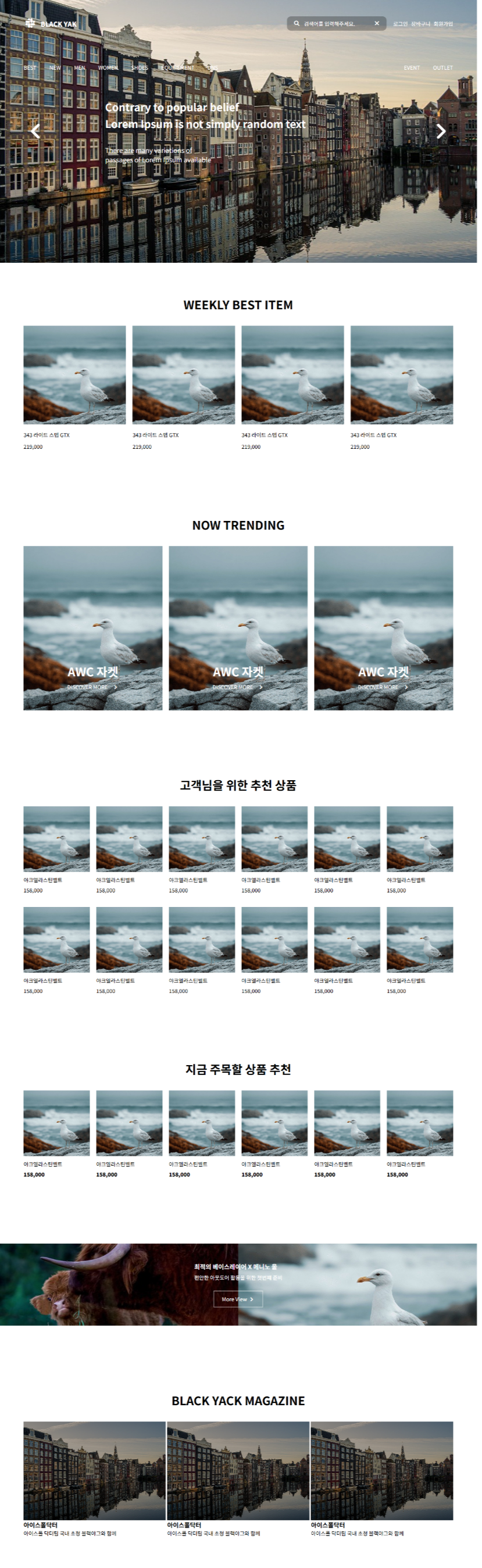
<div class="wrap">
<header>
<img src="a1.jpg" alt="">
<nav>
<div class="top-box">
<div class="logo">
<i class="fa-brands fa-slack"></i>
<p>BLACK YAK</p>
</div>
<div class="left">
<div class="search">
<i class="fa-solid fa-magnifying-glass"></i>
<p>검색어를 입력해주세요.</p>
<i class="fa-solid fa-xmark"></i>
</div>
<div class="login">
<p>로그인</p>
<p>장바구니</p>
<p>회원가입</p>
</div>
</div>
</div>
<div class="bottom-box">
<div class="menu">
<p>BEST</p>
<p>NEW</p>
<p>MEN</p>
<p>WOMEN</p>
<p>SHOES</p>
<p>EQUIPEMENT</p>
<p>DNS</p>
</div>
<div class="event">
<p>EVENT</p>
<p>OUTLET</p>
</div>
</div>
</nav>
<div class="header-title">
<i class="fa-solid fa-angle-left"></i>
<div class="text-box">
<h1>Contrary to popular belief<br> Lorem Ipsum is not simply random text</h1>
<p>There are many variations of<br> passages of Lorem Ipsum available</p>
</div>
<i class="fa-solid fa-angle-right"></i>
</div>
</header>
<main>
<section class="s1">
<h2>WEEKLY BEST ITEM</h2>
<div class="container">
<div class="item">
<div class="img-box">
<img src="a3.png" alt="">
</div>
<div class="text-box">
<p class="title">343 라이트 스텝 GTX</p>
<p class="price">219,000</p>
</div>
</div>
<div class="item">
<div class="img-box">
<img src="a3.png" alt="">
</div>
<div class="text-box">
<p class="title">343 라이트 스텝 GTX</p>
<p class="price">219,000</p>
</div>
</div>
<div class="item">
<div class="img-box">
<img src="a3.png" alt="">
</div>
<div class="text-box">
<p class="title">343 라이트 스텝 GTX</p>
<p class="price">219,000</p>
</div>
</div>
<div class="item">
<div class="img-box">
<img src="a3.png" alt="">
</div>
<div class="text-box">
<p class="title">343 라이트 스텝 GTX</p>
<p class="price">219,000</p>
</div>
</div>
</div>
</section>
<section class="s2">
<h2>NOW TRENDING</h2>
<div class="container">
<div class="item">
<img src="a3.png" alt="">
<div class="text-box">
<h3>AWC 자켓</h3>
<p>DISCOVER MORE
<i class="fa-solid fa-angle-right"></i>
</p>
</div>
</div>
<div class="item">
<img src="a3.png" alt="">
<div class="text-box">
<h3>AWC 자켓</h3>
<p>DISCOVER MORE
<i class="fa-solid fa-angle-right"></i>
</p>
</div>
</div>
<div class="item">
<img src="a3.png" alt="">
<div class="text-box">
<h3>AWC 자켓</h3>
<p>DISCOVER MORE
<i class="fa-solid fa-angle-right"></i>
</p>
</div>
</div>
</div>
</section>
<section class="s3">
<h2>고객님을 위한 추천 상품</h2>
<div class="container">
<div class="item">
<img src="a3.png" alt="">
<p class="title">야크엘라스틴벨트</p>
<p class="price">158,000</p>
</div>
<div class="item">
<img src="a3.png" alt="">
<p class="title">야크엘라스틴벨트</p>
<p class="price">158,000</p>
</div>
<div class="item">
<img src="a3.png" alt="">
<p class="title">야크엘라스틴벨트</p>
<p class="price">158,000</p>
</div>
<div class="item">
<img src="a3.png" alt="">
<p class="title">야크엘라스틴벨트</p>
<p class="price">158,000</p>
</div>
<div class="item">
<img src="a3.png" alt="">
<p class="title">야크엘라스틴벨트</p>
<p class="price">158,000</p>
</div>
<div class="item">
<img src="a3.png" alt="">
<p class="title">야크엘라스틴벨트</p>
<p class="price">158,000</p>
</div>
<div class="item">
<img src="a3.png" alt="">
<p class="title">야크엘라스틴벨트</p>
<p class="price">158,000</p>
</div>
<div class="item">
<img src="a3.png" alt="">
<p class="title">야크엘라스틴벨트</p>
<p class="price">158,000</p>
</div>
<div class="item">
<img src="a3.png" alt="">
<p class="title">야크엘라스틴벨트</p>
<p class="price">158,000</p>
</div>
<div class="item">
<img src="a3.png" alt="">
<p class="title">야크엘라스틴벨트</p>
<p class="price">158,000</p>
</div>
<div class="item">
<img src="a3.png" alt="">
<p class="title">야크엘라스틴벨트</p>
<p class="price">158,000</p>
</div>
<div class="item">
<img src="a3.png" alt="">
<p class="title">야크엘라스틴벨트</p>
<p class="price">158,000</p>
</div>
</div>
</section>
<section class="s3 s4">
<h2>지금 주목할 상품 추천</h2>
<div class="container">
<div class="item">
<img src="a3.png" alt="">
<p class="title">야크엘라스틴벨트</p>
<p class="price">158,000</p>
</div>
<div class="item">
<img src="a3.png" alt="">
<p class="title">야크엘라스틴벨트</p>
<p class="price">158,000</p>
</div>
<div class="item">
<img src="a3.png" alt="">
<p class="title">야크엘라스틴벨트</p>
<p class="price">158,000</p>
</div>
<div class="item">
<img src="a3.png" alt="">
<p class="title">야크엘라스틴벨트</p>
<p class="price">158,000</p>
</div>
<div class="item">
<img src="a3.png" alt="">
<p class="title">야크엘라스틴벨트</p>
<p class="price">158,000</p>
</div>
<div class="item">
<img src="a3.png" alt="">
<p class="title">야크엘라스틴벨트</p>
<p class="price">158,000</p>
</div>
</div>
</section>
<section class="s5">
<div class="container">
<img src="a2.jpg" alt="">
<img src="a3.png" alt="">
<div class="text-box">
<h3>최적의 베이스레이어 X 메니노 울</h3>
<p>편안한 아웃도어 활동을 위한 첫번쨰 준비</p>
<div class="button">
More View
<i class="fa-solid fa-angle-right"></i>
</div>
</div>
</div>
</section>
<section class="s6">
<h2>BLACK YACK MAGAZINE</h2>
<div class="container">
<div class="item">
<div class="img-box">
<img src="a1.jpg" alt="">
</div>
<h3>아이스폴닥터</h3>
<p>아이스폴 닥터팀 국내 초청 블랙야그와 함께</p>
</div>
<div class="item">
<div class="img-box">
<img src="a1.jpg" alt="">
</div>
<h3>아이스폴닥터</h3>
<p>아이스폴 닥터팀 국내 초청 블랙야그와 함께</p>
</div>
<div class="item">
<div class="img-box">
<img src="a1.jpg" alt="">
</div>
<h3>아이스폴닥터</h3>
<p>아이스폴 닥터팀 국내 초청 블랙야그와 함께</p>
</div>
</div>
</section>
</main>
</div>
</body>
</html>
■ 12월 15일 - 3일차
자동 이미지 사이트 : lorem picsum
https://picsum.photos/id/237/200/300

id를 변경하면 다른 이미지가 나옴
뒤에는 너비와 높이 변경

https://picsum.photos/200/300

랜덤한 이미지 나옴
■ img 태그
○ img 태그
- 자체 닫는 태그로 끝에 별도의 닫는 태그가 필요하지 않는다.
- 기본 display = inline-block 임
○ 주요 속성
- src(source) : 이미지의 url을 지정
* 절대 url : https://www.abc.com/image.jpg
* 상대 url : img/image.jpg (현재 페이지에서 img폴더내 jpg파일 참조)
- alt(alternative text)
* 이미지가 표시되지 않을때 사용자에게 보여질 텍스트
* 검색 엔진 최적화에 도움이 됨, 검색 엔진은 이미지 자체를 읽을 수 없지만 alt텍스트로 내용을 이해함
- width와 height
* 이미지 크기를 픽셀 단위로 정의함
* 이미지를 로드하기 전에 이미지의 공간을 예약함, 레이아웃이 안정적 유지
* 크기 지정없이 큰 이미지를 로드 할 경우 레이아웃 변형될 수 있음
<div class="main">
    <img src="https://picsum.photos/id/2/100/100">
    <img src="https://picsum.photos/id/2/100/100" width="50px" height="100px">
</div>
<div class="main">
    <img src="https://picsum.photos/id/2/100/100">
</div>

.main{
    width: 50px; height: 50px;
    border: 2px solid #000;

}
img{
    opacity: 0.5;
    border: 3px solid red;
}
■ 이미지 중앙정렬 방식
○ inline-block 일때 정렬
.main{
    border: 1px solid #000;
    width: 150px; height: 150px;
    align-content: center;
    text-align: center;
}
.main > img{

}
○ block 요소로 변경 하여 정렬
.main{
    border: 1px solid #000;
    width: 150px; height: 150px;
    align-content: center;


}
.main > img{
   display: block;
   margin: 0 auto;
}
○ flex 요소로 변경 하여 정렬
.main{
    border: 1px solid #000;
    width: 150px; height: 150px;
    display: flex;
    justify-content: center;
    align-items: center;
}
.main > img{

}
○ 이미지와 글자 관리
<div class="main">
    <div class="box">
        <img src="img/연습.png" width="100px" height="100px">
        <p>이미지</p>
    </div>
    <div class="box">
        <img src="img/연습.png" width="100px" height="100px">
        <p>이미지</p>
    </div>
    <div class="box">
        <img src="img/연습.png" width="100px" height="100px">
        <p>이미지</p>
    </div>

</div>
.main{
display: flex;
height: 500px;
gap: 20px;
justify-content: center;
align-items: center;
border: 1px solid #000;
}
.box{
width: 100px; height: 130px;
}
.box > img{
}
.box > p{
text-align: center;
margin: 0 4px;
}
■ object-fit
○ object-fit
- 이미지가 본래 가지고 있는 형태가 비율이 변경되면 왜곡되어 보이는 문제가 발생
- fill : 기본값 요소의 크기를 늘리거나 줄여서 컨테이너를 체움
- cover : 콘텐츠의 비율을 유지하면서 컨테이너 전체를 채움 이미지가 잘림
- contain : 콘텐츠의 비율을 유지하면서 컨테이너 맞춰 조절
- none : 콘텐츠의 크기변경 안되고 원본 크기 유지하면서 나옴
<div class="main">
    <img class="a1" src="img/연습.png" width="100" height="100" alt="">
    <img class="a2" src="img/연습.png" width="100" height="100" alt="">
    <img class="a3" src="img/연습.png" width="100" height="100" alt="">
    <img class="a4" src="img/연습.png" width="100" height="100" alt="">
</div>
.main{
border: 1px solid #000;
}
.a1{
width: 50px; height: 100px;
object-fit: fill;
}
.a2{
width: 50px; height: 100px;
object-fit: cover;
}
.a3{
width: 50px; height: 100px;
object-fit: contain;
}
.a4{
width: 50px; height: 100px;
object-fit: none;
}■ object-position
○ object-position
- CSS에서 이미지, 비디오 등 대체 콘텐츠(replaced elements)의 위치를 조절하는 데 사용
이 속성은 object-fit 속성과 함께 사용되어 컨테이너 내에서 콘텐츠가 어떻게 배치될지 제어
- 키워드: center, top, bottom, left, right, 그리고 이들의 조합 예: top left, bottom right 등
- 백분율: 예를 들어 50% 75%는 콘텐츠의 가로 중심과 세로의 75% 지점에 콘텐츠의 중심을 맞추는 것을 의미
- 길이 값: 픽셀(px)이나 em 같은 길이 단위를 사용하여 정확한 위치를 지정
<div class="main">
    <img class="a1" src="img/연습.png" width="100" height="100" alt="">
    <img class="a2" src="img/연습.png" width="100" height="100" alt="">
    <img class="a3" src="img/연습.png" width="100" height="100" alt="">
    <img class="a4" src="img/연습.png" width="100" height="100" alt="">
</div>
.main{
border: 1px solid #000;
}
.main > img{
width: 50px; height: 100px;
object-fit: cover;
}
.a2{
object-position: center;
}
.a3{
object-position: right;
}
.a4{
object-position: left;
}
■ background-image
○ background
- 콘텐츠의 배경을 정의한다.
- 단축속성으로 색상이미지 반복등 정의 할 수 있다.
| 하위속성 | 역할 |
| background-image | 배경 이미지를 정의 |
| background-position | 배경 이미지의 초기 위치 정의 |
| background-size | 배경 이미지의 크기를 정의 |
| background-repeat | 배경 이미지의 반복방법을 정의 |
○ background-image
- 기본적으로 배경이미지가 콘텐츠보다 작으면 배경이미지에 대해서 반복적으로 실행됨
○ background-repeat
- repeat: 이미지를 수평과 수직으로 반복 기본값
- repeat-x: 이미지를 수평으로만 반복
- repeat-y: 이미지를 수직으로만 반복
- no-repeat: 이미지를 반복하지 않음
- space: 이미지를 반복하되, 이미지 사이에 공간을 똑같이 두어 전체 요소를 균일하게
- round: 이미지를 반복하며, 필요한 경우 이미지의 크기를 조정해서 요소의 공간을 정확히 맞춤
○ background-size
- 길이 값 지정: 픽셀(px) 또는 백분율(%) 등의 길이 단위를 사용하여 배경 이미지의 크기를 직접 지정
- cover는 이미지가 요소의 전체 공간을 덮도록 확장되며,
이미지의 가로 세로 비율을 유지하면서 요소의 더 작은 면을 기준으로 크기가 조정
- contain은 이미지가 요소의 경계 내에서 완전히 보이도록 확장되며,
이미지의 가로 세로 비율을 유지하면서 요소의 더 큰 면을 기준으로 크기가 조정
○ background-position
- 배경이미지의 위치를 설정하는 데 사용됨 이 속성을 통해 배경 이미지가 요소내에서 어디에 위치할지 지정
- 기본값은 0% 0% 또는 top left
- 키워드 사용: top, bottom, left, right, center와 같은 키워드를 사용하여 이미지 위치를 설정
- 길이 단위 사용: 픽셀(px), 백분율(%) 등의 단위를 사용하여 정확한 위치를 지정
- 조합 사용: 키워드와 길이 단위를 조합하여 더 세밀하게 위치를 지정
- 예시 right 20px top 10px : 오른쪽에서 20px 왼쪽, 상단에서 10px 아래쪽
○ 코드
<div class="main">
    안녕
</div>
.main{
width: 100px; height: 100px;
border: 1px solid #000;
background-image: url("img/연습.png");
background-repeat: no-repeat;
background-size: 30px 50px;
background-position: 50% 10px;
align-content: end;
text-align: center;
}
■ 기타 효과
○ Border - Radius
- 4개
첫 번째 값은 좌측 상단 모서리에 적용
두 번째 값은 우측 상단 모서리에 적용
세 번째 값은 우측 하단 모서리에 적용
네 번째 값은 좌측 하단 모서리에 적용
border-radius: 15px 50px 30px 5px;
- 3개
첫 번째 값은 좌측 상단 모서리에 적용
두 번째 값은 우측 상단과 좌측 하단 모서리에 적용
세 번째 값은 우측 하단 모서리에 적용
border-radius: 15px 50px 30px;
- 2개
첫 번째 값은 좌측 상단과 우측 하단 모서리에 적용
두 번째 값은 우측 상단과 좌측 하단 모서리에 적용
border-radius: 15px 50px;
- 이미지에 적용
<style>
  img{
    width: 100px;
    height: 100px;
    object-fit: cover;
    border-radius: 10px 30px;
  }

</style>
<body>
  <img src="dog.jpg" alt="">
</body>

- 이미지와 박스에 적용해보기
<style>
  p{
    margin: 2px;
  }
  .box{
    width: 200px;
    border: 1px solid #aaa;
    overflow: hidden; /* 넘치는 것 숨기기 */
    border-radius: 40px 10px;
  }
  .box img{
    width: 100%;
    object-fit: cover;
  }

</style>
<body>
  <div class="box">
    <img src="dog.jpg" alt="">
    <p>제목</p>
    <p>내용</p>
  </div>
</body>
○ Text - shadow
<style>
  .box > h1:nth-child(1){
    text-shadow: 0px 4px; /*좌 아래*/
  }
  .box > h1:nth-child(2){
    text-shadow: -4px -4px red; /*좌 아래 색*/
  }
  .box > h1:nth-child(3){
    text-shadow: 4px 4px 2px; /*좌 아래 흐림*/
  }
  .box > h1:nth-child(4){
    text-shadow: 4px 4px 6px;
  }
  .box > h1:nth-child(5){
    text-shadow: 3px 3px 3px #888 ; /*좌 아래 흐림 색*/
  }

</style>
<body>
  <div class="box">
    <h1>텍스트 그림자1</h1>
    <h1>텍스트 그림자2</h1>
    <h1>텍스트 그림자3</h1>
    <h1>텍스트 그림자4</h1>
    <h1>텍스트 그림자5</h1>
  </div>
</body>

○ Box-shadow
<style>
  .box{
    width: 100px;
    height: 100px;
    background-color: aquamarine;
    margin-bottom: 20px;
  }
  .box:nth-child(1){
    box-shadow: 3px 3px;
  }
  .box:nth-child(2){
    box-shadow: 3px 3px #fff00088;
  }
  .box:nth-child(3){
    box-shadow: 3px 3px 3px red;
  }
  .box:nth-child(4){
    box-shadow: -2px -2px 12px inset rgba(48, 97, 81, 0.308);
  }
  .box:nth-child(5){
    box-shadow: 0px 4px 8px #aaa, 0px 8px 20px #aaa;
  }

</style>
<body>
  <div class="box">1</div>
  <div class="box">2</div>
  <div class="box">3</div>
  <div class="box">4</div>
  <div class="box">5</div>
</body>
○ Text -Stroke
<style>
  .box{
    width: 300px;
    position: relative;
  }
  .box > img{
    width: 300px;
  }
  .box > h1{
    margin: 0;
    -webkit-text-stroke: 6px #ddd;
    color: transparent;
    font-size: 120px;
    font-weight: 900;
    position: absolute;
    top: 50%;
    left: 50%;
    transform: translate(-50%, -50%);
  }

</style>
<body>
  <div class="box">
    <img src="dog.jpg" alt="">
    <h1>DOG</h1>
  </div>
</body>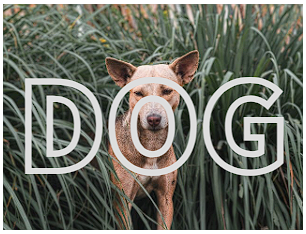
○ background-clip
<style>

  h1{
    margin: 0;
    color: transparent;
    font-size: 120px;
    font-weight: 900;
    background-image: url(dog.jpg);
    background-size: 100%;
    background-position: center;
    background-clip: text;
  }

</style>
<body>
  <h1>DOG</h1>
</body>

○ mask-imge clip
<style>

  .box{
    width: 300px;
    height: 300px;
    background-image: url(dog.jpg);
    background-size: cover;
    background-position: center;
    mask-image: url(Untitled-1.png);
    mask-size: cover;
  }

</style>
<body>
  <div class="box"></div>
</body>
■ 애니메이션 (Animation) 기본
○ 애니메이션 정의
애니메인션은 CSS 스타일을 다른 CSS 스타일로 부드럽게 전환시킴
애니메이션은 애니메이션을 나타내는 CSS 스타일과
애니메이션의 중간 상태를 나타내는 키프레임들로 이루어진다.
○ 애니메이션 하위 속성
- animation-name : 중간 상태를 지정, 중간 상태는 @keyframes 규칙 이용
- animation-duration : 한 싸이클의 애니메이션이 얼마에 걸쳐 일어날지 지정
- animation-timing-function : 중간 상태들의 전환을 어떤 시간간격으로 진행
- animation-delay : 로드 되고 얼마만큼의 시간이 지난 후 실행될지 설정
- animation-iteration-count : 애니메이션이 몇 번 반복될지 지정. infinite은 무한히 반복
- animation- direction : 애니메이션이 종료 후 다시 처음부터, 역방향으로 진행 설정
- animation-fill-mode : 시작되기 전이나 끝나고 난 후 어떤 값이 적용될지 지정
- animation-play-state : 멈추거나 다시 시작
○ 애니메이션 속기형 작성
- 순서는 크게 문제는 안되지만 duration, delay는 기본 앞이 duration, 뒤에 작성시 delay 임
animation: name | duration | timing-function | delay | iteration-count | direction | fill-mode | play-state> [,...];
- 실제 사용법 (순서대로 작성하는 것을 기본으로 한다. )
div{
    animation: abc 3s linear infinite  ;
}
div{
    animation: linear infinite 3s abc;
    /*          타이밍, 개수,  시간, 이름    */
}
○ 애니메이션 @keyframes 사용
CSS 애니메이션과 트랜지션 방식의 주된 차이는 @keyframes rule에 있다.
이 rule을 사용하면 애니메이션의 흐름(sequence) 중의
여러 시점(breakpoint)에서 CSS 프로퍼티값(속성값)을 지정할 수 있다.
- from, to 키워드를 사용하여 애니메이션의 시작과 끝 시점을 정의함
- from, to 키워드 대신 %를 사용가능
@keyframes name{ /* 최초 왼쪽 여백을 0% 지정, 종료시 왼쪽 여백 -100% 지정 */
    from{ margin-left: 0%; }
    to{ margin-left: -100%; }
}

@keyframes name{  /* 50%를 지날때 왼쪽 여백을 -100% 지정, 0%, 100%일때는 왼쪽 여백 0% */
    50%{ margin-left: -100%; }
}
■ 애니메이션 속성(property)별 작성요령
○ animation-name
- @keyframes 뒤에 애니메이션을 대표하는 임의의 이름를 부여하는 형태
- animation-name 프로퍼티값으로 지정하여 사용하고자 하는 @keyframes rule을 선택
- 하나 이상의 애니메이션 이름을 지정할 수 있다.
div{ /* 한개의 이름을 지정 */
    animation-name: move;
}


div{ /* 여러개의 이름을 지정 */
    animation-name: move, fadeOut, changeColor;
}
- 유효한 이름
문자열 시작하는 이름, _(언더바)로 시작, - (하이픈)으로 시작
div{
    animation-name: name; /* 문자열로 시작하는 이름 */
    animation-name: _name; /* 언더바(_)로 시작하는 이름 */
    animation-name: -name; /* 하이픈(-)으로 시작하는 이름 */
}
- 유효하지 않은 이름
숫자로 시작, 특수문자 시작
div{
    animation-name: 1name; /* 숫자로 시작하는 이름 */
    animation-name: @name; /* 특수 문자로 시작하는 이름 */
}
○ animation-duration
- 애니메이션 프레임의 지속시간을 지정
- 지속 시간은 애니메이션이 시작하고 종료하는 데 걸리는 시간 의미
- 단위는 밀리초 ms, 초 s로 지정함
- 지정하지 않는 경우 기본값 0s가 셋팅되어 어떠한 애니메이션도 실행 되지 않음
○ animation-timing-function
- 애니메이션 효과를 위한 수치 함수를 지정
- ease : 기본, 느리게 시작하여 점점 빨라졌다가 느려지면서 종료
- linear : 동일한 속도로 운동
- ease-in : 느리게 시작 한 후 등속 운동
- ease-out : 등속시작해서 느리게 종료
- ease-in-out : ease와 유사
○ animation-delay
- 요소가 로드된 시점과 애니메이션이 실제로 시작하는 사이에
대기하는 시간을 초 단위(s) 또는 밀리 초 단위(ms)로 지정
○ animation-iteration-count
- 애니메이션 주기의 재생 횟수를 지정
- 기본값은 1이며 infinite로 무한반복
○ animation-direction
- 애니메이션이 종료된 이후 반복될 때 진행하는 방향을 지정
- normal : 기본값으로 진행
- reverse : 역순으로 진행(100->0%)
- alternate : 홀수는 normal, 짝수는 reverse로 진행
- alternate-reverse : 홀수는 reverse, 짝수는 normal로 진행
■ 로딩화면
○ 두 원 회전
<style>
    body div {
        box-sizing: border-box;
    }
    .bigbox{
        width: 200px;
        height: 200px;
        border: 1px solid #000;
        position: relative;
    }
    .bigbox > div{
        position: absolute;
    }
    .bigbox > .a{
        transform: rotate(135deg);
        animation: spin 4s infinite;
    }
    @keyframes spin{
        0%{
            transform: rotate(135deg);
            opacity: 1;
        }
        25%{
            opacity: 0.75;
        }
        50%{
            transform: rotate(675deg);
            opacity: 1;
        }
        75%{
            opacity: 0.75;
        }
        100%{
            transform: rotate(135deg);
            opacity: 1;
        }
    }
    .box-l{
        width: 100px;
        height: 100px;
        border-width: 15px 0px 0px 15px;
        border-color: blue;
        border-style: solid;
        border-top-left-radius: 100%;
        transform-origin: 100% 100%;
    }
    .box-r{
        width: 100px;
        height: 100px;
        bottom: 0px;
        right: 0px;
        border-right: 15px solid blue;
        border-bottom: 15px solid blue;
        border-bottom-right-radius: 100%;
        transform-origin: 0% 0%;
    }
    .sbox-r{
        width: 70px;
        height: 70px;
        border: 1px solid #000;
        left: 50%;
        bottom: 50%;
        border-width: 15px 15px 0px 0px;
        border-color: blue;
        border-style: solid;
        border-top-right-radius: 100%;
        transform-origin: 0% 100%;
    }
    .sbox-l{
        width: 70px;
        height: 70px;
        border: 1px solid #000;
        right: 50%;
        top: 50%;
        border-width: 0px 0px 15px 15px;
        border-color: blue;
        border-style: solid;
        border-bottom-left-radius: 100%;
        transform-origin: 100% 0%;
    }
    .cercle{
        width: 50px;
        height: 50px;
        background-color: blue;
        border-radius: 50%;
        left: 50%;
        top: 50%;
        transform: translate(-50%, -50%);
        animation: cercle 2s infinite;
    }
    @keyframes cercle{
        0%{opacity: 1;}
        50%{opacity: 0.5;}
        100%{opacity: 1;}
    }
</style>
<body>
    <div class="bigbox">
        <div class="a box-l"></div>
        <div class="a box-r"></div>
        <div class="a sbox-r"></div>
        <div class="a sbox-l"></div>
        <div class="cercle"></div>
    </div>
</body>
</html>
○ 내부 원 회전
<style>
  /* 컨테이너 설정 */
  .loading-container {
    display: flex;
    justify-content: center;
    align-items: center;
    width: 300px;
    height: 300px;
    background-color: #f5f5f5;
  }

  /* 로딩 박스 설정 */
  .loading-box {
    width: 80px;
    height: 80px;
    border: 8px solid #ccc;
    border-top: 8px solid #3498db;
    border-radius: 50%;
    animation: spin 1s linear infinite;
  }

  /* 회전 애니메이션 */
  @keyframes spin {
    0% { transform: rotate(0deg); }
    100% { transform: rotate(360deg); }
  }
</style>
</head>
<body>

<div class="loading-container">
  <div class="loading-box"></div>
</div>

</body>
</html>
○ 점 물결
<style>
    .loading-container {
        display: flex;
        justify-content: center;
        align-items: center;
        height: 300px;
        width: 300px;
        background-color: #f5f5f5;
    }

    .bouncing-dots {
        display: flex;
        gap: 8px;
    }

    .bouncing-dots div {
        width: 15px;
        height: 15px;
        background-color: #3498db;
        border-radius: 50%;
        animation: bounce 0.6s infinite alternate;
    }

    .bouncing-dots div:nth-child(2) {
        animation-delay: 0.2s;
    }

    .bouncing-dots div:nth-child(3) {
        animation-delay: 0.4s;
    }

    @keyframes bounce {
        from { transform: translateY(0); }
        to { transform: translateY(-15px); }
    }
</style>
</head>
<body>
    <div class="loading-container">
        <div class="bouncing-dots">
          <div></div>
          <div></div>
          <div></div>
        </div>
      </div>
</body>
</html>
○ 선 물결
<style>
   .loading-container{
        width: 200px;
        height: 200px;
        background-color: #ccc;
        align-content: center;
    }
    .wave {
        width: 35px;
        display: flex;
        gap: 5px;
        margin: 0 auto;
    }

    .wave > div {
        width: 5px;
        height: 20px;
        background-color: #3498db;
        animation: wave 0.6s infinite ease-in-out;
    }

    .wave div:nth-child(2) { animation-delay: 0.1s; }
    .wave div:nth-child(3) { animation-delay: 0.2s; }
    .wave div:nth-child(4) { animation-delay: 0.3s; }
    .wave div:nth-child(5) { animation-delay: 0.4s; }

    @keyframes wave {
        0%, 40%, 100% { transform: scaleY(1); }
        20% { transform: scaleY(2); }
    }
</style>
<body>
    <div class="loading-container">
        <div class="wave">
          <div></div>
          <div></div>
          <div></div>
          <div></div>
        </div>
    </div>
</body>
</html>
○ 점 페이드 인아웃
<style>
    .loading-container{
        width: 200px;
        height: 200px;
        background-color: #ccc;
        align-content: center;
    }
    .fade-dots {
        width: calc(15px * 3 + (8px*2));
        display: flex;
        gap: 8px;
        margin: 0 auto;
    }

    .fade-dots div {
        width: 15px;
        height: 15px;
        background-color: #3498db;
        border-radius: 50%;
        animation: fade 1.2s infinite ease-in-out;
    }

    .fade-dots div:nth-child(2) { animation-delay: 0.2s; }
    .fade-dots div:nth-child(3) { animation-delay: 0.4s; }

    @keyframes fade {
        0%, 100% { opacity: 0; }
        50% { opacity: 1; }
    }
</style>
<body>
    <div class="loading-container">
        <div class="fade-dots">
          <div></div>
          <div></div>
          <div></div>
        </div>
    </div>
</body>
○ 원 크기 페이드인아웃
<style>
    .loading-container{
        width: 200px;
        height: 200px;
        background-color: #ccc;
        align-content: center;
    }
    .pulse-ring {
        width: 50px;
        height: 50px;
        margin: 0 auto;
        border: 4px solid #3498db;
        border-radius: 50%;
        animation: pulse 1s infinite ease-in-out;
    }

    @keyframes pulse {
        0% { transform: scale(1); opacity: 1; }
        100% { transform: scale(1.5); opacity: 0; }
    }
</style>
<body>
    <div class="loading-container">
        <div class="pulse-ring"></div>
    </div>
</body>
○ 선 페이드 인 아웃
<style>
    .loading-container{
        width: 200px;
        height: 200px;
        background-color: #ccc;
        align-content: center;
    }
    .flash-stripes {
        width: calc((8px * 4) + (4px*3));
        margin: 0 auto;
        display: flex;
        gap: 4px;
    }

    .flash-stripes div {
        width: 8px;
        height: 40px;
        background-color: #3498db;
        animation: flash 1s infinite ease-in-out;
    }

    .flash-stripes div:nth-child(2) { animation-delay: 0.2s; }
    .flash-stripes div:nth-child(3) { animation-delay: 0.4s; }
    .flash-stripes div:nth-child(4) { animation-delay: 0.6s; }

    @keyframes flash {
        0%, 100% { opacity: 0.2; }
        50% { opacity: 1; }
    }

</style>
<body>
    <div class="loading-container">
        <div class="flash-stripes">
            <div></div>
            <div></div>
            <div></div>
            <div></div>
        </div>
    </div>
</body>
○ 두 원 교차
<style>
    .loading-container{
        width: 200px;
        height: 200px;
        background-color: #ccc;
        align-content: center;
    }
    .colliding-rings {
        position: relative;
        width: 60px;
        height: 60px;
        margin: 0 auto;
    }

    .ring {
        position: absolute;
        width: 60px;
        height: 60px;
        border: 4px solid #3498db;
        border-radius: 50%;
        animation: collide 1.5s infinite ease-in-out;
    }

    .ring:nth-child(2) {
        animation-delay: 0.75s;
    }

    @keyframes collide {
        0%, 100% { transform: scale(1); opacity: 1; }
        50% { transform: scale(0.5); opacity: 0.5; }
    }

</style>
<body>
    <div class="loading-container">
        <div class="colliding-rings">
          <div class="ring"></div>
          <div class="ring"></div>
        </div>
    </div>
</body>
○ 바 체우기
<style>
    .loading-container{
        width: 200px;
        height: 200px;
        background-color: #ccc;
        align-content: center;
        font-family: Arial, sans-serif;
        display: flex;
        flex-direction: column;
        align-items: center;
        justify-content: center;
    }
    /* 로딩 텍스트 */
    .loading-text {
        font-size: 24px;
        font-weight: bold;
        color: #3498db;
        margin-bottom: 20px;
    }

    /* 튀는 점 */
    .dots {
        display: inline-block;
        animation: bounce-dots 0.5s infinite alternate;
    }

    /* 진행 바 */
    .progress-bar {
        width: 80%;
        height: 10px;
        background-color: #e0e0e0;
        border-radius: 5px;
        overflow: hidden;
        position: relative;
    }

    /* 진행 중 */
    .progress {
        width: 0;
        height: 100%;
        background-color: #3498db;
        animation: fill-bar 2s infinite;
    }

    /* 점이 튀는 애니메이션 */
    @keyframes bounce-dots {
        0% { transform: translateY(0); }
        100% { transform: translateY(-8px); }
    }

    /* 진행 바가 채워지는 애니메이션 */
    @keyframes fill-bar {
        0% { width: 0; }
        50% { width: 100%; }
        100% { width: 0; }
    }

</style>
<body>
    <div class="loading-container">
        <div class="loading-text">Loading<span class="dots">...</span></div>
        <div class="progress-bar">
            <div class="progress"></div>
        </div>
    </div>
</body>
■ 12월 16일 - 4일차
■ 체크박스 형태 클릭 이벤트 같은 효과 넣기
○ 체크 박스와 연동된 레이블 만들기
- input 박스는 타입(text, checkbox, radio 등)과 이름(서버로 올릴때 사용할 명) id(자신만의 이름)를 구성할 수 있음
- label은 for 속성으로 나를 클릭했을때 변화할 input를 설정 할 수 있음 input의 아이디명을 넣어줌
<div for="input의 아이디명">박스</div><style>
.box{
width: 200px;
height: 200px;
background-color: lightcyan;
text-align: center;
align-content: center;
}
</style>
<body>
<div class="box">
<input type="checkbox" name="check" id="check-box">
<label for="check-box">체크</label>
</div>
</body>

- div나 다른 태그에 for 속성을 넣어봤자 작동하지 않음
- 멀리 떨어져 있어도 label른 작동함
<style>
    .box{
        width: 200px;
        height: 200px;
        background-color: lightcyan;
        text-align: center;
        align-content: center;
    }
</style>
<body>
    <div class="box">
        <input type="checkbox" name="check" id="check-box">
        <label for="check-box">체크</label>
        <div for="check-box">박스</div>
    </div>
    <label for="check-box">박스외 체크</label>
</body>

○ 체크 되었을때 css 변화 가능
- input 박스 변화는 불가능 너비랑 이런것은 가능하지만
css 속성을 넣어주는 방법
input:checked
- 체크되었을때 label를 통제함
<style>
    .box{
        width: 200px;
        height: 200px;
        background-color: lightcyan;
        text-align: center;
        align-content: center;
    }
    input:checked + label{
        color: red;
        background-color: blue;
    }
</style>
<body>
    <div class="box">
        <input type="checkbox" name="check" id="check-box">
        <label for="check-box">체크</label>
    </div>
</body>
- 일반박스도 통제가능
<style>
    .box{
        width: 200px;
        height: 200px;
        background-color: lightcyan;
        text-align: center;
        align-content: center;
    }

    input:checked + label{
        color: red;
        background-color: blue;
    }

    .sbox{
        width: 30px;
        height: 30px;
        background-color: blue;
    }
    input:checked ~ .sbox{
        background-color: red;
    }
</style>
<body>
    <div class="box">
        <input type="checkbox" name="check" id="check-box">
        <label for="check-box">체크</label>
        <div class="sbox"></div>
    </div>
</body>
○ 박스 내부요소 변화
<style>
    .box{
        width: 200px;
        height: 200px;
        background-color: lightcyan;
        text-align: center;
        align-content: center;
    }

    input:checked + label{
        color: red;
        background-color: blue;
    }

    .sbox{
        width: 30px;
        height: 30px;
        background-color: blue;
    }
    input:checked ~ .sbox{
        background-color: red;
    }
    input:checked ~ .sbox > span{
        color: #fff;
    }
</style>
<body>
    <div class="box">
        <input type="checkbox" name="check" id="check-box">
        <label for="check-box">체크</label>
        <div class="sbox">
            <span>글</span>
        </div>
    </div>
</body>
○ 박스를 클릭 했을때 변화
<style>
    .box{
        width: 200px;
        height: 200px;
        background-color: lightcyan;
        text-align: center;
        align-content: center;
    }
    .sbox{
        width: 30px;
        height: 30px;
        background-color: blue;
    }
    input:checked + label > .sbox{
        background-color: red;
    }

</style>
<body>
    <div class="box">
        <input type="checkbox" name="check" id="check-box">
        <label for="check-box">
            <div class="sbox"></div>
        </label>
    </div>
</body>
○ lable 클릭으로 박스안에 있는 이미지 변화
<style>
    .box{
        width: 200px;
        height: 200px;
        background-color: lightcyan;
        text-align: center;
        align-content: center;
    }
    input{
        display: none;
    }

    .sbox{
        position: relative;
        width: 100px;
        height: 100px;
        margin: 0 auto;
    }
    .sbox > img{
        transition: 2s;
        position: absolute;
        left: 0;
        top: 0;
    }
    .img2{
        opacity: 0;
    }
    input:checked ~ .sbox > .img1{
        opacity: 0;
    }
    input:checked ~ .sbox > .img2{
        opacity: 1;
    }

</style>

<body>
    <div class="box">
        <input type="checkbox" name="check" id="check-box">
        <label for="check-box">버튼</label>
        <div class="sbox">
            <img class="img1" src="https://picsum.photos/id/237/100/100" alt="">
            <img class="img2" src="https://picsum.photos/id/235/100/100" alt="">
        </div>
    </div>
</body>
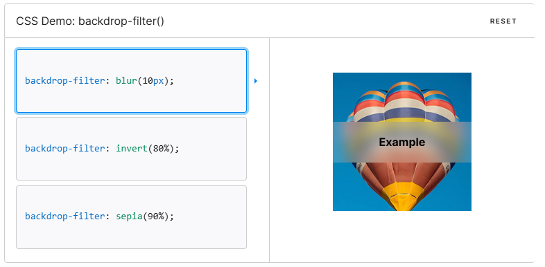
■ backdropfilter
■ border로 말풍선 만들기
- 너비와 높이가 없는 박스에 border를 전체 넣어주고 특정 위치만 색을 다르게 하면 각각의
보더가 들어간것을 확인 할 수 있다.
.box1{
    width: 0;
    height: 0;
    border: 10px solid #ccc;
    border-top: 10px solid #000;
}
- 여러방향 확인하기
<style>

    body{
        margin: 0;
    }
    .wrap{
        width: 300px;
        height: 100px;
        border: 1px solid #000;
        display: flex;
        align-items: center;
        justify-content: space-around;
    }
    .box1{
        width: 0;
        height: 0;
        border: 10px solid #ccc;
        border-top: 10px solid #000;
    }
    .box2{
        width: 0;
        height: 0;
        border: 10px solid #ccc;
        border-left: 10px solid #000;
    }
    .box3{
        width: 0;
        height: 0;
        border: 10px solid #ccc;
        border-right: 10px solid #000;
    }
    .box4{
        width: 0;
        height: 0;
        border: 10px solid #ccc;
        border-bottom: 10px solid #000;
    }
</style>

<body>
    <div class="wrap">
        <div class="box1"></div>
        <div class="box2"></div>
        <div class="box3"></div>
        <div class="box4"></div>
    </div>

</body>

- 말풍선 만들기
<style>

    body{
        margin: 0;
    }
    .wrap{
        width: 400px;
        height: 100px;
        border: 1px solid #000;
        align-content: center;
    }
    .box{
        width: 100px;
        height: 50px;
        margin: 0 auto;
        background-color: #ccc;
        border-radius: 10px;
        position: relative;
    }
    .box::after{
        content: "";
        border: 10px solid transparent;
        border-top: 10px solid #ccc;
        position: absolute;
        top: 100%;
        left: 20%;
    }

</style>

<body>
    <div class="wrap">
        <div class="box"></div>
    </div>

</body>
- 마우스 호버시 말풍선 나오게 만들기

<style>

    body{
        margin: 0;
    }
    .wrap{
        width: 400px;
        height: 100px;
        border: 1px solid #000;
        align-content: center;
    }
    .wrap > i{
        font-size: 60px;
        color: rgb(111, 141, 238);
        cursor: pointer;
        vertical-align: middle;
    }
    .wrap > i:hover + .box{
        display: inline-block;
    }
    .box{
        width: 100px;
        height: 50px;
        display: none;
        align-content: center;
        text-align: center;
        color: #fff;
        margin: 0 auto;
        background-color: rgb(111, 141, 238);
        border-radius: 10px;
        position: relative;
        left: 10px;
        vertical-align: middle;
    }
    .box::after{
        content: "";
        border: 10px solid transparent;
        border-right: 10px solid rgb(111, 141, 238);
        position: absolute;
        top: 50%;
        transform: translateY(-50%);
        right: 100%;
    }

</style>

<body>
    <div class="wrap">
        <i class="fa-brands fa-facebook"></i>
        <div class="box">페이스북</div>
    </div>

</body>
■ 12월 17일 - 5일차

<!DOCTYPE html>
<html lang="en">
<head>
    <meta charset="UTF-8">
    <meta http-equiv="X-UA-Compatible" content="IE=edge">
    <meta name="viewport" content="width=device-width, initial-scale=1.0">
    <title>Document</title>
    <link rel="stylesheet" href="https://cdnjs.cloudflare.com/ajax/libs/font-awesome/7.0.1/css/all.min.css">
    <style>
        :root{
            --pcolor : rgb(226, 105, 49);
        }
        body, h1, h2, h3, h4, p{
            margin: 0;
        }
        img{
            width: 100%; height: 100%; object-fit: cover; display: block;
        }
        .wrap{
            padding: 0 10%;
        }

        nav .nav-top{
            display: flex;
            justify-content: space-between;
            height: 80px;
        }
        nav .icon-w{
            width: 15%;
        }
        nav .search-box{
            display: flex;
            align-items: center;
        }
        nav .search-box img{
            width: 120px; height: 30px;
            margin-right: 20px;
        }

        nav .search{
            position: relative;
        }
        nav .search input{
            height: 35px;
            width: 250px;
            border-radius: 18px;
            padding: 0 30px;
            border-color: var(--pcolor);
            border-style: solid;
            border-width: 3px;
            font-size: 18px;
        }
        nav .search input:focus{
            outline: none;
        }
        nav .search input::placeholder{
            font-size: 14px;
            font-weight: 400;
        }
        nav .search i{
            position: absolute;
            right: 30px; top: 50%; transform: translateY(-50%);
            color: var(--pcolor);
        }


        nav .icon-box{
            display: flex;
            align-items: center;
            justify-content: space-between;
            text-align: center;
        }
        nav .icon-box i{
            font-size: 26px;
            position: relative;
        }
        nav .icon-box i span{
            position: absolute;
            right: -5px;
            top: -5px;
            background-color: var(--pcolor);
            font-size: 10px;
            color: #fff;
            display: inline-block;
            width: 18px;
            aspect-ratio: 1;
            align-content: center;
            border-radius: 50%;
        }
        nav .icon-box p{
            font-size: 13px;
        }

        nav hr{
            border: none;
            height: 1px;
            background-color: #ccc;
            margin-bottom: 0;
        }
        nav .nav-bottom{
            display: flex; justify-content: space-between;
        }
        nav .nav-bottom > div{
            display: flex;
        }
        nav .menu-box{
            align-items: center;
        }
        nav .menu-box .menu.ca{
            padding-right: 30px;
            border-left: 2px solid #ccc;
            border-right: 2px solid #ccc;
        }
        nav .menu-box .menu{
            padding: 10px 20px;
        }
        nav .menu-box .bar{
            width: 2px;
            height: 10px;
            background-color: #ccc;
        }
        nav .menu-box .menu.hl{
            background-color: var(--pcolor);
            color: #fff;
        }
        nav .event{
            gap: 30px;
        }
        nav .event p{
            font-size: 14px;
            height: 100%;
            align-content: center;
        }
        nav .line{
            height: 1px;
            background-color: #000;
        }


        header{
            height: 600px;
            display: flex;
            gap: 20px;
            padding: 30px 0px;
        }
        header .left{
            width: 85%;
            border-radius: 12px;
            overflow: hidden;
            position: relative;
        }
        header .left .text-box{
            position: absolute;
            left: 50px; top: 80px;
            color: #fff;
        }
        header .text-box .pack{
            background-color: #000;
            width: fit-content;
            padding: 5px 10px;
            margin-bottom: 15px;
        }
        header .text-box h1{
            font-size: 42px;
            margin-bottom: 30px;
        }
        header .text-box .more{
            text-decoration: underline;
        }

        header .right{
            width: calc(15% - 20px);
        }

    </style>
</head>
<body>
    <div class="wrap">
        <nav>
            <div class="nav-top">
                <div class="top-box icon-w"></div>
                <div class="search-box">
                    <img src="img1.jpg" alt="">
                    <div class="search">
                        <input type="text" placeholder="인테리어 고민 해결">
                        <i class="fa-solid fa-magnifying-glass"></i>
                    </div>
                </div>
                <div class="icon-box icon-w">
                    <div class="icon">
                        <i class="fa-regular fa-user"></i>
                        <p>마이존</p>
                    </div>
                    <div class="icon">
                        <i class="fa-solid fa-cart-shopping">
                            <span>2</span>
                        </i>
                        <p>장바구니</p>
                    </div>
                    <div class="icon">
                        <i class="fa-regular fa-truck"></i>
                        <p>주문배송</p>
                    </div>
                </div>
            </div>
            <hr>
            <div class="nav-bottom">
                <div class="menu-box">
                    <div class="menu ca">
                        <i class="fa-solid fa-bars"></i>
                        <span>전체 카테고리</span>
                    </div>
                    <div class="menu">
                        리모델링
                    </div>
                    <div class="bar"></div>
                    <div class="menu">
                        인테리어 전문 상담
                    </div>
                    <div class="bar"></div>
                    <div class="menu">
                        매장 통합검색
                    </div>
                    <div class="menu hl">
                        빠른 상담 신청
                    </div>
                </div>
                <div class="event">
                    <p>이벤트</p>
                    <p>미디어</p>
                </div>
            </div>
            <div class="line"></div>
        </nav>
        <header>
            <div class="left">
                <img src="img2.jpg" alt="">
                <div class="text-box">
                    <p class="pack">STYLE PACKAGE</p>
                    <h1>TRENDY STYLE</h1>
                    <p class="more">VIEW MORE</p>
                </div>
                <div class="bottom">
                    <span>1/1</span>
                    <i class="fa-regular fa-circle-pause"></i>
                </div>
                <div class="promotion">
                    <div class="icon">
                        <i class="fa-solid fa-clipboard"></i>
                        <span>Promotion</span>
                    </div>
                    <div class="icon">
                        <i class="fa-solid fa-certificate"></i>
                        <span>Organic</span>
                    </div>
                    <div class="icon">
                        <i class="fa-solid fa-copyright"></i>
                        <span>Soft</span>
                    </div>
                    <div class="icon revers">
                        <i class="fa-solid fa-marker"></i>
                        <span>Trendy</span>
                    </div>
                </div>
            </div>
            <div class="right">
                <h2>트렌디 스타일 패키지
                    <i class="fa-solid fa-angle-right"></i>
                </h2>
                <div class="package">
                    <div class="item">
                        <img src="img3.jpg" alt="">
                        <p>토탈 리모델링</p>
                    </div>
                    <div class="item">
                        <img src="img3.jpg" alt="">
                        <p>욕실</p>
                    </div>
                    <div class="item">
                        <img src="img3.jpg" alt="">
                        <p>거실</p>
                    </div>
                    <div class="item">
                        <img src="img3.jpg" alt="">
                        <p>침실</p>
                    </div>
                    <div class="item">
                        <img src="img3.jpg" alt="">
                        <p>현관</p>
                    </div>
                    <div class="item">
                        <img src="img3.jpg" alt="">
                        <p>윈도우</p>
                    </div>
                </div>
            </div>
        </header>
    </div>
</body>
</html>
■ 12월 18일 - 6일차

<!DOCTYPE html>
<html lang="en">
<head>
<meta charset="UTF-8">
<meta http-equiv="X-UA-Compatible" content="IE=edge">
<meta name="viewport" content="width=device-width, initial-scale=1.0">
<title>Document</title>
<link rel="stylesheet" href="https://cdnjs.cloudflare.com/ajax/libs/font-awesome/7.0.1/css/all.min.css">
<style>
:root{
--pcolor : rgb(226, 105, 49);
}
body, h1, h2, h3, h4, p{
margin: 0;
}
img{
width: 100%; height: 100%; object-fit: cover; display: block;
}
.wrap{
padding: 0 10%;
}
nav .nav-top{
display: flex;
justify-content: space-between;
height: 80px;
}
nav .icon-w{
width: 15%;
}
nav .search-box{
display: flex;
align-items: center;
}
nav .search-box img{
width: 120px; height: 30px;
margin-right: 20px;
}
nav .search{
position: relative;
}
nav .search input{
height: 35px;
width: 250px;
border-radius: 18px;
padding: 0 30px;
border-color: var(--pcolor);
border-style: solid;
border-width: 3px;
font-size: 18px;
}
nav .search input:focus{
outline: none;
}
nav .search input::placeholder{
font-size: 14px;
font-weight: 400;
}
nav .search i{
position: absolute;
right: 30px; top: 50%; transform: translateY(-50%);
color: var(--pcolor);
}
nav .icon-box{
display: flex;
align-items: center;
justify-content: space-between;
text-align: center;
}
nav .icon-box i{
font-size: 26px;
position: relative;
}
nav .icon-box i span{
position: absolute;
right: -5px;
top: -5px;
background-color: var(--pcolor);
font-size: 10px;
color: #fff;
display: inline-block;
width: 18px;
aspect-ratio: 1;
align-content: center;
border-radius: 50%;
}
nav .icon-box p{
font-size: 13px;
}
nav hr{
border: none;
height: 1px;
background-color: #ccc;
margin-bottom: 0;
}
nav .nav-bottom{
display: flex; justify-content: space-between;
}
nav .nav-bottom > div{
display: flex;
}
nav .menu-box{
align-items: center;
}
nav .menu-box .menu.ca{
padding-right: 30px;
border-left: 2px solid #ccc;
border-right: 2px solid #ccc;
}
nav .menu-box .menu{
padding: 10px 20px;
}
nav .menu-box .bar{
width: 2px;
height: 10px;
background-color: #ccc;
}
nav .menu-box .menu.hl{
background-color: var(--pcolor);
color: #fff;
}
nav .event{
gap: 30px;
}
nav .event p{
font-size: 14px;
height: 100%;
align-content: center;
}
nav .line{
height: 1px;
background-color: #000;
}
header{
height: 500px;
display: flex;
gap: 20px;
padding: 30px 0px;
}
header .left{
width: 75%;
border-radius: 12px;
overflow: hidden;
position: relative;
}
header .left .text-box{
position: absolute;
left: 50px; top: 80px;
color: #fff;
}
header .text-box .pack{
background-color: #000;
width: fit-content;
padding: 5px 10px;
margin-bottom: 15px;
}
header .text-box h1{
font-size: 42px;
margin-bottom: 30px;
}
header .text-box .more{
text-decoration: underline;
}
header .left .bottom{
position: absolute;
bottom: 0;
background-color: var(--pcolor);
width: 100%; height: 50px;
padding: 0 40px; box-sizing: border-box;
align-content: center; text-align: end;
color: #fff;
}
header .left .bottom i{
margin-left: 14px;
font-size: 18px;
}
header .left .promotion{
position: absolute; left: 40px; bottom: 0;
background-color: var(--pcolor); color: #fff;
display: flex;
box-shadow: -1px -1px 4px #0004;
}
header .left .promotion .icon{
width: 100px; height: 100px;
padding-left: 20px;
display: flex; flex-direction: column; justify-content: center;
}
header .left .promotion .revers{
background-color: #fff; color: var(--pcolor);
}
header .promotion i{
font-size: 24px;
}
header .right{
width: calc(25% - 20px);
padding: 0 30px; box-sizing: border-box;
align-content: center;
border-radius: 20px;
box-shadow: 2px 2px 20px #0002;
}
header .right h2{
font-size: 22px;
margin-bottom: 12px;
}
header .right .package{
display: flex; gap: 20px 20px; flex-wrap: wrap;
}
header .right .package .item{
width: calc((100% - 20px)/2);
text-align: center;
}
header .right .package .item img{
height: 100px;
border-radius: 10px;
margin-bottom: 6px;
}
.s1{
padding: 30px;
background-color: #0001;
border-radius: 10px;
}
.s1 .container{
display: flex; gap: 30px;
}
.s1 .container .left{
width: fit-content;
white-space: nowrap;
padding: 40px 30px;
background-color: #fff;
border-radius: 10px;
}
.s1 .container .left h3{
margin-bottom: 12px;
}
.s1 .container .left p:nth-child(2){
margin-bottom: 30px;
font-size: 14px;
color: #666;
}
.s1 .container .left .more{
font-size: 14px;
}
.s1 .container .left .more span{
margin-right: 10px;
text-decoration: underline;
}
.s1 .container .left .more i{
color: #e6c617;
}
.s1 .container .right{
display: flex; justify-content: space-between;
position: relative;
}
.s1 .container .right .item{
width: calc((100% - 40px)/3);
border-radius: 10px;
overflow: hidden;
cursor: pointer;
}
.s1 .container .right .item .img-box{
height: 250px;
overflow: hidden;
}
.s1 .container .right .item .img-box img{
transition: 0.8s;
}
.s1 .container .right .item:hover img{
scale: 1.2;
}
.s1 .container .right .item .text-box{
padding: 12px 14px;
background-color: #fff;
}
.s1 .container .right .item .text-box span:nth-child(1){
color: var(--pcolor);
font-size: 12px;
padding: 1px 8px;
border: 2px solid var(--pcolor);
border-radius: 12px;
display: inline-block;
margin-bottom: 4px;
}
.s1 .container .right .item .text-box span:nth-child(3){
font-weight: 600;
}
.s1 .container .right .button{
position: absolute; left: 50%; top: 50%;
transform: translate(-50%, -50%);
color: var(--pcolor);
font-size: 32px;
width: 105%;
display: flex;
justify-content: space-between;
}
.s2{
padding: 30px 0;
}
.s2 .top{
display: flex; justify-content: space-between;
margin-bottom: 22px;
}
.s2 .top h2{
font-size: 22px;
}
.s2 .top h2 span{
font-size: 16px;
color: #999;
padding-left: 8px;
}
.s2 .top p span{
font-size: 14px;
text-decoration: underline;
padding-right: 8px;
}
.s2 .top p i{
color: #e6c617;
}
.s2 .bottom{
display: flex; flex-wrap: wrap; gap: 30px;
}
.s2 .bottom .item{
width: calc((100% - 90px)/4);
}
.s2 .bottom .item img{
height: 200px;
border-radius: 10px;
margin-bottom: 8px;
}
.s2 .bottom .item p{
padding-left: 5px;
font-weight: 600;
}
</style>
</head>
<body>
<div class="wrap">
<nav>
<div class="nav-top">
<div class="top-box icon-w"></div>
<div class="search-box">
<img src="img1.jpg" alt="">
<div class="search">
<input type="text" placeholder="인테리어 고민 해결">
<i class="fa-solid fa-magnifying-glass"></i>
</div>
</div>
<div class="icon-box icon-w">
<div class="icon">
<i class="fa-regular fa-user"></i>
<p>마이존</p>
</div>
<div class="icon">
<i class="fa-solid fa-cart-shopping">
<span>2</span>
</i>
<p>장바구니</p>
</div>
<div class="icon">
<i class="fa-regular fa-truck"></i>
<p>주문배송</p>
</div>
</div>
</div>
<hr>
<div class="nav-bottom">
<div class="menu-box">
<div class="menu ca">
<i class="fa-solid fa-bars"></i>
<span>전체 카테고리</span>
</div>
<div class="menu">
리모델링
</div>
<div class="bar"></div>
<div class="menu">
인테리어 전문 상담
</div>
<div class="bar"></div>
<div class="menu">
매장 통합검색
</div>
<div class="menu hl">
빠른 상담 신청
</div>
</div>
<div class="event">
<p>이벤트</p>
<p>미디어</p>
</div>
</div>
<div class="line"></div>
</nav>
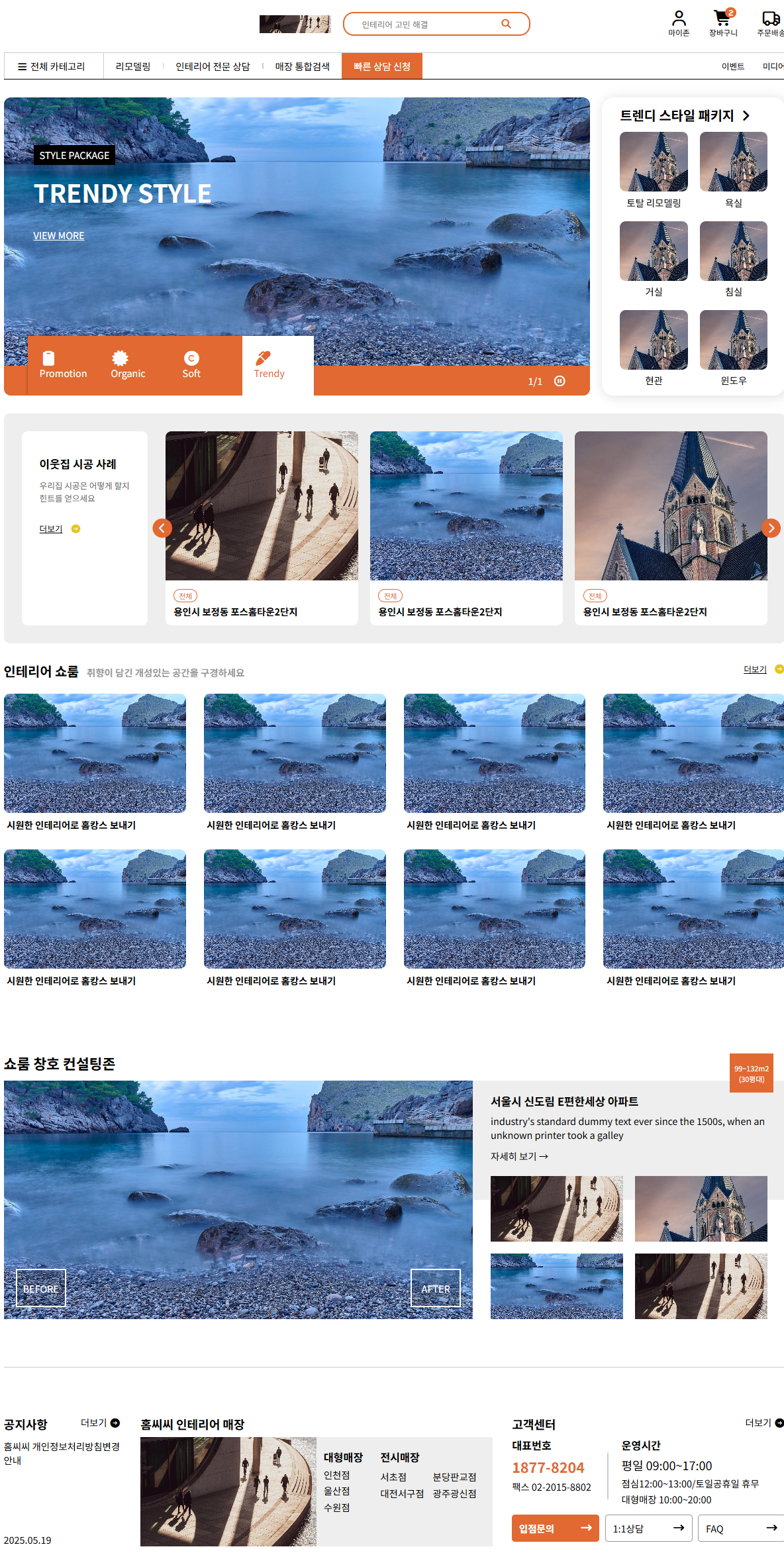
<header>
<div class="left">
<img src="img2.jpg" alt="">
<div class="text-box">
<p class="pack">STYLE PACKAGE</p>
<h1>TRENDY STYLE</h1>
<p class="more">VIEW MORE</p>
</div>
<div class="bottom">
<span>1/1</span>
<i class="fa-regular fa-circle-pause"></i>
</div>
<div class="promotion">
<div class="icon">
<i class="fa-solid fa-clipboard"></i>
<span>Promotion</span>
</div>
<div class="icon">
<i class="fa-solid fa-certificate"></i>
<span>Organic</span>
</div>
<div class="icon">
<i class="fa-solid fa-copyright"></i>
<span>Soft</span>
</div>
<div class="icon revers">
<i class="fa-solid fa-marker"></i>
<span>Trendy</span>
</div>
</div>
</div>
<div class="right">
<h2>트렌디 스타일 패키지
<i class="fa-solid fa-angle-right"></i>
</h2>
<div class="package">
<div class="item">
<img src="img3.jpg" alt="">
<p>토탈 리모델링</p>
</div>
<div class="item">
<img src="img3.jpg" alt="">
<p>욕실</p>
</div>
<div class="item">
<img src="img3.jpg" alt="">
<p>거실</p>
</div>
<div class="item">
<img src="img3.jpg" alt="">
<p>침실</p>
</div>
<div class="item">
<img src="img3.jpg" alt="">
<p>현관</p>
</div>
<div class="item">
<img src="img3.jpg" alt="">
<p>윈도우</p>
</div>
</div>
</div>
</header>
<main>
<section class="s1">
<div class="container">
<div class="left">
<h3>이웃집 시공 사례</h3>
<p>우리집 시공은 어떻게 할지<br>힌트를 얻으세요</p>
<p class="more">
<span>더보기</span>
<i class="fa-solid fa-circle-arrow-right"></i>
</p>
</div>
<div class="right">
<div class="item">
<div class="img-box">
<img src="img1.jpg" alt="">
</div>
<div class="text-box">
<span>전체</span>
<br><span>용인시 보정동 포스홈타운2단지</span>
</div>
</div>
<div class="item">
<div class="img-box">
<img src="img2.jpg" alt="">
</div>
<div class="text-box">
<span>전체</span>
<br><span>용인시 보정동 포스홈타운2단지</span>
</div>
</div>
<div class="item">
<div class="img-box">
<img src="img3.jpg" alt="">
</div>
<div class="text-box">
<span>전체</span>
<br><span>용인시 보정동 포스홈타운2단지</span>
</div>
</div>
<div class="button">
<i class="fa-solid fa-circle-chevron-left"></i>
<i class="fa-solid fa-circle-chevron-right"></i>
</div>
</div>
</div>
</section>
<section class="s2">
<div class="top">
<h2>
인테리어 쇼룸
<span>취향이 담긴 개성있는 공간을 구경하세요</span>
</h2>
<p>
<span>더보기</span>
<i class="fa-solid fa-circle-arrow-right"></i>
</p>
</div>
<div class="bottom">
<div class="item">
<img src="img2.jpg" alt="">
<p>시원한 인테리어로 홈캉스 보내기</p>
</div>
<div class="item">
<img src="img2.jpg" alt="">
<p>시원한 인테리어로 홈캉스 보내기</p>
</div>
<div class="item">
<img src="img2.jpg" alt="">
<p>시원한 인테리어로 홈캉스 보내기</p>
</div>
<div class="item">
<img src="img2.jpg" alt="">
<p>시원한 인테리어로 홈캉스 보내기</p>
</div>
<div class="item">
<img src="img2.jpg" alt="">
<p>시원한 인테리어로 홈캉스 보내기</p>
</div>
<div class="item">
<img src="img2.jpg" alt="">
<p>시원한 인테리어로 홈캉스 보내기</p>
</div>
<div class="item">
<img src="img2.jpg" alt="">
<p>시원한 인테리어로 홈캉스 보내기</p>
</div>
<div class="item">
<img src="img2.jpg" alt="">
<p>시원한 인테리어로 홈캉스 보내기</p>
</div>
</div>
</section>
</main>
</div>
</body>
</html>
■ 12월 22일 - 6일차
<!DOCTYPE html>
<html lang="en">
<head>
<meta charset="UTF-8">
<meta http-equiv="X-UA-Compatible" content="IE=edge">
<meta name="viewport" content="width=device-width, initial-scale=1.0">
<title>Document</title>
<link rel="stylesheet" href="https://cdnjs.cloudflare.com/ajax/libs/font-awesome/7.0.1/css/all.min.css">
<style>
:root{
--pcolor : rgb(226, 105, 49);
}
body, h1, h2, h3, h4, p{
margin: 0;
}
img{
width: 100%; height: 100%; object-fit: cover; display: block;
}
.wrap{
padding: 0 10%;
}
nav .nav-top{
display: flex;
justify-content: space-between;
height: 80px;
}
nav .icon-w{
width: 15%;
}
nav .search-box{
display: flex;
align-items: center;
}
nav .search-box img{
width: 120px; height: 30px;
margin-right: 20px;
}
nav .search{
position: relative;
}
nav .search input{
height: 35px;
width: 250px;
border-radius: 18px;
padding: 0 30px;
border-color: var(--pcolor);
border-style: solid;
border-width: 3px;
font-size: 18px;
}
nav .search input:focus{
outline: none;
}
nav .search input::placeholder{
font-size: 14px;
font-weight: 400;
}
nav .search i{
position: absolute;
right: 30px; top: 50%; transform: translateY(-50%);
color: var(--pcolor);
}
nav .icon-box{
display: flex;
align-items: center;
justify-content: space-between;
text-align: center;
}
nav .icon-box i{
font-size: 26px;
position: relative;
}
nav .icon-box i span{
position: absolute;
right: -5px;
top: -5px;
background-color: var(--pcolor);
font-size: 10px;
color: #fff;
display: inline-block;
width: 18px;
aspect-ratio: 1;
align-content: center;
border-radius: 50%;
}
nav .icon-box p{
font-size: 13px;
}
nav hr{
border: none;
height: 1px;
background-color: #ccc;
margin-bottom: 0;
}
nav .nav-bottom{
display: flex; justify-content: space-between;
}
nav .nav-bottom > div{
display: flex;
}
nav .menu-box{
align-items: center;
}
nav .menu-box .menu.ca{
padding-right: 30px;
border-left: 2px solid #ccc;
border-right: 2px solid #ccc;
}
nav .menu-box .menu{
padding: 10px 20px;
}
nav .menu-box .bar{
width: 2px;
height: 10px;
background-color: #ccc;
}
nav .menu-box .menu.hl{
background-color: var(--pcolor);
color: #fff;
}
nav .event{
gap: 30px;
}
nav .event p{
font-size: 14px;
height: 100%;
align-content: center;
}
nav .line{
height: 1px;
background-color: #000;
}
header{
height: 500px;
display: flex;
gap: 20px;
padding: 30px 0px;
}
header .left{
width: 75%;
border-radius: 12px;
overflow: hidden;
position: relative;
}
header .left .text-box{
position: absolute;
left: 50px; top: 80px;
color: #fff;
}
header .text-box .pack{
background-color: #000;
width: fit-content;
padding: 5px 10px;
margin-bottom: 15px;
}
header .text-box h1{
font-size: 42px;
margin-bottom: 30px;
}
header .text-box .more{
text-decoration: underline;
}
header .left .bottom{
position: absolute;
bottom: 0;
background-color: var(--pcolor);
width: 100%; height: 50px;
padding: 0 40px; box-sizing: border-box;
align-content: center; text-align: end;
color: #fff;
}
header .left .bottom i{
margin-left: 14px;
font-size: 18px;
}
header .left .promotion{
position: absolute; left: 40px; bottom: 0;
background-color: var(--pcolor); color: #fff;
display: flex;
box-shadow: -1px -1px 4px #0004;
}
header .left .promotion .icon{
width: 100px; height: 100px;
padding-left: 20px;
display: flex; flex-direction: column; justify-content: center;
}
header .left .promotion .revers{
background-color: #fff; color: var(--pcolor);
}
header .promotion i{
font-size: 24px;
}
header .right{
width: calc(25% - 20px);
padding: 0 30px; box-sizing: border-box;
align-content: center;
border-radius: 20px;
box-shadow: 2px 2px 20px #0002;
}
header .right h2{
font-size: 22px;
margin-bottom: 12px;
}
header .right .package{
display: flex; gap: 20px 20px; flex-wrap: wrap;
}
header .right .package .item{
width: calc((100% - 20px)/2);
text-align: center;
}
header .right .package .item img{
height: 100px;
border-radius: 10px;
margin-bottom: 6px;
}
.s1{
padding: 30px;
background-color: #0001;
border-radius: 10px;
}
.s1 .container{
display: flex; gap: 30px;
}
.s1 .container .left{
width: fit-content;
white-space: nowrap;
padding: 40px 30px;
background-color: #fff;
border-radius: 10px;
}
.s1 .container .left h3{
margin-bottom: 12px;
}
.s1 .container .left p:nth-child(2){
margin-bottom: 30px;
font-size: 14px;
color: #666;
}
.s1 .container .left .more{
font-size: 14px;
}
.s1 .container .left .more span{
margin-right: 10px;
text-decoration: underline;
}
.s1 .container .left .more i{
color: #e6c617;
}
.s1 .container .right{
width: 100%;
display: flex; justify-content: space-between;
position: relative;
}
.s1 .container .right .item{
width: calc((100% - 40px)/3);
border-radius: 10px;
overflow: hidden;
cursor: pointer;
}
.s1 .container .right .item .img-box{
height: 250px;
overflow: hidden;
}
.s1 .container .right .item .img-box img{
transition: 0.8s;
}
.s1 .container .right .item:hover img{
scale: 1.2;
}
.s1 .container .right .item .text-box{
padding: 12px 14px;
background-color: #fff;
}
.s1 .container .right .item .text-box span:nth-child(1){
color: var(--pcolor);
font-size: 12px;
padding: 1px 8px;
border: 2px solid var(--pcolor);
border-radius: 12px;
display: inline-block;
margin-bottom: 4px;
}
.s1 .container .right .item .text-box span:nth-child(3){
font-weight: 600;
}
.s1 .container .right .button{
position: absolute; left: 50%; top: 50%;
transform: translate(-50%, -50%);
color: var(--pcolor);
font-size: 32px;
width: 105%;
display: flex;
justify-content: space-between;
}
.s2{
padding: 30px 0;
}
.s2 .top{
display: flex; justify-content: space-between;
margin-bottom: 22px;
}
.s2 .top h2{
font-size: 22px;
}
.s2 .top h2 span{
font-size: 16px;
color: #999;
padding-left: 8px;
}
.s2 .top p span{
font-size: 14px;
text-decoration: underline;
padding-right: 8px;
}
.s2 .top p i{
color: #e6c617;
}
.s2 .bottom{
display: flex; flex-wrap: wrap; gap: 30px;
}
.s2 .bottom .item{
width: calc((100% - 90px)/4);
}
.s2 .bottom .item img{
height: 200px;
border-radius: 10px;
margin-bottom: 8px;
}
.s2 .bottom .item p{
padding-left: 5px;
font-weight: 600;
}
.s3{
padding: 80px 0;
}
.s3 > h2{
margin-bottom: 12px;
}
.s3 > .container{
display: flex;
height: 400px;
position: relative;
}
.s3 .container .left{
width: 60%;
position: relative;
}
.s3 .container .left .bt{
position: absolute;
bottom: 20px;
width: 80px; height: 60px;
text-align: center; align-content: center;
color: #fff;
background-color: #0002;
border: 3px solid #fff;
}
.s3 .container .left .before{
left: 20px;
}
.s3 .container .left .after{
right: 20px;
}
.s3 .container .right{
width: 40%;
}
.s3 .container .right > .box{
height: 50%;
position: relative;
}
.s3 .container .right .box:nth-child(1){
background-color: #eee;
box-sizing: border-box;
padding: 20px 30px 0px;
}
.s3 .container .right .box h3{
margin-bottom: 8px;
}
.s3 .container .right .box p:nth-child(2){
margin-bottom: 12px;
}
.s3 .right .box > .container{
position: absolute;
left: 30px; top: -20%;
width: calc(100% - 60px); height: 120%;
display: flex;
flex-wrap: wrap; gap: 20px;
}
.s3 .right .box > .container img{
width: calc((100% - 20px)/2);
height: calc((100% - 20px)/2);
}
.s3 > .container .button{
position: absolute;
right: 20px; bottom: calc(100% - 20px);
background-color: var(--pcolor);
color: #fff; font-size: 12px;
padding: 15px 8px; text-align: center;
}
main .line{
height: 1px;
background-color: #ccc;
}
.s4{
padding: 80px 0;
display: flex;
justify-content: space-between;
height: 220px;
}
.s4 .head{
display: flex;
justify-content: space-between;
}
.s4 h3,
.s4 .head span:nth-child(1){
font-size: 20px;
font-weight: 600;
}
.s4 h3, .s4 .head{
margin-bottom: 8px;
}
.s4 img{
height: calc(220px - 29px - 8px);
}
.s4 span.title{
display: inline-block;
width: 100%;
font-weight: 600;
font-size: 18px;
margin-bottom: 6px;
}
.s4 .left{
width: 15%;
display: flex;
flex-direction: column;
justify-content: space-between;
}
.s4 .left p:nth-child(2){
height: 70%;
}
.s4 .center{
width: 45%;
}
.s4 .center .container{
display: flex;
}
.s4 .center .container .item{
width: 50%;
}
.s4 .center .container .item:nth-child(2){
box-sizing: border-box;
padding: 20px 12px 0px;
background-color: #eee;
display: flex;
justify-content: space-between;
}
.s4 .center .container .item .item-left{
width: 30%;
}
.s4 .item-left span{
display: inline-block;
margin-bottom: 4px;
width: 100%;
}
.s4 .center .container .item .item-right{
width: 65%;
}
.s4 .item-right span{
display: inline-block;
width: 48%;
margin-bottom: 4px;
}
.s4 .item-right .title{
width: 100%;
margin-bottom: 8px;
}
.s4 .right{
width: 35%;
}
.s4 .right .container{
display: flex;
justify-content: space-between;
align-items: center;
height: 130px;
}
.s4 .right .container .con-l{
width: 30%;
height: 100%;
}
.s4 .right .container .line{
width: 2px;
height: 60%;
background-color: #ccc;
}
.s4 .right .container .con-r{
width: 60%;
height: 100%;
}
.s4 .right .container .tel{
color: var(--pcolor);
font-size: 24px;
font-weight: 600;
display: inline-block;
width: 100%;
margin-bottom: 4px;
}
.s4 .right .container .day{
font-size: 20px;
display: inline-block;
width: 100%;
margin-bottom: 4px;
}
.s4 .right .container .week{
display: inline-block;
width: 100%;
margin-bottom: 3px;
}
.s4 .right .faq{
display: flex;
justify-content: space-between;
}
.s4 .right .faq .bt{
width: 32%;
box-sizing: border-box;
padding: 10px 12px;
border: 2px solid #0006;
border-radius: 5px;
display: flex; justify-content: space-between;
align-items: center;
}
.s4 .right .faq .bt.hl{
background-color: var(--pcolor);
border: none;
color: #fff;
font-weight: 600;
}
</style>
</head>
<body>
<div class="wrap">
<nav>
<div class="nav-top">
<div class="top-box icon-w"></div>
<div class="search-box">
<img src="img1.jpg" alt="">
<div class="search">
<input type="text" placeholder="인테리어 고민 해결">
<i class="fa-solid fa-magnifying-glass"></i>
</div>
</div>
<div class="icon-box icon-w">
<div class="icon">
<i class="fa-regular fa-user"></i>
<p>마이존</p>
</div>
<div class="icon">
<i class="fa-solid fa-cart-shopping">
<span>2</span>
</i>
<p>장바구니</p>
</div>
<div class="icon">
<i class="fa-regular fa-truck"></i>
<p>주문배송</p>
</div>
</div>
</div>
<hr>
<div class="nav-bottom">
<div class="menu-box">
<div class="menu ca">
<i class="fa-solid fa-bars"></i>
<span>전체 카테고리</span>
</div>
<div class="menu">
리모델링
</div>
<div class="bar"></div>
<div class="menu">
인테리어 전문 상담
</div>
<div class="bar"></div>
<div class="menu">
매장 통합검색
</div>
<div class="menu hl">
빠른 상담 신청
</div>
</div>
<div class="event">
<p>이벤트</p>
<p>미디어</p>
</div>
</div>
<div class="line"></div>
</nav>
<header>
<div class="left">
<img src="img2.jpg" alt="">
<div class="text-box">
<p class="pack">STYLE PACKAGE</p>
<h1>TRENDY STYLE</h1>
<p class="more">VIEW MORE</p>
</div>
<div class="bottom">
<span>1/1</span>
<i class="fa-regular fa-circle-pause"></i>
</div>
<div class="promotion">
<div class="icon">
<i class="fa-solid fa-clipboard"></i>
<span>Promotion</span>
</div>
<div class="icon">
<i class="fa-solid fa-certificate"></i>
<span>Organic</span>
</div>
<div class="icon">
<i class="fa-solid fa-copyright"></i>
<span>Soft</span>
</div>
<div class="icon revers">
<i class="fa-solid fa-marker"></i>
<span>Trendy</span>
</div>
</div>
</div>
<div class="right">
<h2>트렌디 스타일 패키지
<i class="fa-solid fa-angle-right"></i>
</h2>
<div class="package">
<div class="item">
<img src="img3.jpg" alt="">
<p>토탈 리모델링</p>
</div>
<div class="item">
<img src="img3.jpg" alt="">
<p>욕실</p>
</div>
<div class="item">
<img src="img3.jpg" alt="">
<p>거실</p>
</div>
<div class="item">
<img src="img3.jpg" alt="">
<p>침실</p>
</div>
<div class="item">
<img src="img3.jpg" alt="">
<p>현관</p>
</div>
<div class="item">
<img src="img3.jpg" alt="">
<p>윈도우</p>
</div>
</div>
</div>
</header>
<main>
<section class="s1">
<div class="container">
<div class="left">
<h3>이웃집 시공 사례</h3>
<p>우리집 시공은 어떻게 할지<br>힌트를 얻으세요</p>
<p class="more">
<span>더보기</span>
<i class="fa-solid fa-circle-arrow-right"></i>
</p>
</div>
<div class="right">
<div class="item">
<div class="img-box">
<img src="img1.jpg" alt="">
</div>
<div class="text-box">
<span>전체</span>
<br><span>용인시 보정동 포스홈타운2단지</span>
</div>
</div>
<div class="item">
<div class="img-box">
<img src="img2.jpg" alt="">
</div>
<div class="text-box">
<span>전체</span>
<br><span>용인시 보정동 포스홈타운2단지</span>
</div>
</div>
<div class="item">
<div class="img-box">
<img src="img3.jpg" alt="">
</div>
<div class="text-box">
<span>전체</span>
<br><span>용인시 보정동 포스홈타운2단지</span>
</div>
</div>
<div class="button">
<i class="fa-solid fa-circle-chevron-left"></i>
<i class="fa-solid fa-circle-chevron-right"></i>
</div>
</div>
</div>
</section>
<section class="s2">
<div class="top">
<h2>
인테리어 쇼룸
<span>취향이 담긴 개성있는 공간을 구경하세요</span>
</h2>
<p>
<span>더보기</span>
<i class="fa-solid fa-circle-arrow-right"></i>
</p>
</div>
<div class="bottom">
<div class="item">
<img src="img2.jpg" alt="">
<p>시원한 인테리어로 홈캉스 보내기</p>
</div>
<div class="item">
<img src="img2.jpg" alt="">
<p>시원한 인테리어로 홈캉스 보내기</p>
</div>
<div class="item">
<img src="img2.jpg" alt="">
<p>시원한 인테리어로 홈캉스 보내기</p>
</div>
<div class="item">
<img src="img2.jpg" alt="">
<p>시원한 인테리어로 홈캉스 보내기</p>
</div>
<div class="item">
<img src="img2.jpg" alt="">
<p>시원한 인테리어로 홈캉스 보내기</p>
</div>
<div class="item">
<img src="img2.jpg" alt="">
<p>시원한 인테리어로 홈캉스 보내기</p>
</div>
<div class="item">
<img src="img2.jpg" alt="">
<p>시원한 인테리어로 홈캉스 보내기</p>
</div>
<div class="item">
<img src="img2.jpg" alt="">
<p>시원한 인테리어로 홈캉스 보내기</p>
</div>
</div>
</section>
<section class="s3">
<h2>쇼룸 창호 컨설팅존</h2>
<div class="container">
<div class="left">
<img src="img2.jpg" alt="">
<div class="bt before">BEFORE</div>
<div class="bt after">AFTER</div>
</div>
<div class="right">
<div class="box">
<h3>서울시 신도림 E편한세상 아파트</h3>
<p>industry's standard dummy text ever since the 1500s, when an unknown printer took a galley</p>
<p>자세히 보기 →</p>
</div>
<div class="box">
<div class="container">
<img src="img1.jpg" alt="">
<img src="img3.jpg" alt="">
<img src="img2.jpg" alt="">
<img src="img1.jpg" alt="">
</div>
</div>
</div>
<div class="button">
<span>99~132m2</span>
<br>
<span>(30평대)</span>
</div>
</div>
</section>
<div class="line"></div>
<section class="s4">
<div class="left">
<div class="head">
<span>공지사항</span>
<span>더보기
<i class="fa-solid fa-circle-arrow-right"></i>
</span>
</div>
<p>홈씨씨 개인정보처리방침변경 안내</p>
<p>2025.05.19</p>
</div>
<div class="center">
<h3>홈씨씨 인테리어 매장</h3>
<div class="container">
<div class="item">
<img src="img1.jpg" alt="">
</div>
<div class="item">
<div class="item-left">
<span class="title">대형매장</span>
<span>인천점</span>
<span>울산점</span>
<span>수원점</span>
</div>
<div class="item-right">
<span class="title">전시매장</span>
<span>서초점</span>
<span>분당판교점</span>
<span>대전서구점</span>
<span>광주광신점</span>
</div>
</div>
</div>
</div>
<div class="right">
<div class="head">
<span>고객센터</span>
<span>더보기
<i class="fa-solid fa-circle-arrow-right"></i>
</span>
</div>
<div class="container">
<div class="con-l">
<span class="title">대표번호</span>
<span class="tel">1877-8204</span>
<span class="fax">팩스 02-2015-8802</span>
</div>
<div class="line"></div>
<div class="con-r">
<span class="title">운영시간</span>
<span class="day">평일 09:00~17:00</span>
<span class="week">점심12:00~13:00/토일공휴일 휴무</span>
<span class="week">대형매장 10:00~20:00</span>
</div>
</div>
<div class="faq">
<div class="bt hl">
<span>입점문의</span>
<i class="fa-solid fa-arrow-right-long"></i>
</div>
<div class="bt">
<span>1:1상담</span>
<i class="fa-solid fa-arrow-right-long"></i>
</div>
<div class="bt">
<span>FAQ</span>
<i class="fa-solid fa-arrow-right-long"></i>
</div>
</div>
</div>
</section>
</main>
</div>
</body>
</html>
■ 12월 23일 - 7일차
<!DOCTYPE html>
<html lang="en">
<head>
    <meta charset="UTF-8">
    <meta http-equiv="X-UA-Compatible" content="IE=edge">
    <meta name="viewport" content="width=device-width, initial-scale=1.0">
    <title>Document</title>
    <link rel="stylesheet" href="https://cdnjs.cloudflare.com/ajax/libs/font-awesome/7.0.1/css/all.min.css">
    <style>
        body, h1, h2, h3, h4, p{
            margin: 0;
        }
        ul{
            padding: 0;
            margin: 0;
            list-style: none;
        }
        button{
            background-color: transparent;
        }
        img{
            width: 100%; height: 100%; object-fit: cover; display: block;
        }
        header{
            padding: 0 80px;
            height: 700px;
            background-image: url(img1.jpg);
            background-size: cover;
            color: #fff;
            text-transform: uppercase;
        }
        nav{
            position: relative;
            margin-bottom: 250px;
        }
        nav .menu{
            height: 100px;
            display: flex;
            justify-content: center;
        }
        nav .menu > li{
            height: 100%;
            align-content: center;
            padding: 0 15px;
            cursor: pointer;
        }
        nav .menu > li:hover{
            background-color: #0006;
        }
        nav .logo{
            position: absolute;  left: 0;  top: 50%;
            transform: translateY(-50%);
            font-size: 36px; font-weight: 600;
        }
        nav .support{
            position: absolute; right: 0; top: 50%;
            transform: translateY(-50%);
            display: flex; align-items: center;
        }
        nav .support button{
            color: #fff;
            border: 1px solid #fff;
            background-color: #0004;
            border-radius: 20px;
            padding: 6px 8px;
            font-size: 16px; text-transform: uppercase;
            font-weight: 600;
            margin-right: 20px;
        }
        nav .support p{
            font-weight: 600;
            text-shadow: 1px 1px 2px #0005;
            margin-right: 30px;
        }
        nav .support > i{
            font-size: 24px;
        }
        header .text-box h1{
            font-size: 44px;
            margin-bottom: 12px;
        }
        header .text-box p{
            text-transform: capitalize;
            margin-bottom: 32px;
        }
        header .text-box button{
            border: 1px solid #fff;
            color: #fff;
            padding: 12px 18px;
            border-radius: 20px;
            font-size: 16px; text-transform: capitalize;
        }
        main{
            padding: 50px; box-sizing: border-box;
        }
        .s1{
            display: flex;
            justify-content: space-between;
        }
        .s1 .item{
            width: 49.5%;
            position: relative;
            overflow: hidden;
        }
        .s1 .item img{
            width: 100%;
            height: 250px;
            object-fit: cover;
            transition: 1s;
        }
        .s1 .item:hover img{
            scale: 1.2;
        }
        .s1 .item h2{
            position: absolute;
            bottom: 30px; left: 15px;
            text-transform: capitalize; color: #fff;
        }
        .s2{
            padding: 80px 0;
        }
        .s2 h2{
            font-size: 40px;
            text-transform: uppercase;
            margin-bottom: 20px;
            text-align: center;
        }
        .s2 p{
            width: 55%;
            margin: 0 auto;
            text-align: center;
            font-size: 14px;
        }
    </style>
</head>
<body>
    <div class="wrap">
        <header>
            <nav>
                <ul class="menu">
                    <li>motorcyclese</li>
                    <li>cycling</li>
                    <li>outdoor</li>
                    <li>marine</li>
                    <li>stories</li>
                    <li>coolaborations</li>
                </ul>
                <div class="logo">SENA</div>
                <div class="support">
                    <button>
                        <i class="fa-solid fa-suitcase"></i>
                        store
                    </button>
                    <p>support</p>
                    <i class="fa-solid fa-magnifying-glass"></i>
                </div>
            </nav>
            <div class="text-box">
                <h1>S1</h1>
                <p>There are many variations of passages of Lorem Ipsum available</p>
                <button class="more">
                    learn more
                    <i class="fa-solid fa-angle-right"></i>
                </button>
            </div>
        </header>
        <main>
            <section class="s1">
                <div class="item">
                    <img src="img2.jpg" alt="">
                    <h2>popular belief</h2>
                </div>
                <div class="item">
                    <img src="img2.jpg" alt="">
                    <h2> not simply random</h2>
                </div>
            </section>
            <section class="s2">
                <h2>Richard McClintock, a Latin professor at<br> Hampden-Sydney College in Virginia</h2>
                <p>Hampden-Sydney College in Virginia, looked up one of the more obscure Latin words, consectetur, from a Lorem Ipsum passage, and going through the cites of the word</p>
            </section>
        </main>
    </div>
</body>
</html>
■ 12월 24일 - 8일차
<!DOCTYPE html>
<html lang="en">
<head>
<meta charset="UTF-8">
<meta http-equiv="X-UA-Compatible" content="IE=edge">
<meta name="viewport" content="width=device-width, initial-scale=1.0">
<title>Document</title>
<link rel="stylesheet" href="https://cdnjs.cloudflare.com/ajax/libs/font-awesome/7.0.1/css/all.min.css">
<style>
body, h1, h2, h3, h4, p{
margin: 0;
}
ul{
padding: 0;
margin: 0;
list-style: none;
}
button{
background-color: transparent;
}
img{
width: 100%; height: 100%; object-fit: cover; display: block;
}
header{
padding: 0 80px;
height: 700px;
background-image: url(img1.jpg);
background-size: cover;
color: #fff;
text-transform: uppercase;
}
nav{
position: relative;
margin-bottom: 250px;
}
nav .menu{
height: 100px;
display: flex;
justify-content: center;
}
nav .menu > li{
height: 100%;
align-content: center;
padding: 0 15px;
cursor: pointer;
}
nav .menu > li:hover{
background-color: #0006;
}
nav .logo{
position: absolute; left: 0; top: 50%;
transform: translateY(-50%);
font-size: 36px; font-weight: 600;
}
nav .support{
position: absolute; right: 0; top: 50%;
transform: translateY(-50%);
display: flex; align-items: center;
}
nav .support button{
color: #fff;
border: 1px solid #fff;
background-color: #0004;
border-radius: 20px;
padding: 6px 8px;
font-size: 16px; text-transform: uppercase;
font-weight: 600;
margin-right: 20px;
}
nav .support p{
font-weight: 600;
text-shadow: 1px 1px 2px #0005;
margin-right: 30px;
}
nav .support > i{
font-size: 24px;
}
header .text-box h1{
font-size: 44px;
margin-bottom: 12px;
}
header .text-box p{
text-transform: capitalize;
margin-bottom: 32px;
}
header .text-box button{
border: 1px solid #fff;
color: #fff;
padding: 12px 18px;
border-radius: 20px;
font-size: 16px; text-transform: capitalize;
}
main{
padding: 50px; box-sizing: border-box;
}
.s1{
display: flex;
justify-content: space-between;
}
.s1 .item{
width: 49.5%;
position: relative;
overflow: hidden;
}
.s1 .item img{
width: 100%;
height: 250px;
object-fit: cover;
transition: 1s;
}
.s1 .item:hover img{
scale: 1.2;
}
.s1 .item h2{
position: absolute;
bottom: 30px; left: 15px;
text-transform: capitalize; color: #fff;
}
.s2{
padding: 80px 0;
}
.s2 h2{
font-size: 40px;
text-transform: uppercase;
margin-bottom: 20px;
text-align: center;
}
.s2 p{
width: 55%;
margin: 0 auto;
text-align: center;
font-size: 14px;
}
.s3{
display: flex;
justify-content: space-between;
}
.s3 .item{
width: calc((100% - 30px)/4);
height: 400px;
overflow: hidden;
position: relative;
cursor: pointer;
}
.s3 .item .img-box{
width: 200%;
height: 100%;
display: flex;
position: relative;
transition: 1s;
left: 0;
}
.s3 .item:hover .img-box{
left: -100%;
}
.s3 .item .img-box img{
width: 50%;
}
.s3 .item h2{
position: absolute;
bottom: 40px; left: 20px;
color: #fff;
transition: 1s;
}
.s3 .item:hover h2{
left: 40px;
scale: 1.4;
}
.s4{
padding: 80px 0;
}
.s4 h2{
font-size: 42px;
text-align: center;
margin-bottom: 20px;
}
.s4 .item{
height: 400px;
position: relative;
overflow: hidden;
}
.s4 .item:hover::after{
left: 100%;
}
.s4 .item:hover .text-box{
top: 60%;
transition: 1s 1s;
}
.s4 .item::after{
content: "";
display: block;
position: absolute;
left: 0; top: 0;
width: 100%; height: 100%;
background-color: #0003;
transition: 1s;
}
.s4 .item .text-box{
position: absolute;
left: 40px;
top: 100%;
width: 600px;
color: #fff;
transition: 1s;
}
.s4 .item .text-box h3{
font-size: 30px;
margin-bottom: 10px;
}
.s5{
padding: 80px 0;
}
.s5 h2{
font-size: 48px;
text-align: center;
text-transform: uppercase;
margin-bottom: 20px;
}
.s5 .container{
display: flex;
justify-content: space-between;
}
.s5 .container .item{
width: calc((100% - 20px)/3);
height: 600px;
overflow: hidden;
}
.s5 .container .item img{
transition: 1s;
}
.s5 .container .item:hover img{
height: calc(100% - 140px);
}
.s5 .container .item .text-box{
padding: 0 20px; box-sizing: border-box;
align-content: center;
height: 140px;
background-color: #000;
color: #fff;
}
.s6{
height: 600px;
position: relative;
}
.s6 .text-box{
position: absolute;
left: 20px; top: 50%; transform: translateY(-50%);
height: 90%; width: 30%;
display: flex; flex-direction: column;
justify-content: space-between; color: #fff;
}
.s6 .text-box .get{
padding: 5px 10px; width: fit-content;
text-transform: uppercase;
border-radius: 20px;
border: 1px solid #fff;
}
.s6 .text-box h2{
font-size: 40px;
margin-bottom: 14px;
}
.s6 .text-box p{
margin-bottom: 30px;
}
.s6 .text-box .bt{
background-color: #000;
width: 150px; height: 50px;
text-align: center; align-content: center;
border-radius: 25px;
text-transform: uppercase;
transition: 1s;
transform-origin: left 100%;
}
.s6 .text-box:hover .bt{
transform: scale(1.2);
}
</style>
</head>
<body>
<div class="wrap">
<header>
<nav>
<ul class="menu">
<li>motorcyclese</li>
<li>cycling</li>
<li>outdoor</li>
<li>marine</li>
<li>stories</li>
<li>coolaborations</li>
</ul>
<div class="logo">SENA</div>
<div class="support">
<button>
<i class="fa-solid fa-suitcase"></i>
store
</button>
<p>support</p>
<i class="fa-solid fa-magnifying-glass"></i>
</div>
</nav>
<div class="text-box">
<h1>S1</h1>
<p>There are many variations of passages of Lorem Ipsum available</p>
<button class="more">
learn more
<i class="fa-solid fa-angle-right"></i>
</button>
</div>
</header>
<main>
<section class="s1">
<div class="item">
<img src="img2.jpg" alt="">
<h2>popular belief</h2>
</div>
<div class="item">
<img src="img2.jpg" alt="">
<h2> not simply random</h2>
</div>
</section>
<section class="s2">
<h2>Richard McClintock, a Latin professor at<br> Hampden-Sydney College in Virginia</h2>
<p>Hampden-Sydney College in Virginia, looked up one of the more obscure Latin words, consectetur, from a Lorem Ipsum passage, and going through the cites of the word</p>
</section>
<section class="s3">
<div class="item">
<div class="img-box">
<img src="img1.jpg" alt="">
<img src="img2.jpg" alt="">
</div>
<h2>Motorcycles</h2>
</div>
<div class="item">
<div class="img-box">
<img src="img1.jpg" alt="">
<img src="img2.jpg" alt="">
</div>
<h2>Cycling</h2>
</div>
<div class="item">
<div class="img-box">
<img src="img1.jpg" alt="">
<img src="img2.jpg" alt="">
</div>
<h2>Outdoor</h2>
</div>
<div class="item">
<div class="img-box">
<img src="img1.jpg" alt="">
<img src="img2.jpg" alt="">
</div>
<h2>Marine</h2>
</div>
</section>
<section class="s4">
<h2>ENERGIZES YOUR RIDE</h2>
<div class="item">
<img src="img3.jpg" alt="">
<div class="text-box">
<h3>Contrary to</h3>
<p>discovered the undoubtable source. Lorem Ipsum comes from sections 1.10.32 and 1.10.33 of "de Finibus Bonorum</p>
</div>
</div>
</section>
<section class="s5">
<h2>discovered the undoubtable source</h2>
<div class="container">
<div class="item">
<img src="img3.jpg" alt="">
<div class="text-box">
<h3>The first line</h3>
<p>the cites of the word in classical literature, discovered the undoubtable source. Lorem Ipsum comes from sections </p>
</div>
</div>
<div class="item">
<img src="img3.jpg" alt="">
<div class="text-box">
<h3>The first line</h3>
<p>the cites of the word in classical literature, discovered the undoubtable source. Lorem Ipsum comes from sections </p>
</div>
</div>
<div class="item">
<img src="img3.jpg" alt="">
<div class="text-box">
<h3>The first line</h3>
<p>the cites of the word in classical literature, discovered the undoubtable source. Lorem Ipsum comes from sections </p>
</div>
</div>
</div>
</section>
<section class="s6">
<img src="img2.jpg" alt="">
<div class="text-box">
<div class="get">popular belief</div>
<div class="box">
<h2>Hampden-Sydney College in Virginia,</h2>
<p>consectetur, from a Lorem Ipsum and going through the cites of the word in</p>
<div class="bt">very popular</div>
</div>
</div>
</section>
</main>
</div>
</body>
</html>
■ 12월 29일 - 10일차
■ Animate
자주 사용하던지 기본적인 애니메이션을 제공해주는 사이트

CDN
<link rel="stylesheet" href="https://cdnjs.cloudflare.com/ajax/libs/animate.css/4.1.1/animate.css">
효과를 확인

애니메이션이 실행할 박스의 클래스를
animate__animated 기본값 지정해주고
넣어줄 효과 animate__heartBeat 같이 지정함
<style>
    h1{
        text-align: center;
    }
</style>
<body>
    <h1 class="animate__animated animate__heartBeat">animate element</h1>
</body>
어떤 특정 박스 안에서 실행
<style>
    .box{
        width: 400px;
        overflow: hidden;
    }
    h1{
        text-align: center;
    }
</style>
<body>
    <div class="box">
        <h1 class="animate__animated animate__fadeInRight">animate element1</h1>
        <h1 class="animate__animated animate__fadeInUp">animate element2</h1>
    </div>

</body>
개발자 모드 확인
클래스를 fadeInUp 으로 넣어주면 에니메이션 네임이 fadeInUp 이 들어감

○ 마우스 호버시 애니메이션 실행
<style>
    .box{
        width: 400px;
        overflow: hidden;
    }
    .box:hover > .a{
        animation: fadeInRight 2s;
    }
    .box:hover > .b{
        animation: fadeInUp 2s;
    }
    h1{
        text-align: center;
    }
</style>
<body>
    <div class="box">
        <h1 class="animate__animated a">animate element1</h1>
        <h1 class="animate__animated b">animate element2</h1>
    </div>

</body>
○ 두번째는 지연후 실행
- 파일 확인

<style>
    .box{
        width: 400px;
        /* height: 200px; */
        overflow: hidden;
    }
    .b{
        opacity: 0;
    }

    .box:hover > .a{
        animation: fadeInRight 2s;
    }
    .box:hover > .b{
        animation: fadeInUp 2s 2s;
    }
    h1{
        text-align: center;
    }
</style>
<body>
    <div class="box">
        <h1 class="animate__animated a">animate element1</h1>
        <h1 class="animate__animated b">animate element2</h1>
    </div>

</body>
■ 단위(상대 단위, 뷰포트 단위)
○ 절대 단위, 상대 단위
- 절대 단위 : px 은 절대 길이 단위로 화면이 변형되어도 변경되지 않고 고정되어있음
- 상대 단위 : rem, em 은 상대적인 길이 단위로 특정 요소에 고정되어 요소의 변경에 따라 변화됨
○ em, rem
- 박스에서 텍스트 크기를 조정할 때 사용하는 상대 단위
- em : 부모요소의 글꼴 크기를 의미함 부모가 20px 이면 1em = 20px, 2em = 40px
- rem : 루트 요소의 글꼴 크기를 의미함 1rem = 16px, 2rem = 32px
- 루트 요소는 Html요소를 말하고 기본값은 16px
- Hint : em으로 여백(margin, padding) 크기를 지정할 때는 부모가 아닌 가지 자신의 글자크기를 기준으로 함
○ 뷰포트 단위 (vw, vh, vmin, vmax)
- em 과 rem은 주변에 맞게 크기를 변경하지만 기기화면에 따른 변화는 불가능
- 기기 화면 크기에 맞춰 변화는 단위를 뷰포트 단위 라고 함
- 1vw : 뷰포트 너비의 100분의 1
- 1vh : 뷰포트, 높이의 100분의 1
- 1vmin : 뷰포트 높이와 너비중 작은 쪽
- 1vmax : 뷰포트 높이와 너비중 큰 쪽
○ %단위 가변 레이아웃
- % 백분율로 부모요소와의 상대적 크기를 지정시 사용
- 부모요소와의 상대적 크기를 지정할 수 있다.
- font-size : 부모 글자크기의 50% 비율
- height : 부모 높이의 % 비율
- width, margin, padding : 부모 너비의 %비율 / margin,padding은 너비를 기준으로 들어감
○ Calc
- Css 함수는 괄호안에 인수를 전달하면, 인수에 따른 결과값을 속성에 적용
- calc 사용시 주의 사항으로 사칙연산의 앞뒤는 1칸씩 띄어 써야 함.
width: calc(100% - 100px);
■ 12월 30일 - 11일차
■ 반응형 웹 기본
○ 반응형 웹 기본
오늘날 다양한 기기와 해상도를 통해 웹 문서를 열람하고 있는데
이로 인해 특정 기기, 브라우저에 국한 되지 않고
다양한 환경에서 동일한 경험을 제공할 수 있는 웹 문서를 만들어야 한다.
이것을 반응형 웹 이라고 함.
○ 반응형 웹이란?
다양한 기기나 브라우저의 크기에 맞게 구성이나 크기를 변경해 가며
반응하는 웹문서 또는 이를 위해 사용하는 기법
스마트 모바일 기기 등장 및 태블릿 등장으로 웹문서 설계에 변화가 필요함
모바일 전용 URL 제공, 데스크톱 전용 URL 따로 제공하는 방식도 있음.
그러나 기기의 유형의 다양해 짐에 따라 한계가 드러날 수 밖에 없음
그로인해 사용하는 기기에 적절하게 맞춰지는 사이트를 개발 하는 것이 바람직해졌고
가변성을 유지 시켜주는 것이 핵심 키워드가 됨.
○ 뷰포트 (Viewport)
현재 화면에 보여지는 영역을 의미
기기 별로 뷰포트가 다르기 때문에 동일한 웹 페이지 라도 기기에 따른 배율조정으로 화면의 크기가 다르게 보임
<meta name="viewport" content="width=device-width, initial-scale=1.0">- 기기의 너비 기준으로 초기 크기를 1배율로 하겠다라는 의미 임.
- 작성하지 않으면 뷰포트 변경에 따라서 크기가 유지 되지 않고 사이즈가 각각 달라짐.
반응형 웹의 일반적 화면 크기는 모바일 768px 미만, 태블릿 1024px 미만, 데스크 탑 1024px 이상

■ 미디어 쿼리
○ 미디어 쿼리(media query)
미디어 타입을 인식하고 물리적 속성을 감지할 수 있는 기능
- 두가지 구성요소를 가지고 있음 (미디어 타입, 조건에 대한 물음)
@media 미디어 타입 and (조건) {
    div{	/* 변경 요소 */

    }
}
/* 800px 이하를 뜻함 */
@media screen and (max-width:800px) {
div{
width: 300px;
height: 300px;
}
}
/* 500px 이하를 뜻함 */
@media screen and (max-width:500px) {
div{
width: 200px;
height: 300px;
}
}
- link로 사용하기 screen and (max-width:800px) 800미만 일때 style.css 적용
- 기존 link보다는 밑에 있어야 적용됨 (나중에 읽기 때문에)
<link rel="stylesheet" href="style2.css">
<link rel="stylesheet" href="style.css" media="screen and (max-width:800px)">
@media (min-width:1025px){ /* 1025px 이상때 실행*/
    .a{
        background-color: red;
    }
}
@media (min-width:701px) and (max-width:1024px){ /* 701px~1024px사이때 실행*/
    .a{
        background-color: blue;
    }
}
@media (max-width:700px){/* 700px 이하일때 실행*/
    .a{
        background-color: green;
    }
}


■ 12월 31일 - 12일차
■ 변수 및 반응성

<!DOCTYPE html>
<html lang="en">
<head>
    <meta charset="UTF-8">
    <meta name="viewport" content="width=device-width, initial-scale=1.0">
    <title>Document</title>

</head>
<style>

    body{
        margin: 0;
        --gap : 5px;
        --bg1 : red;
        --bg2 : blue;
        --bg3 : green;
        --b5 : 5;
    }
    .container{
        margin: 0 auto;
        width: calc(100% - 60px);
        background-color: yellow;
        display: flex;
        flex-wrap: wrap;
        gap: var(--gap);
    }
    .a{
        width: calc((100% - var(--gap) * 4) / 5);
        aspect-ratio: 1;
        background-color: var(--bg3);
    }
    .a:nth-child(5n){
        background-color: var(--bg2);
    }
    @media (max-width: 1024px){
        .a{
            width: calc((100% - var(--gap) * 3) / 4);
            aspect-ratio: 1 / 0.8;
        }
        .a:nth-child(4n){
            background-color: var(--bg2);
        }
        .a:not(:nth-child(4n)){
            background-color: var(--bg3);
        }
    }
    @media (max-width: 768px){
        .a{
            width: calc((100% - var(--gap) * 2) / 3);
            aspect-ratio: 1 / 0.5;
        }
        .a:nth-child(3n){
            background-color: var(--bg2);
        }
        .a:not(:nth-child(3n)){
            background-color: var(--bg3);
        }
    }
</style>
<body>
    <div class="wrap">
        <div class="container">
            <div class="a"></div>
            <div class="a"></div>
            <div class="a"></div>
            <div class="a"></div>
            <div class="a"></div>
            <div class="a"></div>
            <div class="a"></div>
            <div class="a"></div>
            <div class="a"></div>
            <div class="a"></div>
            <div class="a"></div>
        </div>
    </div>
</body>
</html>
■ 레이아웃(Layout)
전체적인 디자인 콘셉트와 계획에 따라 서체와 이미지 등 각각의
시각적 요소들을 한정된 공간 안에 적절하게 배치하는 것을 의미
인터페이스 디자인에서 레이아웃이란
화면의 전체적인 구도를 파악하고 심미적 요소들을
화면에 배치하는 것을 의미
시각적 인터페이스의 레이아웃을 결정하는데 있어서의 핵심은
정보의 분류와 위계, 체계 등의 정보 설계, 즉 콘텐츠 구조임
레이아웃을 구성할 때에는 그리드가 명확해야 하며,
페이지 간의 일관성이 뛰어나 사용자가 어떤 페이지에 머물든지 간에
원하는 정보를 빠르게 찾을 수 있어야 한다.
그러나 모든 페이지가 일관적이기만 하면 페이지의 인상이 지루해질 수 있기 때문에
일관성을 유지 하면서도 약간의 변화와 다양성을 줄 수 있어야 한다.
레이아웃은 웹사이트의 심미성 뿐 아니라
사용 편의성 및 효율성, 정보 전달성 등에 밀접한 영향을 미침
○ 그리드 시스템(Grid System)
같은 간격으로 배치된 수직·수평의 가상의 선, 즉 격자로 된 가이드라인을 의미하며,
그리드를 이용하여 디자인 요소들을 조화롭게 구성하고 배치하는 레이아웃 기법

○ 그리드의 종류
그리드를 단으로 나누는 것인데, 단(column)의 수에 따라 이미지가 달라진다.

그리드는 정확한 배치와 통합, 질서, 순서를 부여함으로써
웹사이트 공간을 체계적으로 활용할 수 있게 한다
시각적 조화와 심미성을 높여주며, 정보
를 조직적이고 명료하게 표현하도록 한다
그리드 시스템을 활용하게 되면 시각적 구성 요소들을 배치하는데
기준이 되기 때문에 단순히 감에 의지하여 구성 요소를 배치하는 것보다
레이아웃 작업이 훨씬 쉬워지며, 여러 페이지에 걸쳐 작업해야 하는
웹사이트의 경우에는 웹페이지들의 일관성과 통일성을 유지할 수가 있다

○ 해상도 및 배치
웹사이트를 디자인할 때에는 모니터에 따라 작업 해상도가 달라진다.
가로와 세로 각각 1024×768, 1280×1024, 1920×1080 해상도 등이 있으며,
각 해상도 안에 콘텐츠가 안전하게 보일 수 있도록
디자인 작업 시 좌우 여백을 주는 것이 일반적임
콘텐츠 영역의 폭을 12개의 칼럼으로 나누고
가로 사이즈를 960px로 설정하는 960 그리드 시스템을 적극 활용하는 것이 좋다.
가로 폭을 12개의 칼럼으로 나누는 이유는 12가 1, 2, 3, 4, 6으로 나누어지기 때문인데,
웹사이트 디자인에서 콘텐츠 배치를 위한 가장 일반적 분할이
2단, 3단, 4단임을 고려했을 때 12개의 칼럼은 콘텐츠의 종류와 크기에 따라
다양한 분할과 통합에 매우 효율적이다


■ 반응형 웹 레이아웃
○ 반응형 웹사이트의 레이아웃
사용자의 화면 크기에 반응을 한다고 하여 반응형 웹이라고 하며
반응형 웹디자인을 기반으로 하는 다양한 디바이스를 대응하는 웹을 말한다.
디스플레이 종류와 크기에 따라 자동으로 조절하며 정보 설계상에서 중요한 항목들을 도출하여
화면에 대한 레이아웃을 정한다
- 유동형 패턴(Mostly Fluid)
중대형 화면에서 중간 크기의 화면까지는 여백 정도만 조정하고,
작은 화면이 되면 그리드가 움직이며 콘텐츠를 수직으로 배치한다.

- 기본형태
<style>
    body{
        padding: 0;
        margin: 0;
    }
    #wrap{
        width: 960px;
        margin: 0 auto;
    }
    #wrap > div {
        height: 400px;
    }
    .box1{
        width: 100%;
        background-color: hotpink;
    }
    .box2{
        width: 50%;
        background-color: aqua;
        float: left;
    }
    .box3{
        width: 50%;
        background-color: blueviolet;
        float: right;
    }


</style>

<body>
    <div id="wrap">
        <div class="box1"></div>
        <div class="box2"></div>
        <div class="box3"></div>
    </div>
</body>
- Media 쿼리 사용
    @media screen and (max-width: 960px){
        #wrap{
            width: 95%;
        }
    }
    @media screen and (max-width: 768px){
        #wrap{
            width: 100%;
        }
    }
    @media screen and (max-width: 480px){
        .box2, .box3{
            float: none;
            width: 100%;
        }
    }
- 칼럼드롭(Column Drop)
화면의 폭이 좁아져 더 이상 콘텐츠의 정상적인 표시가 힘들 경우 컬럼을 하단으로
하여 열을 수직으로 쌓는다.
콘텐츠가 서로 연관 되어 있지 않을때 효과적임
세 개의 콘텐츠가 연관되어 있다면 계층구조 관리가 힘듦

- 기본형태
<style>
    body{
        padding: 0;
        margin: 0;
    }
    #wrap{
        width: 100%;
        display: flex;
    }
    .box1{
        width: 25%;
        height: 600px;
        background-color: hotpink;
    }
    .box2{
        width: 50%;
        background-color: aqua;
    }
    .box3{
        width: 25%;
        background-color: blueviolet;
    }

</style>

<body>
    <div id="wrap">
        <div class="box1"></div>
        <div class="box2"></div>
        <div class="box3"></div>
    </div>
</body>
- Media 쿼리 사용
    @media (max-width: 960px){
        #wrap{
            flex-wrap: wrap;
        }
        .box1{
            width: 30%;
        }
        .box2{
            width: 70%;
        }
        .box3{
            width: 100%;
            height: 300px;
        }

    }
    @media (max-width: 768px){
        .box1{
            width: 100%;
            height: 300px;
        }
        .box2{
            width: 100%;
            height: 600px;
            order: -1;
        }

    }
    @media (max-width: 480px){
        .box2{
            height: 1000px;
        }
        .box1, .box3{
            height: 600px;
        }
    }
- 칼럼드롭(Column Drop)
화면의 폭이 좁아져 더 이상 콘텐츠의 정상적인 표시가 힘들 경우 컬럼을 하단으로
하여 열을 수직으로 쌓는다.
콘텐츠가 서로 연관 되어 있지 않을때 효과적임
세 개의 콘텐츠가 연관되어 있다면 계층구조 관리가 힘듦
- 기본형태
<style>
    body{
        padding: 0;
        margin: 0;
    }
    #wrap{
        width: 100%;
        display: flex;
    }
    .box1{
        width: 25%;
        height: 600px;
        background-color: hotpink;
    }
    .box2{
        width: 50%;
        background-color: aqua;
    }
    .box3{
        width: 25%;
        background-color: blueviolet;
    }

</style>

<body>
    <div id="wrap">
        <div class="box1"></div>
        <div class="box2"></div>
        <div class="box3"></div>
    </div>
</body>
- Media 쿼리 사용
    @media (max-width: 960px){
        #wrap{
            flex-wrap: wrap;
        }
        .box1{
            width: 30%;
        }
        .box2{
            width: 70%;
        }
        .box3{
            width: 100%;
            height: 300px;
        }

    }
    @media (max-width: 768px){
        .box1{
            width: 100%;
            height: 300px;
        }
        .box2{
            width: 100%;
            height: 600px;
            order: -1;
        }

    }
    @media (max-width: 480px){
        .box2{
            height: 1000px;
        }
        .box1, .box3{
            height: 600px;
        }
    }
- 레이아웃 시프터 패턴(Layout Shifter)
이 패턴은 스크린 크기 마다 다른 형태의 레이아웃을 사용하여 다른 패턴들 보다 복잡하다.
단순히 컬럼을 아래로 떨어뜨리는 배치 방식이 아닌
화면 크기마다 새로운 레이아웃으로 변형한다

- 기본형태
<style>
    body{
        padding: 0;
        margin: 0;
    }
    #wrap{
        width: 960px;
        display: flex;
        margin: 0 auto;
        height: 100vh;
    }
    .box1{
        width: 30%;
        height: 100%;
        background-color: green;
    }
    .boxwrap{
        width: 70%;
        height: 100%;
    }
    .box2{
        height: 50%;
        background-color: brown;
    }
    .box3{
        height: 50%;
        background-color: aqua;
    }

</style>

<body>
    <div id="wrap">
        <div class="box1"></div>
        <div class="boxwrap">
            <div class="box2"></div>
            <div class="box3"></div>
        </div>

    </div>
</body>
- Media 쿼리 사용
    @media (max-width: 960px){
        #wrap{
            width: 95%;
        }
    }
    @media (max-width: 768px){
        #wrap{
            width: 100%;
            display: block;
        }
        .box1{
            width: 100%;
            height: 100px;
        }
        .boxwrap{
            width: 100%;
        }
    }
    @media (max-width: 480px){
        .box1{
            width: 100%;
            height: 50px;
        }
        .boxwrap{
            height: 200%;
        }
    }
- 미세조정 패턴(Tiny Tweaks)
미니멀리즘에 따른 접근 방식으로 다른 패턴들 보다 단순한 패턴이다.
보통 하나의 컬럼을 사용하여 브라우저의 폭이 변하더라도 레이아웃의 변화가 크지 않아서
블로그에서 많이 사용되는 패턴

- 기본형태
<style>
    body{
        margin: 0; padding: 0;
        background-color: bisque;
    }
    #wrap{
        width: 80%; margin: 100px auto;
    }
    .box{
        width: 18%; height: 50px; margin: 1%;
        background-color: #fff;
        border-radius: 10px; float: left;
    }

</style>

<body>
    <div id="wrap">
        <div class="box"></div>
        <div class="box"></div>
        <div class="box"></div>
        <div class="box"></div>
        <div class="box"></div>
        <div class="box"></div>
        <div class="box"></div>
        <div class="box"></div>
        <div class="box"></div>
        <div class="box"></div>
    </div>
</body>
- Media 쿼리 사용
    @media(max-width:1024px){
        .box{width: 23%;}
    }
    @media(max-width:960px){
        .box{width: 31.333%;}
    }
    @media(max-width:768px){
        .box{width: 48%;}
    }
    @media(max-width:480px){
        .box{width: 98%;}
    }
- 오프캔버스 패턴(Off- canvas)
패턴들이 작은 화면에서는 길게 늘어나는 결과가 나타나기 때문에
페이지 컴포넌스를 스크린 밖으로 밀어냈다가 요청을 받으면
슬라이딩 도어처럼 다시 콘텐츠를 화면에 노출하는 방식이다

- 기본형태
<style>
    body{
        padding: 0;
        margin: 0;
    }
    #wrap{
        width: 960px;
        margin: 0 auto;
        height: 100vh;
    }
    #wrap-box{
        width: 100%;
        height: 100%;
        display: flex;
    }
    #wrap-box > div{
        width: calc(100% / 3);
    }
    .box1{
        background-color: aquamarine;
    }
    .box2{
        background-color: burlywood;
    }
    .box3{
        background-color: chartreuse;
    }

</style>

<body>
    <div id="wrap">
        <div id="wrap-box">
            <div class="box1"></div>
            <div class="box2"></div>
            <div class="box3"></div>
        </div>
    </div>
</body>
- Media 쿼리 사용
    @media (max-width: 960px){
        #wrap{
            width: 100%;
        }
    }
    @media (max-width: 768px){
        #wrap{
            overflow: hidden;

            position: relative;
        }
        #wrap-box{
            position: absolute;
            width: 150%;
        }
    }
    @media (max-width: 480px){
        #wrap-box{
            width: 300%;
            margin-left: -100%;
        }

    }
■ 1월 5일 - 13일차
■ grid layout
○ grid layout이란
- 이름 그대로 격자 형태의 레이아웃을 만드는 2차원 레이아웃 방식
- 그리드 아이템의 배치와 정렬은 컨테이너 내부 행과 열의 상호작용을 통해 결정
- flex는 주축과 교차축을 가지고 정리한다고 한다면 gird는 상호작용을 통해 결정
- grid container : 레이아웃을 그리드 방식으로 결정할 요소
- grid item : 컨테이너 내부에서 그리드 방식으로 배치
○ 사용법
grid container에서 display속성의 값에 grid 사용
div{
	diplay: grid;
}
■ grid-template-columns,rows
○ grid-template-columns
- grid container 트랙 중 열 내 아이템들의 크기를 지정할 수 있는 속성
- 기본형태는 열과 행 모두 container의 크기에 맞게 나온다.
- 트랙이란 행 또는 열을 뜻함
○ 사용법
- px형태로 3열을 구성하려면 px px px (개수에 따라서 열 구성, 차이는 남)
- %형태로 container의 크기의 %형태로 들어감
- fr형태 남은 사이즈를 가지고 fr의 전체를 가지고 나눔 1fr 2fr (남은것중 1/3 2/3) 크기
- 같이 사용 가능
○ 코드
<div class="container">
    <div class="item">1</div>
    <div class="item">2</div>
    <div class="item">3</div>
    <div class="item">4</div>
</div>

<style>
    .container{
        height: 100px;
        background-color: yellow;
        display: grid;
        grid-template-columns: 10% 100px 2fr;
    }
    .item{
        background-color: yellowgreen;
        border: 1px solid #000;
    }
</style>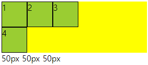
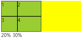

○ grid-template-rows
- grid container 트랙 중 행 내 아이템들의 크기를 지정할 수 있는 속성
- columns와 동일하며 item이 부족해 남으면 빈공간을 남김
- columns과 같이 주어도 됨
○ 코드
<div class="container">
    <div class="item">1</div>
    <div class="item">2</div>
    <div class="item">3</div>
    <div class="item">4</div>
</div>

<style>
    .container{
        height: 200px;
        background-color: yellow;
        display: grid;
        grid-template-rows: 1fr 2fr;
        grid-template-columns: 1fr 2fr;
    }
    .item{
        background-color: yellowgreen;
        border: 1px solid #000;
    }
</style>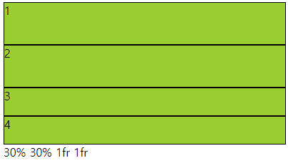

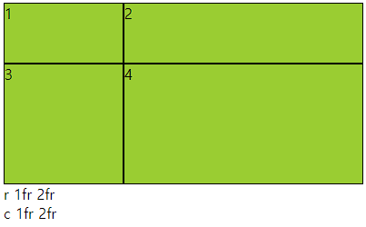
■ gap(grid-gap)
○ gap(grid-gap)
- gap으로만 사용가능
- grid cotainer에서 item들의 사이 간격을 지정하는 속성
- columns 와 rows가 수치로 되어 있으면 container를 넘어감
○ 사용법
- px로 사용해도 되고 %로 사용해도됨 그러나 너비와 높이가 다르면 %는 각각에 %임
○ 코드
<div class="container">
    <div class="item">1</div>
    <div class="item">2</div>
    <div class="item">3</div>
    <div class="item">4</div>
</div>

<style>
    .container{
        height: 200px;
        background-color: yellow;
        display: grid;
        grid-template-rows: 1fr 2fr;
        grid-template-columns: 1fr 2fr;
        gap: 30px 10px;
    }
    .item{
        background-color: yellowgreen;
        border: 1px solid #000;
    }
</style>

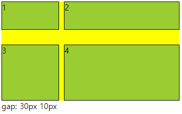
■ grid layout
○ grid layout이란
- 이름 그대로 격자 형태의 레이아웃을 만드는 2차원 레이아웃 방식
- 그리드 아이템의 배치와 정렬은 컨테이너 내부 행과 열의 상호작용을 통해 결정
- flex는 주축과 교차축을 가지고 정리한다고 한다면 gird는 상호작용을 통해 결정
- grid container : 레이아웃을 그리드 방식으로 결정할 요소
- grid item : 컨테이너 내부에서 그리드 방식으로 배치
○ 사용법
grid container에서 display속성의 값에 grid 사용
div{
	diplay: grid;
}
■ grid-template-columns,rows
○ grid-template-columns
- grid container 트랙 중 열 내 아이템들의 크기를 지정할 수 있는 속성
- 기본형태는 열과 행 모두 container의 크기에 맞게 나온다.
- 트랙이란 행 또는 열을 뜻함
○ 사용법
- px형태로 3열을 구성하려면 px px px (개수에 따라서 열 구성, 차이는 남)
- %형태로 container의 크기의 %형태로 들어감
- fr형태 남은 사이즈를 가지고 fr의 전체를 가지고 나눔 1fr 2fr (남은것중 1/3 2/3) 크기
- 같이 사용 가능
○ 코드
<div class="container">
    <div class="item">1</div>
    <div class="item">2</div>
    <div class="item">3</div>
    <div class="item">4</div>
</div>

<style>
    .container{
        height: 100px;
        background-color: yellow;
        display: grid;
        grid-template-columns: 10% 100px 2fr;
    }
    .item{
        background-color: yellowgreen;
        border: 1px solid #000;
    }
</style>
○ grid-template-rows
- grid container 트랙 중 행 내 아이템들의 크기를 지정할 수 있는 속성
- columns와 동일하며 item이 부족해 남으면 빈공간을 남김
- columns과 같이 주어도 됨
○ 코드
<div class="container">
    <div class="item">1</div>
    <div class="item">2</div>
    <div class="item">3</div>
    <div class="item">4</div>
</div>

<style>
    .container{
        height: 200px;
        background-color: yellow;
        display: grid;
        grid-template-rows: 1fr 2fr;
        grid-template-columns: 1fr 2fr;
    }
    .item{
        background-color: yellowgreen;
        border: 1px solid #000;
    }
</style>
■ gap(grid-gap)
○ gap(grid-gap)
- gap으로만 사용가능
- grid cotainer에서 item들의 사이 간격을 지정하는 속성
- columns 와 rows가 수치로 되어 있으면 container를 넘어감
○ 사용법
- px로 사용해도 되고 %로 사용해도됨 그러나 너비와 높이가 다르면 %는 각각에 %임
○ 코드
<div class="container">
    <div class="item">1</div>
    <div class="item">2</div>
    <div class="item">3</div>
    <div class="item">4</div>
</div>

<style>
    .container{
        height: 200px;
        background-color: yellow;
        display: grid;
        grid-template-rows: 1fr 2fr;
        grid-template-columns: 1fr 2fr;
        gap: 30px 10px;
    }
    .item{
        background-color: yellowgreen;
        border: 1px solid #000;
    }
</style>
■ 트랙함수
○ 트랙 함수
- grid container의 크기를 지정할때 사용할 수 있는 유용 함수
- repeat(), minmax(), auto-fill, auto-fit 이며 template에서 사용한다.
- grid-template-columns: repeat( , ) 형태로 사용
○ repeat(반복개수, 크기)
- 반복적으로 수치를 설정할때 사용함
- 크기가 container를 넘어가면 넘어간다.
○ minmax(작은, 큰)
- 작은보다 작아질수 없고 큰보다 커질수 없다.
- repeat(개수, minmax(작은, 큰)) 으로 사용함
○ auto-fill, auto-fit
- repeat의 개수에 작성
- auto-fill은 공간이 남으면 개수를 늘리고 모든것이 열로 나오면 남은 공간을 남김
- auto-fit은 위와 동일하나 남은 공간을 체워준다.
- 수치값이 어떠냐에 따라 체워주지 않을수도 있다.
○ 코드
<div class="container">
    <div class="item">1</div>
    <div class="item">2</div>
    <div class="item">3</div>
    <div class="item">4</div>
</div>

<style>
    .container{
        height: 100px;
        background-color: yellow;
        display: grid;
        grid-template-columns: repeat(auto-fill,minmax(80px, 1fr));

    }
    .item{
        background-color: yellowgreen;
        border: 1px solid #000;
    }
</style>


■ grid-row, grid-column
○ grid-row, grid-column
grid-item에서 사용하며 그리드 컨테이너의 줄번호를 이용해 배치할 수 있다.
row는 위아래로 내려오면서 기준선을 따라서 번호 가장 윗선이 1
column은 좌우로 넘어가면서 기준선을 따라서 번호 가장 왼쪽이 1

○ 코드
<div class="main">
    <div class="a">1</div>
    <div class="a">2</div>
    <div class="a">3</div>
    <div class="a">4</div>
    <div class="a">5</div>
    <div class="a">6</div>
</div>
div{
border: 1px solid #000;
box-sizing: border-box;
}
.main{
width: 300px; height: 100px;
display: grid;
grid-template-columns: repeat(3,1fr);
grid-template-rows: repeat(3,1fr);
background-color: yellowgreen;
}
.a{
background-color: aquamarine;
}
.a:nth-child(2){
grid-column: 2/4;
grid-row: 2/5;
}
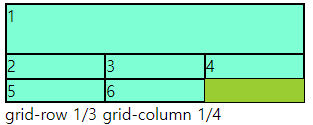
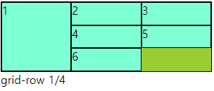
○ grid-row-start, end / grid-coumn-start,end
- grid-row : 1 / 3 == grid-row-start: 1; grid-row-end: 3 과 동일
■ grid-templare-areas, grid-area
○ grid-templare-areas, grid-area
- 그리드 영역의 이름을 이용해 레이아웃의 형태를 정의
- grid-templare-areas : grid container에서 형태를 지정
- grid-area : grid item에서 이름을 지정하는 형태
- grid item에서 이름지정방식
.a:nth-child(1){
    grid-area: a;
}
-grid container에서 areas 통제방식
.container{
	grid-template-areas:
    "a a b"
    "d d b"
    "- - c"
    ;
}
- 빈칸은 다른 이름으로 넣어주면 됨 보통(.)으로 넣는다. 숫자는 사용하지 않을것
- 요소들이 분리되면 문제 발생
- 비어 있어도, 넘어가도 문제 발생
- 행과 열이 많이 편성되어 있을때 지역을 잡지 않으면 나오는 문제
<div class="main">
    <div class="a">1</div>
    <div class="a">2</div>
    <div class="a">3</div>
    <div class="a">4</div>
</div>
div{
border: 1px solid #000;
box-sizing: border-box;
}
.main{
width: 300px; height: 100px;
display: grid;
grid-template-columns: repeat(3,1fr);
grid-template-rows: repeat(4,1fr);
background-color: yellowgreen;
grid-template-areas:
"a a b"
"d d b"
"- - c"
;
}
.a{
background-color: aquamarine;
}
.a:nth-child(1){
grid-area: a;
}
.a:nth-child(2){
grid-area: b;
}
.a:nth-child(3){
grid-area: c;
}
.a:nth-child(4){
grid-area: d;
}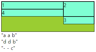

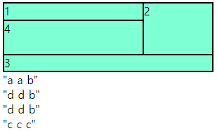
■ align-items,self / justify-items,slef
○ align-items,self / justify-items,slef
- align-items : grid container 에서 행트랙의 높이 기준으로 grid item 배치
- justify-items : grid container 에서 행트랙의 너비 기준으로 그리드 grid item 배치
- align-self : grid item 에서 행트랙의 높이 기준으로 개별 배치
- justify-self : grid item 에서 행트랙의 너비 기준으로 개별 배치
- 속성 값 : flex-end, flex-start, center 등
○ 코드
<div class="main">
    <div class="a">1</div>
    <div class="a">2</div>
    <div class="a">3</div>
    <div class="a">4</div>
</div>
div{
border: 1px solid #000;
box-sizing: border-box;
}
.main{
width: 300px; height: 100px;
display: grid;
grid-template-columns: repeat(2,1fr);
grid-template-rows: repeat(2,1fr);
background-color: yellowgreen;
align-items: center;
}
.a{
background-color: aquamarine;
}
.a:nth-child(2){
align-self: flex-end;
}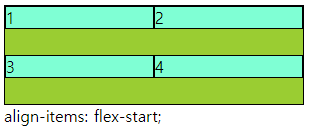


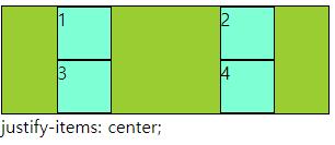


■ align-content, justify-content
○ align-content, justify-content
- align-content : 열방향에 container에 여유공간이 있을때 사용할 수 있다.
- justify-content : 행방향에 container에 여유공간이 있을때 사용할 수 있다.
- 속성으로 : flex-end, flex-start, center, space-around, space-bertween, space-evenly
○ 코드
div{
    border: 1px solid #000;
    box-sizing: border-box;
}
.main{
    width: 300px;   height: 100px;
    display: grid;
    grid-template-columns: repeat(2,40px);
    grid-template-rows: repeat(2,30px);
    background-color: yellowgreen;
    justify-content: space-between;
    align-content: center;

}
.a{
    background-color: aquamarine;
}


■ 1월 6일 - 14일차

<!DOCTYPE html>
<html lang="en">
<head>
    <meta charset="UTF-8">
    <meta name="viewport" content="width=device-width, initial-scale=1.0">
    <title>Document</title>
    <style>
        body{
            margin: 0;
        }
        .wrap{
            width: 1024px;
            margin: 0 auto;
        }
        header{
            height: 5vh;
            background-color: #ccc;
        }
        main{
            height: 90vh;
            display: flex;
        }
        .section1{
            width: 20%;
            background-color: #eee;
        }
        .section2{
            width: 80%;
        }
        .section2 > article{
            height: calc(100% / 3);
        }
        .section2 > .article1{
            background-color: #aaa;
        }
        .section2 > .article2{
            background-color: #999;
        }
        .section2 > .article3{
            background-color: #777;
        }
        footer{
            height: 5vh;
            background-color: #555;
        }


        @media (max-width:1024px){
            .wrap{
                width: 100%;
            }
            header{
                height: 10vh;
            }
            .section2 > article{
                height: 50%;
            }
            .section2 > .article3{
                display: none;
            }
        }
        @media (max-width:768px){
            header{
                height: 20vh;
            }
            main{
                height: 80vh;
                display: block;
            }
            .section1{
                width: 100%;
                height: 20vh;
            }
            .section2{
                width: 100%;
                height: 60vh;
                display: flex;
            }
            .section2 > article{
                width: 50%;
                height: 100%;
            }
        }

        @media (max-width:500px){
            main{
                height: 120vh;
            }
            .section1{
                height: 40vh;
            }
            .section2{
                display: block;
                height: 80vh;
            }
            .section2 > article{
                width: 100%;
                height: 50%;
            }
        }
    </style>
</head>

<body>
    <div class="wrap">
        <header></header>
        <main>
            <section class="section1"></section>
            <section class="section2">
                <article class="article1"></article>
                <article class="article2"></article>
                <article class="article3"></article>
            </section>
        </main>
        <footer></footer>
    </div>

</body>
</html>
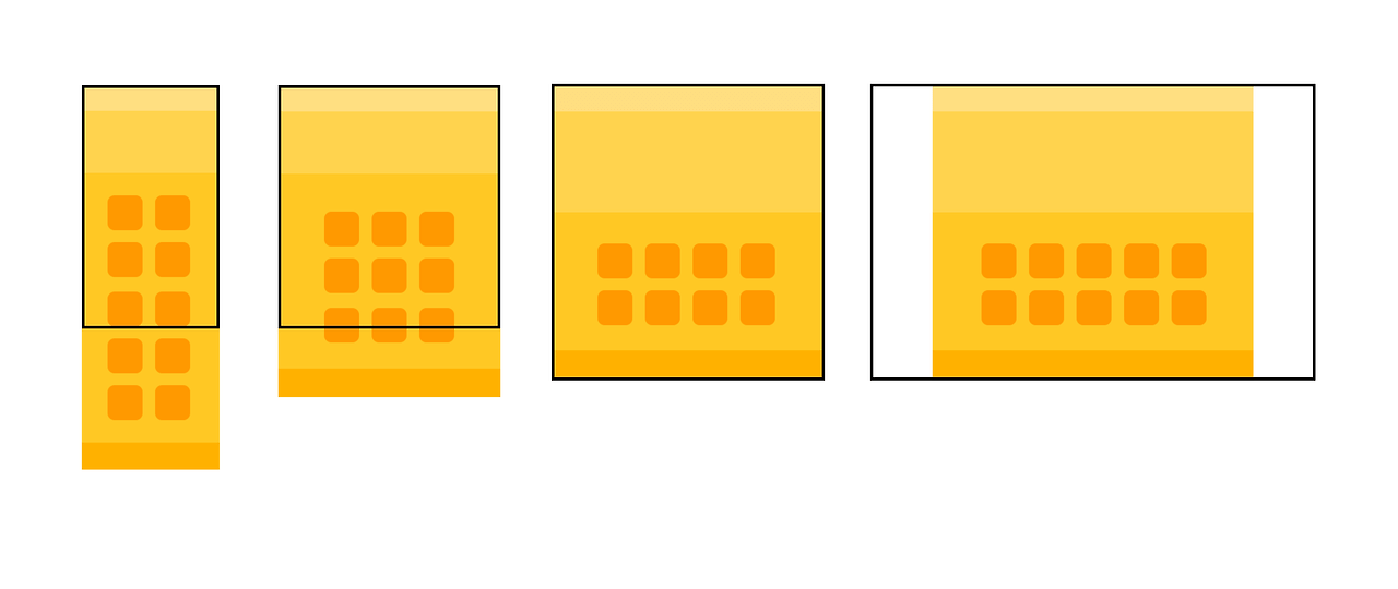
<!DOCTYPE html>
<html lang="en">
<head>
    <meta charset="UTF-8">
    <meta http-equiv="X-UA-Compatible" content="IE=edge">
    <meta name="viewport" content="width=device-width, initial-scale=1.0">
    <title>Document</title>
    <style>
        body{
            margin: 0;
        }
        .wrap{
            width: 1200px;
            margin: 0 auto;
        }
        nav{
            height: 5vh;
            background-color: rgb(255, 232, 156);
        }
        header{
            height: 35vh;
            background-color: rgb(177, 154, 77);
        }
        main{
            height: 50vh;
            background-color: rgb(255, 218, 55);
            padding: 40px 150px; box-sizing: border-box;
            display: flex; flex-wrap: wrap; gap: 20px;
        }
        main > .box{
            width: calc((100% - 80px)/5);
            background-color:  rgb(100, 90, 47);
            border-radius: 20px;
        }
        footer{
            height: 10vh;
            background-color: rgb(151, 124, 2) ;
        }
        @media (max-width:1200px){
            .wrap{
                width: 100%;
            }
            main > .box:nth-child(9),
            main > .box:nth-child(10){
                display: none;
            }
            main > .box{
                width: calc((100% - 60px)/4);
            }
        }
        @media (max-width:800px){
            header{
                height: 25vh;
            }
            main{
                height: 80vh;
                padding: 40px 100px;
            }
            main > .box:nth-child(9){
                display: block;
            }
            main > .box{
                width: calc((100% - 40px)/3);
            }
        }
        @media (max-width:500px){
            main{
                height: 100vh;
                padding: 40px 50px;
            }
            main > .box:nth-child(10){
                display: block;
            }
            main > .box{
                width: calc((100% - 20px)/2);
            }
        }
    </style>
</head>
<body>
    <div class="wrap">
        <nav></nav>
        <header></header>
        <main>
            <div class="box"></div>
            <div class="box"></div>
            <div class="box"></div>
            <div class="box"></div>
            <div class="box"></div>
            <div class="box"></div>
            <div class="box"></div>
            <div class="box"></div>
            <div class="box"></div>
            <div class="box"></div>
        </main>
        <footer></footer>
    </div>
</body>
</html>

<!DOCTYPE html>
<html lang="en">
<head>
    <meta charset="UTF-8">
    <meta http-equiv="X-UA-Compatible" content="IE=edge">
    <meta name="viewport" content="width=device-width, initial-scale=1.0">
    <title>Document</title>
    <style>
        body{margin: 0;}
        .wrap{width: 1200px; margin: 0 auto;}
        nav{height: 5vh; background-color: rgb(214, 214, 255);}
        header{height: 35vh; background-color: rgb(187, 187, 255);}
        .s1{height: 50vh; display: flex;}
        .s1 .left{width: calc(100% / 3); background-color: rgb(153, 153, 252);}
        .s1 .right{width: calc(100% / 3 * 2);}
        .s1 .right div{height: 50%;}
        .s1 .right .box1{background-color: rgb(105, 105, 238);}
        .s1 .right .box2{background-color: rgb(75, 75, 243);}
        .s2{height: 35vh; display: flex;}
        .s2 div{width: calc(100% / 3);}
        .s2 .box1{background-color: rgb(48, 48, 219);}
        .s2 .box2{background-color: rgb(24, 24, 173);}
        .s2 .box3{background-color: rgb(10, 10, 110);}
        .s3{background-color: rgb(185, 185, 247); padding: 40px 80px; box-sizing: border-box;
            display: flex; gap: 20px;
        }
        .s3 .box{width: 100%; aspect-ratio: 1; background-color: rgb(24, 24, 173);
            border-radius: 20px;
        }
        footer{height: 5vh; background-color: rgb(75, 75, 243);}
        @media (max-width:1200px){
            .wrap{width: 100%;}
            .s2 .box3{display: none;}
            .s2 div{width: calc(100% / 2);}
            .s3 .box:nth-child(4){display: none;}
        }
        @media (max-width:800px){
            .s1{height: 60vh;}
            .s2{flex-direction: column;}
            .s2 div{width: 100%; height: 50%;}
            .s3{padding: 40px 120px; gap: 40px;}
        }
        @media (max-width:500px){
            .s1{flex-direction: column;}
            .s1 .left{height: 20%; width: 100%;}
            .s1 .right{height: 80%; width: 100%;}
            .s3{flex-direction: column; padding: 40px 60px;}
            .s3 .box{ aspect-ratio: 2;}
        }
    </style>
</head>
<body>
    <div class="wrap">
        <nav></nav>
        <header></header>
        <main>
            <section class="s1">
                <div class="left"></div>
                <div class="right">
                    <div class="box1"></div>
                    <div class="box2"></div>
                </div>
            </section>
            <section class="s2">
                <div class="box1"></div>
                <div class="box2"></div>
                <div class="box3"></div>
            </section>
            <section class="s3">
                <div class="box"></div>
                <div class="box"></div>
                <div class="box"></div>
                <div class="box"></div>
            </section>
        </main>
        <footer></footer>
    </div>
</body>
</html>
■ 1월 7일 - 15일차


<!DOCTYPE html>
<html lang="en">
<head>
<meta charset="UTF-8">
<meta http-equiv="X-UA-Compatible" content="IE=edge">
<meta name="viewport" content="width=device-width, initial-scale=1.0">
<title>Document</title>
<link rel="stylesheet" href="https://cdnjs.cloudflare.com/ajax/libs/font-awesome/7.0.1/css/all.min.css">
<style>
body, h1, ul, h2, p{
margin: 0;
}
ul{
padding: 0;
list-style: none;
}
a{
display: inline-block;
text-decoration: none;
color: inherit;
}
header{
height: 80vh;
position: relative;
}
header img{
width: 100%;
height: 100%;
object-fit: cover;
display: block;
}
header h1{
position: absolute;
top: 50%;
width: 100%; text-align: center;
font-size: 68px; color: #fff;
transform: translateY(-50%);
text-transform: uppercase;
}
nav{
position: absolute;
left: 0; top: 0;
background-color: #0007;
color: #fff;
width: 100%; height: 80px;
display: flex; justify-content: space-between;
align-items: center;
padding: 0 100px; box-sizing: border-box;
}
nav .logo{
font-size: 24px;
}
nav > .menu{
width: 70%; height: 100%;
display: flex;
justify-content: space-between;
}
nav > .menu > li{
width: 25%; height: 100%;
text-align: center;
position: relative;
}
nav > .menu > li > a{
width: 100%; height: 100%;
align-content: center;
text-transform: uppercase; font-size: 24px;
}
nav > .menu > li:hover > a{
background-color: #fff;
color: #000; transition: 1s;
}
nav > .menu > li:hover > .submenu{
display: block;
}
nav > .menu .submenu{
position: absolute;
left: 0; top: 100%;
width: 100%;
background-color: #0008;
display: none;
}
nav > .menu .submenu li a{
width: 100%; height: 40px; align-content: center;
}
nav > .menu .submenu li a:hover{
background-color: #fff; color: #000; transition: 1s;
}
nav .shop{
font-size: 20px;
display: flex;
gap: 12px;
}
nav .m-menu{
display: none;
}
.s1{
padding: 50px 100px;
box-sizing: border-box;
}
.s1 h2{
font-size: 36px;
margin-bottom: 30px;
}
.s1 .container{
display: flex;
flex-wrap: wrap;
gap: 20px;
}
.s1 .container .item{
width: calc((100% - 60px)/4);
}
.s1 .container .item .img-box{
overflow: hidden;
}
.s1 .container .item .title{
font-size: 18px;
font-weight: 600;
margin-bottom: 12px;
}
.s1 .container .item .img-box:hover img{
scale: 1.2;
}
.s1 .container img{
width: 100%; height: 300px; object-fit: cover;
transition: 0.5s;
}
@media(max-width: 1000px){
nav{
padding: 0 30px;
}
nav > .menu > li > a{
font-size: 18px;
}
.s1{
padding: 50px 30px;
}
.s1 .container .item{
width: calc((100% - 20px)/2);
}
}
@media(max-width: 556px){
header{
overflow: hidden;
}
header h1{
text-align: start;
font-size: 40px;
left: 30px; top: 110px; transform: translateY(0);
width: 140px;
}
nav > .menu{
display: none;
}
nav .shop{
display: none;
}
nav .m-menu{
display: block;
font-size: 30px;
height: 100%; width: 80px;
text-align: right;
align-content: center;
cursor: pointer;
}
nav .m-menu:hover .menu{
right: 0;
transition: 1s;
}
nav .m-menu .menu{
display: block;
position: absolute;
top: 100%; right: -250px;
font-size: 24px;
color: #000;
width: 250px; height: calc(80vh - 80px);
background-color: #fff;
text-align: center;
}
nav .m-menu a{
display: inline-block;
width: 100%;
}
nav .m-menu .menu > li > a{
height: 50px; align-content: center;
}
nav .m-menu .menu > li .submenu a{
height: 40px; font-size: 18px; align-content: center;
}
nav .m-menu .menu a:hover{
color: #fff; background-color: #000;
}
nav .m-menu .menu > li:hover .submenu{
display: block;
}
nav .m-menu .menu > li .submenu{
display: none;
}
.s1{
padding: 50px 0;
}
.s1 .container .item{
width: 100%;
}
.s1 .container .item:nth-child(2n){
display: none;
}
}
</style>
</head>
<body>
<div class="wrap">
<header>
<img src="img3.jpg" alt="">
<h1>Home page</h1>
<nav>
<div class="logo">
<i class="fa-solid fa-school-flag"></i>
</div>
<ul class="menu">
<li>
<a href="#">menu1</a>
<ul class="submenu">
<li><a href="#">sub1-1</a></li>
<li><a href="#">sub1-2</a></li>
<li><a href="#">sub1-3</a></li>
<li><a href="#">sub1-4</a></li>
</ul>
</li>
<li>
<a href="#">menu2</a>
<ul class="submenu">
<li><a href="#">sub2-1</a></li>
<li><a href="#">sub2-2</a></li>
<li><a href="#">sub2-3</a></li>
<li><a href="#">sub2-4</a></li>
</ul>
</li>
<li>
<a href="#">menu3</a>
<ul class="submenu">
<li><a href="#">sub3-1</a></li>
<li><a href="#">sub3-2</a></li>
<li><a href="#">sub3-3</a></li>
<li><a href="#">sub3-4</a></li>
</ul>
</li>
<li>
<a href="#">menu4</a>
<ul class="submenu">
<li><a href="#">sub4-1</a></li>
<li><a href="#">sub4-2</a></li>
<li><a href="#">sub4-3</a></li>
<li><a href="#">sub4-4</a></li>
</ul>
</li>
</ul>
<div class="shop">
<i class="fa-solid fa-bell"></i>
<i class="fa-solid fa-bookmark"></i>
<i class="fa-solid fa-cart-shopping"></i>
</div>
<div class="m-menu">
<i class="fa-solid fa-align-justify"></i>
<ul class="menu">
<li>
<a href="#">menu1</a>
<ul class="submenu">
<li><a href="#">sub1-1</a></li>
<li><a href="#">sub1-2</a></li>
<li><a href="#">sub1-3</a></li>
<li><a href="#">sub1-4</a></li>
</ul>
</li>
<li>
<a href="#">menu2</a>
<ul class="submenu">
<li><a href="#">sub2-1</a></li>
<li><a href="#">sub2-2</a></li>
<li><a href="#">sub2-3</a></li>
<li><a href="#">sub2-4</a></li>
</ul>
</li>
<li>
<a href="#">menu3</a>
<ul class="submenu">
<li><a href="#">sub3-1</a></li>
<li><a href="#">sub3-2</a></li>
<li><a href="#">sub3-3</a></li>
<li><a href="#">sub3-4</a></li>
</ul>
</li>
<li>
<a href="#">menu4</a>
<ul class="submenu">
<li><a href="#">sub4-1</a></li>
<li><a href="#">sub4-2</a></li>
<li><a href="#">sub4-3</a></li>
<li><a href="#">sub4-4</a></li>
</ul>
</li>
</ul>
</div>
</nav>
</header>
<section class="s1">
<h2>specimen book</h2>
<div class="container">
<div class="item">
<div class="img-box">
<img src="img3.jpg" alt="">
</div>
<div class="text-box">
<p class="title">Contrary to popular</p>
<p class="source">The standard chunk of Lorem Ipsum used since the 1500s is reproduced below for those</p>
</div>
</div>
<div class="item">
<div class="img-box">
<img src="img3.jpg" alt="">
</div>
<div class="text-box">
<p class="title">Contrary to popular</p>
<p class="source">The standard chunk of Lorem Ipsum used since the 1500s is reproduced below for those</p>
</div>
</div>
<div class="item">
<div class="img-box">
<img src="img3.jpg" alt="">
</div>
<div class="text-box">
<p class="title">Contrary to popular</p>
<p class="source">The standard chunk of Lorem Ipsum used since the 1500s is reproduced below for those</p>
</div>
</div>
<div class="item">
<div class="img-box">
<img src="img3.jpg" alt="">
</div>
<div class="text-box">
<p class="title">Contrary to popular</p>
<p class="source">The standard chunk of Lorem Ipsum used since the 1500s is reproduced below for those</p>
</div>
</div>
<div class="item">
<div class="img-box">
<img src="img3.jpg" alt="">
</div>
<div class="text-box">
<p class="title">Contrary to popular</p>
<p class="source">The standard chunk of Lorem Ipsum used since the 1500s is reproduced below for those</p>
</div>
</div>
<div class="item">
<div class="img-box">
<img src="img3.jpg" alt="">
</div>
<div class="text-box">
<p class="title">Contrary to popular</p>
<p class="source">The standard chunk of Lorem Ipsum used since the 1500s is reproduced below for those</p>
</div>
</div>
<div class="item">
<div class="img-box">
<img src="img3.jpg" alt="">
</div>
<div class="text-box">
<p class="title">Contrary to popular</p>
<p class="source">The standard chunk of Lorem Ipsum used since the 1500s is reproduced below for those</p>
</div>
</div>
<div class="item">
<div class="img-box">
<img src="img3.jpg" alt="">
</div>
<div class="text-box">
<p class="title">Contrary to popular</p>
<p class="source">The standard chunk of Lorem Ipsum used since the 1500s is reproduced below for those</p>
</div>
</div>
</div>
</section>
</div>
</body>
</html>
■ 1월 8일 - 16일차

<!DOCTYPE html>
<html lang="en">
<head>
    <meta charset="UTF-8">
    <meta http-equiv="X-UA-Compatible" content="IE=edge">
    <meta name="viewport" content="width=device-width, initial-scale=1.0">
    <title>Document</title>
    <link rel="stylesheet" href="https://cdnjs.cloudflare.com/ajax/libs/font-awesome/7.0.1/css/all.min.css">
    <style>
        body, h2, h3, p{
            margin: 0;
        }
        img{
            width: 100%; height: 100%;
            object-fit: cover; display: block;
        }
        header{
            height: 90vh;
            position: relative;
        }
        nav{
            position: absolute;
            left: 0; top: 0;
            padding: 0 80px; box-sizing: border-box;
            width: 100%; height: 80px; color: #fff;
            display: flex; justify-content: space-between; align-items: center;
        }
        nav .logo, nav .icon{
            width: 240px;
        }
        nav .logo{
            font-size: 24px;
            font-weight: 600;
            text-transform: uppercase;
        }
        nav .menu{
            display: flex;
            gap: 30px;
            font-weight: 600;
            text-transform: uppercase;
        }
        nav .icon{
            display: flex;
            justify-content: end;
            font-size: 18px; gap: 15px; align-items: center;
        }
        header .text-box{
            position: absolute;
            left: 50%; transform: translateX(-50%);
            bottom: 80px;
            color: #fff;
            text-align: center;
            text-transform: uppercase;
        }
        header .text-box h2{
            font-size: 34px;
            margin-bottom: 12px;
        }
        header .text-box p{
            font-weight: 600;
            margin-bottom: 32px;
        }
        header .text-box .bt{
            border: 3px solid #fff;
            width: 100px; margin: 0 auto; height: 40px;
            align-content: center;
            border-radius: 10px;
        }
        section{
            padding: 60px 40px; box-sizing: border-box;
        }
        section h3{
            font-size: 30px;
            text-align: center;
        }
        section > p{
            text-align: center;
        }

        .s1 > p{
            margin-bottom: 20px;
        }
        .s1 .container{
            display: flex; gap: 10px;
        }
        .s1 .container .item{
            width: calc((100% - 30px)/4);
        }
        .s1 .container .item img{
            height: 300px;
            margin-bottom: 10px;
        }
        .s1 .container .item p:nth-child(2){
            margin-bottom: 8px;
        }

        .s2 > p{
            margin-bottom: 30px;
        }
        .s2 .container{
            display: flex; flex-wrap: wrap; gap: 50px 10px;
        }
        .s2 .container .item{
            width: calc((100% - 50px)/6);
            height: 200px;
        }

        .s3{
            padding: 60px 0;
            display: flex;
        }
        .s3 .item{
            width: 50%;
            height: 80vh;
            position: relative;
        }
        .s3 .item .text-box{
            position: absolute;
            width: 100%; text-align: center;
            bottom: 40px; color: #fff;
        }
        .s3 .item .text-box h3{
            font-size: 24px;
            margin-bottom: 5px;
        }
        .s3 .item .text-box p{
            margin-bottom: 26px;
        }
        .s3 .item .text-box .bt{
            border: 1px solid #fff;
            width: fit-content;
            margin: 0 auto;
            padding: 4px 20px;
            border-radius: 5px;
        }
        .s4 > p{
            margin-bottom: 30px;
        }
        .s4 .container{
            display: flex; gap: 10px;
        }
        .s4 .container .item{
            width: calc((100% - 10px)/2);
            height: 40vh;
        }
        .s4 .container .con{
            display: flex; gap: 10px;
        }
        .s4 .container .con img{
            width: calc((100% - 10px)/2);
        }
        .s5{
            display: flex; flex-wrap: wrap; gap: 10px;
        }
        .s5 .item{
            width: calc((100% - 10px)/2);
            height: 40vh;
        }
        .s5 .item3{
            width: 100%;
        }
        @media(max-width:1024px){
            nav .icon{
                display: none;
            }
            .s1 .container .item{
                width: calc((100% - 20px)/3);
            }
            .s1 .container .item:last-child{
                display: none;
            }
            .s2 .container .item{
                width: calc((100% - 30px)/4);
            }
        }
        @media(max-width:768px){
            nav{
                height: fit-content;
                padding-top: 40px;
                padding-left: 20px;
                flex-direction: column;
                justify-content: center;
                align-items: flex-start;
                gap: 20px;
            }
            header .text-box{
                bottom: 50%; transform: translate(-50%, 50%);
            }
            .s1 .container{
                flex-wrap: wrap;
            }
            .s1 .container .item{
                width: calc((100% - 10px)/2);
            }
            .s1 .container .item:last-child{
                display: block;
            }
            .s2 .container .item{
                width: calc((100% - 20px)/3);
            }
            .s2 .container .item:nth-child(4n){
                display: none;
            }
            .s3{
                flex-wrap: wrap;
            }
            .s3 .item{
                width: 100%;
            }
            .s4 .container{
                flex-wrap: wrap;
            }
            .s4 .container .item{
                width: 100%;
            }
            .s5 .item{
                width: 100%;
            }
            .s5 .item4, .s5 .item5{
                display: none;
            }
        }
    </style>
</head>
<body>
    <div class="wrap">
        <header>
            <img src="img3.jpg" alt="">
            <nav>
                <div class="logo">
                    munsingwear
                    <i class="fa-brands fa-apple"></i>
                </div>
                <div class="menu">
                    <p>남성</p>
                    <p>여성</p>
                    <p>magazine</p>
                    <p>munsingwear</p>
                    <p>early bird</p>
                </div>
                <div class="icon">
                    <i class="fa-solid fa-bag-shopping"></i>
                    <i class="fa-solid fa-bahai"></i>
                    <i class="fa-solid fa-bars-progress"></i>
                </div>
            </nav>
            <div class="text-box">
                <h2>be the way</h2>
                <p>먼싱웨어의 변하지 않는 가치, 배우 차예련의 확고한 선택</p>
                <div class="bt">더보기</div>
            </div>
        </header>
        <section class="s1">
            <h3>NEW IN</h3>
            <p>WOMEN MEN</p>
            <div class="container">
                <div class="item">
                    <img src="img1.jpg" alt="">
                    <p>여성 경량 패딩 레그워머</p>
                    <p>178,000원</p>
                </div>
                <div class="item">
                    <img src="img1.jpg" alt="">
                    <p>여성 경량 패딩 레그워머</p>
                    <p>178,000원</p>
                </div>
                <div class="item">
                    <img src="img1.jpg" alt="">
                    <p>여성 경량 패딩 레그워머</p>
                    <p>178,000원</p>
                </div>
                <div class="item">
                    <img src="img1.jpg" alt="">
                    <p>여성 경량 패딩 레그워머</p>
                    <p>178,000원</p>
                </div>
            </div>
        </section>
        <section class="s1">
            <h3>BEST SELLER</h3>
            <p>WOMEN MEN</p>
            <div class="container">
                <div class="item">
                    <img src="img1.jpg" alt="">
                    <p>여성 경량 패딩 레그워머</p>
                    <p>178,000원</p>
                </div>
                <div class="item">
                    <img src="img1.jpg" alt="">
                    <p>여성 경량 패딩 레그워머</p>
                    <p>178,000원</p>
                </div>
                <div class="item">
                    <img src="img1.jpg" alt="">
                    <p>여성 경량 패딩 레그워머</p>
                    <p>178,000원</p>
                </div>
                <div class="item">
                    <img src="img1.jpg" alt="">
                    <p>여성 경량 패딩 레그워머</p>
                    <p>178,000원</p>
                </div>
            </div>
        </section>
        <section class="s2">
            <h3>GRANDSLAM</h3>
            <p>먼싱웨어 최상의 퍼포먼스 라인</p>
            <div class="container">
                <div class="item">
                    <img src="img2.jpg" alt="">
                </div>
                <div class="item">
                    <img src="img2.jpg" alt="">
                </div>
                <div class="item">
                    <img src="img2.jpg" alt="">
                </div>
                <div class="item">
                    <img src="img2.jpg" alt="">
                </div>
                <div class="item">
                    <img src="img2.jpg" alt="">
                </div>
                <div class="item">
                    <img src="img2.jpg" alt="">
                </div>
                <div class="item">
                    <img src="img2.jpg" alt="">
                </div>
                <div class="item">
                    <img src="img2.jpg" alt="">
                </div>
                <div class="item">
                    <img src="img2.jpg" alt="">
                </div>
                <div class="item">
                    <img src="img2.jpg" alt="">
                </div>
                <div class="item">
                    <img src="img2.jpg" alt="">
                </div>
                <div class="item">
                    <img src="img2.jpg" alt="">
                </div>
            </div>
        </section>
        <section class="s3">
            <div class="item">
                <img src="img1.jpg" alt="">
                <div class="text-box">
                    <h3>3IN1 DETACHABLE OUTER</h3>
                    <p>따로 혹은 같이, 3가지 스타일 연출이 가능한 아우터</p>
                    <div class="bt">더보기</div>
                </div>
            </div>
            <div class="item">
                <img src="img3.jpg" alt="">
            </div>
        </section>
        <section class="s4">
            <h3>MUST-HAVE KNITWEAR</h3>
            <p>포근함에 머물다, 럭셔리 스웨터</p>
            <div class="container">
                <div class="item">
                    <img src="img1.jpg" alt="">
                </div>
                <div class="item con">
                    <img src="img2.jpg" alt="">
                    <img src="img3.jpg" alt="">
                </div>
            </div>
        </section>
        <section class="s5">
            <div class="item item1">
                <img src="img1.jpg" alt="">
            </div>
            <div class="item item2">
                <img src="img2.jpg" alt="">
            </div>
            <div class="item item3">
                <img src="img3.jpg" alt="">
            </div>
            <div class="item item4">
                <img src="img1.jpg" alt="">
            </div>
            <div class="item item5">
                <img src="img2.jpg" alt="">
            </div>
        </section>
    </div>
</body>
</html>'Web 수업자료 > Web 정규' 카테고리의 다른 글
| 웹 디자인 1 26-1 (0) | 2026.01.17 |
|---|---|
| Web 3 26-1 (0) | 2026.01.12 |
| UIUX 디자인 24-11 (0) | 2025.11.23 |
| 웹디자인 2 25-10 (0) | 2025.10.25 |
| 웹디자인 1 25-09 (0) | 2025.09.20 |